
How can you “Get the Look” you see in the projects that adorn our glossy magazines and TV screens? You simply need some translation. Read on for my tips.
This project is an extension of an existing home in Moonee Ponds, Melbourne. The owners sought a renovation that would open the house up and create the extra space they needed for their family.
As you get excited about your renovation or new home you’re planning, no doubt you’ll be looking at magazines and searching online for inspiration. However, in those glossy pages and beautiful photographs, it can often seem overwhelming to think how you’ll actually achieve that look at your place – and what it will cost.
In this post, I take you through a beautiful home in Melbourne, and decode for you what’s working … what are the elements that are seducing you in those images, and what is it that makes this home a great place to live in. Once decoded and demystified with some industry-insider info, then you can explore and exploit their use in your home design – and get great results. I summarise it upfront, and then go through in much more detail after the gorgeous images.
First seen by UA in Grand Designs Australia Issue 3.3. All images from the website of Luke Stanley Architects (lukestanleyarchitects.com.au) and photography by Sonia Mangiapane.
Project Team | Architects: Cameron David Fry Architect (0414 472 590) and Luke Stanley Architects (0403 186 004, lukestanley architects.com) | Builder: Fry Built (0418 337 708, frybuilt.com.au)
And here are some of the design elements that make this house work so well, and how can you use them in your home …
- Great use of natural light to animate and expand the volume of the spaces and create such a lovely living environment.
- The void is located well to accentuate the light and volume in the house, open it up, and is proportioned beautifully in relation to the home.
- Use of thermal mass (the concrete floor slab) to maintain consistent, comfortable, internal temperatures without artificial heating and cooling.
- The planning and detailing is beautifully simple, crisp and clean
- Great use of storage to keep spaces uncluttered
- A monochromatic colour palette with natural materials to provide pattern and texture provides a great backdrop to any furniture and interior accessories
- Interior colour selection of dark base with light top, walls, and ceilings helps enhance the light-filled nature of the home, and guides the eye upwards and outwards to where the light is coming from.
Scroll below the photos to see more explanation of these design elements, and how you can use them in your design.
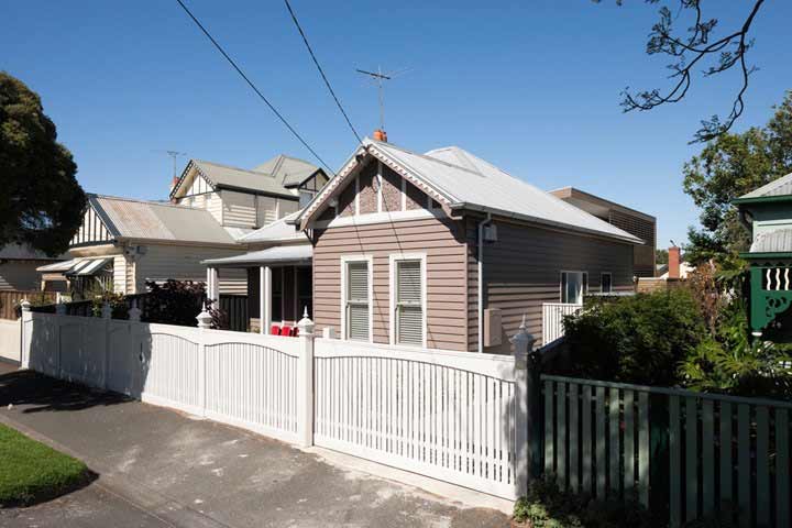 A peek of the extension from the main street means the front of the home appears in its original character, protecting the history of its place in the street.

Here’s how to “Get the Look” that works so well in this home
Great use of natural light (passive solar design)
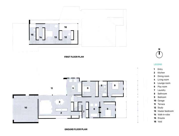
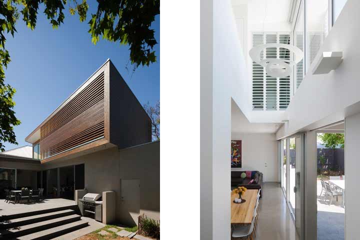
The site is oriented north to the side, and so the extension pulls the living/dining/kitchen space back from the northern boundary. This creates an open external area exposed to the north, and ensures that the glazing of the living/kitchen/dining area is far enough away from the neighbour to not be overshadowed from winter sun.
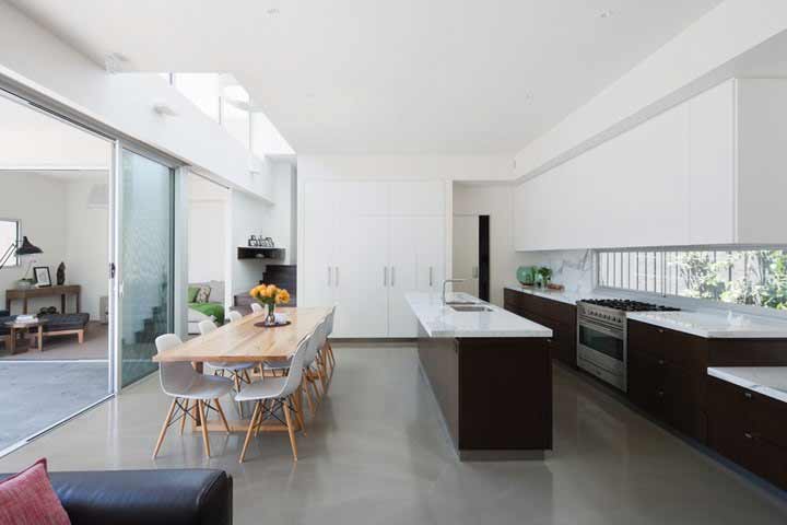
The void created over the dining area and stairs enhances this, as it increases the amount of sun exposure to the lower floor (and it also adds a great sense of volume to the floor plan).
The upper floor sits outside of the glazing line on the lower floor to shelter it from weather and shade it from the high level summer sun.
The access of natural light to the home is controlled this way so the home is always light-filled without creating problems in heating and cooling. Light, and the way it is used in this home, plays a massive part in this home looking and feeling as good as it does.
So, use big areas of glazing, particularly to connect your living area with outdoors. Ensure you orient it to the north, and provide shade from summer sun.
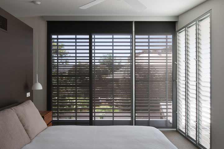
Create privacy and shade where you need to through screens (like the timber battened one used on the upstairs bedroom).
A void is always great but be careful they’re not too small as they’ll feel like a vertical tunnel, particularly if you’re sitting below them. Here, the void is used beautifully to connect the lower and upper floor around the stairs, and to extend the access to light for the lower floor.
Work to bring the outside in, and your home’s size will grow visually.
Use of thermal mass (heavy material) to control heating and cooling in the home
The lower floor is constructed from concrete, with a polished finish. This heavy material, in contact with the ground, provides fantastic thermal mass. The ground is always a fairly even temperature – because there’s so much mass in it, it takes a lot to heat it up and cool it down – so it stays fairly constant, and loses or gains heat very slowly.
When you put concrete in contact with the ground, the concrete also performs similarly.
Allow the sun to heat up the concrete in winter by providing exposure to the northern winter sun (especially throughout the morning), and as the evening temperature drops, the concrete slab will lose its heat and keep your house warm. Shade the concrete slab from the sun in summer, and it will stay cool, and keep your house cool throughout the day.
This house is designed to optimise this natural heating and cooling, keeping energy bills down and making a fantastic living environment. (Don’t like polished concrete? You can tile it and this will work too. Timber floorboards over the top don’t work so well, as they perform thermally different to concrete based materials.)
Remember to use thermal mass in the design of your home.
The clean planning and detailing
Do you notice on the floor plan that everything looks very ‘clean’? Simply shaped rooms, no truncated corners. Joinery running full widths of rooms. No awkward hallways or entries to rooms. Rooms are easy to furnish. You always walk in on the foot of the beds. Can you see that it just looks really simple? This is because it’s well-designed. It actually takes a lot of work to achieve this level of simplicity.
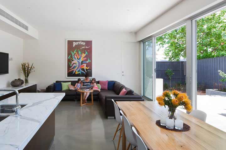
The built in joinery also enhances this look. See how the kitchen joinery extends into the living area to create a TV unit? This removes the need for loose furniture and helps things look integral to the home – part of it rather than added to it.
Also, there are no cornices. These are the elements used to cover the join between the ceilings and the walls. In this home, the cornices are ‘square set’ – which means they’re plastered to a crisp internal corner. It’s more labour intensive to do, because wall and ceiling plasterboard has to be cut more accurately to meet in the corners (because there’s nothing to cover it) and the plasterer has to take their time to finish this junction. Because it’s more labour intensive, it costs more than a standard cornice finish. But it does a lot to keep the look clean, crisp and simple.
Ceiling lights are really minimal, recessed downlights – you have to look really hard to see them. Wall lights are white and almost invisible too (but at night would look fantastic in that void).
Cupboard joinery disappears into the walls because it’s the same colour. Airconditioning is supplied via lineal grates in the bulkhead over the kitchen. Ceilings generally don’t have a lot of ‘stuff’ in them – big open spaces with big clean surfaces.
There are also very few architraves – the picture frames normally used around windows – and here they appear to be flush with the walls. The same with the skirtings from what I can see.
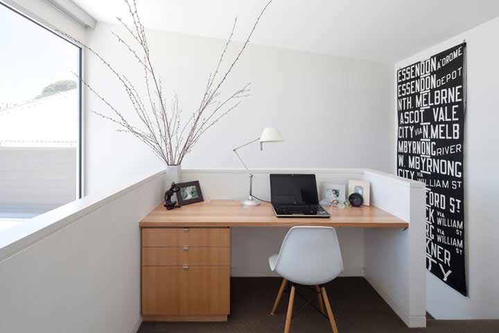
There’s also a lot of storage – robes, built-in cupboards, a butler’s pantry off the kitchen, linen and a study nook upstairs. When you have places to put things so they’re hidden away, behind clean white doors, it removes the clutter from benchtops and from being on view.
So think about your surfaces and how you finish them. Keep things flush where you can – recessed downlights, minimal permanent fixtures on your walls and ceilings.
Create great storage that suits what you have to store (and for most families – it’ll help to have a lot!)
If you prefer angles to the squareness of this plan, then make sure you have a purpose – angles can add drama to a space, but they can also create rooms difficult to furnish and unsettling to be in. Often when doors are angled on a room, it’s because the circulation through a house hasn’t been planned properly, and truncated corners on rooms are being added so you can move through the house. In my opinion, it’s horrible.
A space will always feel better when you can move cleanly through it in a straight line, without having to side-step where walls jut out, or zig-zags occur, or furniture is poorly arranged.
As human beings, we generally respond to order, as it brings harmony to our experience. Bring this into your home with intention.
Monochromatic colour palette with natural highlights
See how everything below bench height in the kitchen is dark – the kitchen joinery, the stairs, the floor. And above bench height is light, white and bright. Do you find your eyes naturally are led upwards, to notice the void, the volume, the light coming in through the windows? That the base of each image just disappears a little from your focus?
Added to this are the big areas of glazing to maximise the natural light coming into the home, which is enhanced by the light surfaces. The void lets you see a lot of the glazing too, being located next to it.
The neutral palette provides a calming backdrop where the furniture can then be the highlight or feature. This makes good sense long-term – you can update furniture and accessories a lot more easily than a tile finish or joinery piece. It also helps for resale, as anyone can add their things and it work. And you can still create personality that is uniquely yours through what you add – the wall-hangings, the soft furnishings, a quirky chair, a favourite lamp.
The natural stone on the benchtops adds a little bit of drama and texture with its pattern, without being fussy. Natural stone doesn’t always perform as well as reconstituted stone in stain-resistance, so do your research. Here it is well-used, because it’s the consistent item through the kitchen, living room and bathroom joinery.
In a compact home, keep your finishes selection to a reduced palette you use in various areas. It has a calming effect that ties the house together, and makes it feel more consistent and spacious as a result.
A final note about external aesthetics
It’s worth noting too that this extension doesn’t seek to mimic the weatherboard cottage in its form, size and shape. This approach liberates the new parts of the house, enabling them to be sized and detailed to suit modern family life. Here, they’ve clad the new extension in horizontal natural timber cladding – the same material as the weatherboard house, and the same horizontal lines, but in a different form.
If you’re renovating an old house, this is always my recommended approach. Use new materials and forms that compliment the existing dwelling but are of their time. It’s part of the story telling we do with houses.
ps …
I just received an email about this product, which looks like a much more straightforward way of achieving flush skirtings. They also have a flush architrave product too. Ordinarily to achieve this look of the flush skirting/architrave with the shadow, would take a few different components, but this system combines it into one element that looks faster and easier to install and finish. Suggest it to your builder and see if they are familiar with it. I’ve no idea about this company, (http://intrimmouldings.com.au/contact-us/) and their website is terrible! So do your own homework 🙂
 With over 30 years industry experience, Amelia Lee founded Undercover Architect in 2014 as an award-winning online resource to help and teach you how to get it right when designing, building or renovating your home. You are the key to unlocking what’s possible for your home. Undercover Architect is your secret ally
Leave a Reply