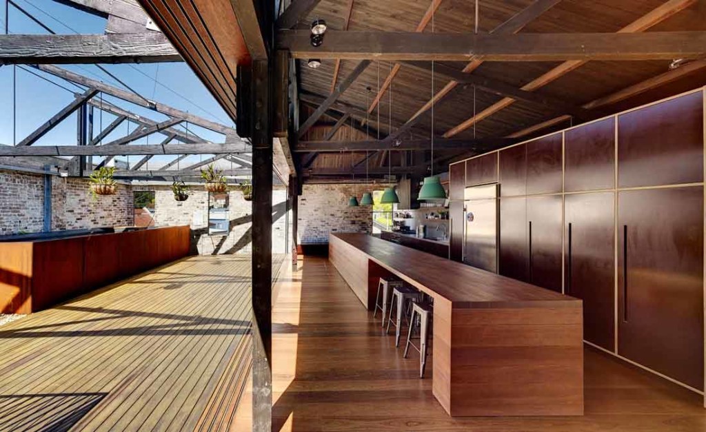
When I first saw this kitchen, I took an audible gasp. Wowsers. Swoonworthy. I bookmarked it for inspiration immediately – I’d found my ideal, dream kitchen. Incredible.

Image of Virginia Kerridge’s award winning Lilyfield Warehouse [image source]
Seriously though, would it ever be possible for me to have this kitchen? This home won the 2013 Houses Award for alterations and additions over 200m2. It is stunning – no doubt about it, and a worthy recipient of the award. That island bench is 8m long though! It’s a huge kitchen, and a dramatic and high budget statement, in this dramatic and high budget renovation.
When you’re planning a renovation or a brand new home, you start looking around. Getting ideas. Getting inspired. Getting informed.
You get excited about what’s possible. You start curating your shopping list of must-haves, the things you love, and the things you don’t.
Slowly though, you can become overwhelmed. You start to look at the pricetags on items. The information about renovation or building costs.
Lusting over things you wonder if you can ever afford. Feeling like you’ve got such expensive taste. Getting exasperated over the beautiful spaces you’re falling in love with, and becoming totally demoralised before you even start on your own project.
You wonder – is it possible to create a champagne home on a beer budget. Will you ever get the home you dream of?
So how do you avoid this budget frustration, and stay inspired and excited about your project, and believe in the possibilities for your home?
Styling and seduction
Like the photoshopped models on our fashion magazines, the images of homes we see on glossy magazine pages and beautiful online photos have been styled to seduce. Even magazines like Real Living will style the real reader homes featured in their pages.
The key to breaking through the seduction is to identify what you’re actually responding to when you see an image. What is it that you’re really falling in love with, and how can you bring it into your home?
Take my kitchen example.
When I saw that image a couple of years ago, I immediately thought, “Oh my, that kitchen is insane,” and “one day it will be mine” (insert dramatic bwah bwah bwah laugh here).
Meanwhile, I’ve done other kitchens in my own, and in other people’s homes, and not used this style or inspiration. It’s such an individual and unique kitchen, I don’t believe it’s a style you can put in every home, and especially in one you’re renovating or building to sell.
So what is it that works? And how can that be translated into any home, on any budget? Here’s how …
It fits the big picture
This kitchen completely suits the warehouse home, with its natural materials and raw industrial style. You can’t imagine a white and bright kitchen sitting in the space, can you? And that holistic design approach – that total ‘fit’ – is something all designs can achieve.
The quality of light is stunning
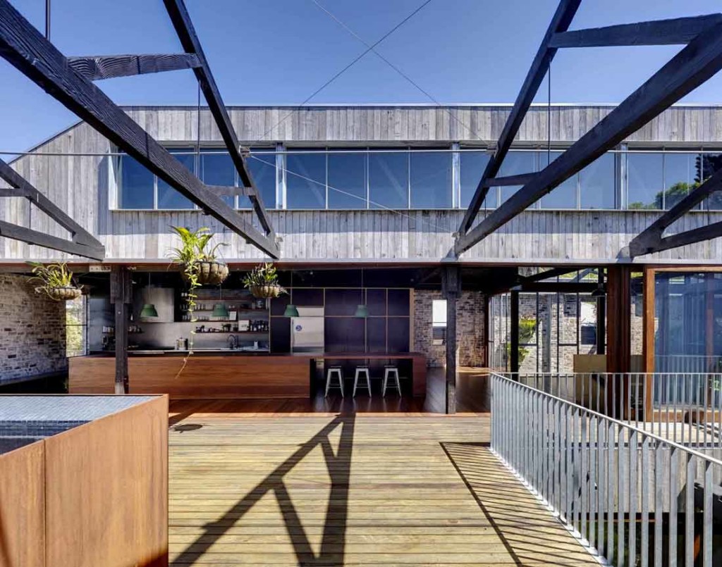
The way that the light spills into the space and really lights up that kitchen area is lovely. It faces east / south-east which is beautiful for sun-filled space in the morning, and ambient light at other times of the day. Enhanced by the volume of the space, it adds a feeling of spaciousness, and a light and airy quality.
Inside and outside is blurred
There is a seamless connection between indoors and outdoors. The glass sliding doors just completely disappear. You can see a sliding track sitting in the floor, flush with the floor itself. Massive door sliding panels have slid right off and left the structure exposed as the boundary between inside and out.
So far, that tells me, “Okay. I want really good quality natural light, a sense of spaciousness, a design that works with the rest of the home style-wise, and I want a seamless connection between indoors and outdoors.”
Image of Virginia Kerridge’s award winning Lilyfield Warehouse [image source]
The materials are to my taste – at this time! (because tastes change)
A raw and industrial finish can sometimes feel quite stark and cold, but here there’s a great warmth and texture to it here.
This raw industrial aesthetic may not work in every home. Here it works well because it’s a warehouse – a rustic, industrial building.
The space still has great volume, and lots of natural light. There is also contrast in the finishes used – it’s not all dark.
Of course, dark finishes can show up marks and smears more readily – which is challenging in a kitchen. So using this idea is also about balancing that with the maintenance.
It almost doesn’t look like a kitchen
I actually love kitchens that look like furniture. When they’re in open plan living areas, I prefer kitchens that appear as simple, seamless joinery and help you tidy everything away.
So I love that the island looks like a piece of furniture. There is almost a café feel about it, and no services in it. It’s a big, long (very long) table.
I also love that there’s no handles. The joinery has been designed to create slots for handles.
So that tells me how I should think about how arranging a kitchen to keep the services (such as a sink, etc) out of the island and make the island feel like a big, warm and friendly table that everybody can gather around.
Order and proportion
Design can be hidden and overt. It can seem incredibly obvious to us when something is designed well. At other times be almost invisible except for an emotive and intuitive response that draws us to like something.
Often that reaction will be as a result of order and proportion being used well in the layout or arrangement.
Here, there is a balance between light and dark. There is also a balance between the various elements within the kitchen. The warehouse, as a volume, can feel tall and dwarf you as a user of that space (which then doesn’t feel intimate as a home). This kitchen has strong horizontal lines, which help ground the space, and give it (and you) the right scale to use it comfortably.
The emotional aspiration
The best images in magazines and online help us aspire to visualise ourselves standing in them. We can picture the feeling of home, having a place we’re proud of and can entertain in, and feel relaxed and comfortable with family.
So access that. The feelings you feel. Understand what that feeling is, and then focus on how you can get that feeling in the spaces that you are designing.
Feel the feeling …
I think that, in this kitchen, I would feel pretty awesome because there’s so much natural light. I would feel visually connected to everything going on. I would feel like I could have friends around, be the hostest with the mostest, and not feel like I’m locked away in the kitchen.
I feel like I’d be able to have an organised clutter-free kitchen because there’s great storage that can hide everything away, and it feels a little bit funky, quirky and artistic without being pretty or fussy.
And so I’d feel more organised. More relaxed. More at-home. More funky. More grown-up! More ‘together’.
Don’t copy. Instead, interpret.
Determine the qualities you love, and break them down. Feel the feelings. Stay inspired, and interpret what you see – don’t mimic it. Interpretation gives you lots of flexibility with your budget.
This is really about how your home feels, and how you feel in your home. Focus on that, and you’ll always get a great outcome – on any budget.

 With over 30 years industry experience, Amelia Lee founded Undercover Architect in 2014 as an award-winning online resource to help and teach you how to get it right when designing, building or renovating your home. You are the key to unlocking what’s possible for your home. Undercover Architect is your secret ally
Leave a Reply