In this Spotlight, Amelia worked with these homeowners to improve the design they had, and create the best outcome for their big move.
The kids have not only all moved out – they’ve moved to the other side of the country. So this couple are seeking to create a new home, on a new coast, and the new life that will go with it.
UPDATE: Due to her mission to educate ALL homeowners to get it right in their own projects, Amelia no longer provides 1:1 design services. The best way to access Amelia’s expertise, experience, support and guidance (plus get her answers to your regular questions), is via her flagship program: HOME Method. Learn more here.
And so, their new home will be a space for the two of them, but will also need to host guests who come to stay for a little (or long) time. And be a place for larger family gatherings as well. They’re working with a local building broker to design their new home, but feeling the outcome is falling short of their aspirations.
The homeowners and their land
This couple sees this as their retirement home. They’re relocating from a large home on acreage on the eastern side of Australia, to a small lot in Perth, and building a brand new home.
They’ve been working with a building broker to design and organise the house build. It’s an interesting process where the company draws up the design (in consultation with the client) and organises quotes at fixed price construction. Then the chosen builder pays a commission to the builder broker to cover the design services.
In the homeowners’ words:
“Our home had to be squeezed onto a 10m wide x 500m deep block and the building design was slowly getting larger to solve each new functional conflict that arose. We were sure that someone with the appropriate expertise could make smarter use of the space, and blend the various components into a more cohesive mix. We seemed to be going around in circles trying to resolve problems ourselves.”
The block of land is 507m2 in size, and is north / north-east to rear.
Given Perth’s sandy soil conditions, construction there is a little different ot other parts of Australia. They use double brick externally, with single brick internally. And they do a slab on ground, with suspended slab for the upper floor as well. No plasterboard lining, and instead rendered walls.
Perth’s town planning rules are also fantastically organised. This may be as a result of a big, developer led, housing boom and a need to control building envelopes very closely. What it does, however, is very clearly stipulate what’s permissible in building a new home.
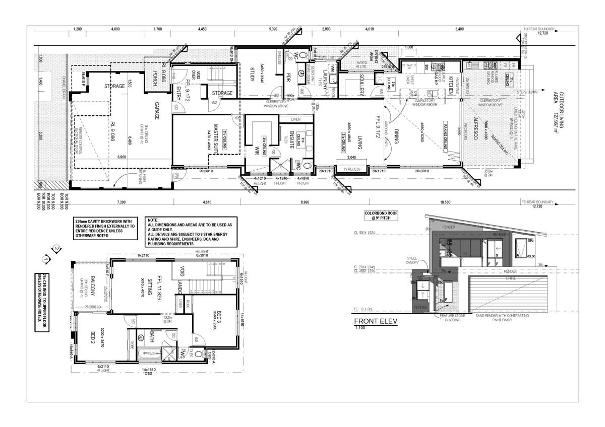
This is the proposed design, prior to their Fix Your Floor Plan service. It’s copyrighted to the building broker.
The Brief
They would like to create a house that:
- looks great and works well
- is compact and functional
- good accessibility for long term use of the home
- provides for an enjoyable home life
- is eco-friendly
- helps them entertain and host visiting family and friends
- is resalable
Their wants for the house are:
- 3 bedrooms, with master suite on the lower floor (so their living is all on one level)
- study downstairs
- double garage
- large alfresco area for entertaining
- large dining area
- great kitchen with butler’s pantry
- separate toilet to family bathroom upstairs
The Budget
Current cost estimates from building broker based on square metre rates for building, and the current size of the home, is around $600,000.
Main Observations about the Proposed Design
The living room is inbound in the floor plan
The location of the living room, away from the external doors, means it is a thoroughfare. In addition, this design locates the internal dining immediately adjacent to the external dining area – so you look across one table to the next. It would be great to locate the living room next to the outdoor entertaining area, so the living room is the destination for internal movement.
The stair arrangement runs out the front door, and calls for a feature staircase ($$)
Currently the stairs are located immediately near the front door. This maintains easy circulation, however they run straight out the front door (which isn’t great Feng Shui). When stairs are the first thing to see, it’s great for guiding the eye upwards (and creating a sense of volume) but it also means the stairs need to be great to look at.
This can drive up the budget as it will need ‘feature stairs’ to work well.
Stairs are also a great device in narrow homes for bringing natural light into the ‘guts’ of the floor plan (the middle behind the garage!) There may also be better opportunities in how they’re located to help make this happen in the home.
The kitchen has the right functions, but they’re disparately arranged
The scullery (or butler’s pantry) is quite detached from the kitchen. I find these areas work best when they feel like a continuation of the kitchen space.
The master bedroom is immediately adjacent to the garage
It can be challenging to arrange a floor plan on a narrow site that puts the master suite on the lower floor.
However, when the master is directly next door to the garage, there’s an association between those areas that impacts how the master bedroom feels.
The master is directly accessed off the hallway, reducing its privacy. In addition, movement occurs through the walkin-robe to access the ensuite, which can pose long term maintenance issues with steam, mould and floor coverings, if these spaces are not properly separated.
The upper floor arrangement has some challenges
Arriving to the upper floor sitting area helps with a sense of spaciousness at the top of the stairs. However, Bed 3 is getting all the best north-eastern sun, and the sitting area has to borrow light from the stair void (or has the southern and western light via windows and doors).
The robe and linen storage is quite tight also.
Some Main Design Aims
When I started preparing the design concept, I had these aims …
- To create spaciousness. Looking down an entry hallway, and seeing a row of doors, creates a cluttered feeling in any home. The design sought to maximise ‘clean’ runs of wall, and give privacy to the spaces along the hallway by visually concealing the entries into rooms.
- To locate the interior living next to the alfresco area, so that the living room becomes more of a destination in the home and helps with indoor / outdoor living.
- To play with the position of the staircase and see if it provided opportunities to better arrange the floor plan overall. Often the stair location can be key in unlocking what’s possible for a floor plan design.
- Size rooms as compactly as possible, whilst dedicating space to where it will be most regularly used by the homeowners.
- Ensure there is great and functional storage on both levels of the home.
The alternative design options
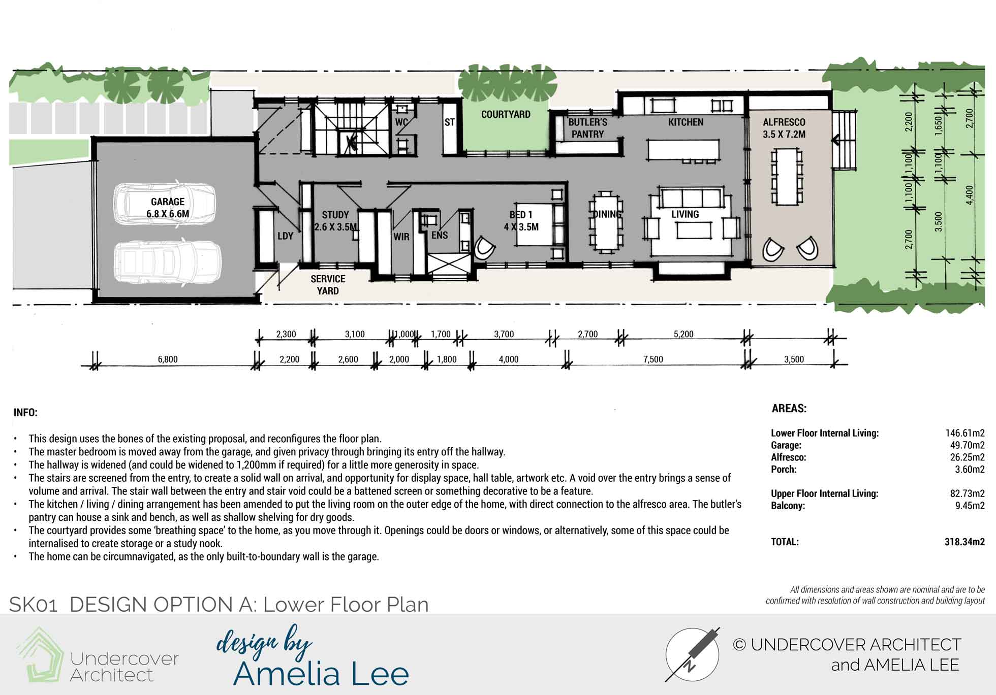

I prepared three alternative design options, with Options B1 and B2 sharing the same upper floor plan. Option A kept the stair in its current location, and rearranged the rest of the floor plan. Option B1 and B2 explored an alternative staircase location.
Option A Lower Floor uses the existing proposal and reconfigures it to move the master bedroom away from the garage. The hallway is widened and stairs are screened from the entry (so as to not need to be a feature). The courtyard provides some breathing space in the movement through the home, and extra light in the floor plan.
I provide a semi-transparent overlay so you can compare the two floor plans. Here you can see where elements and walls line up and don’t.
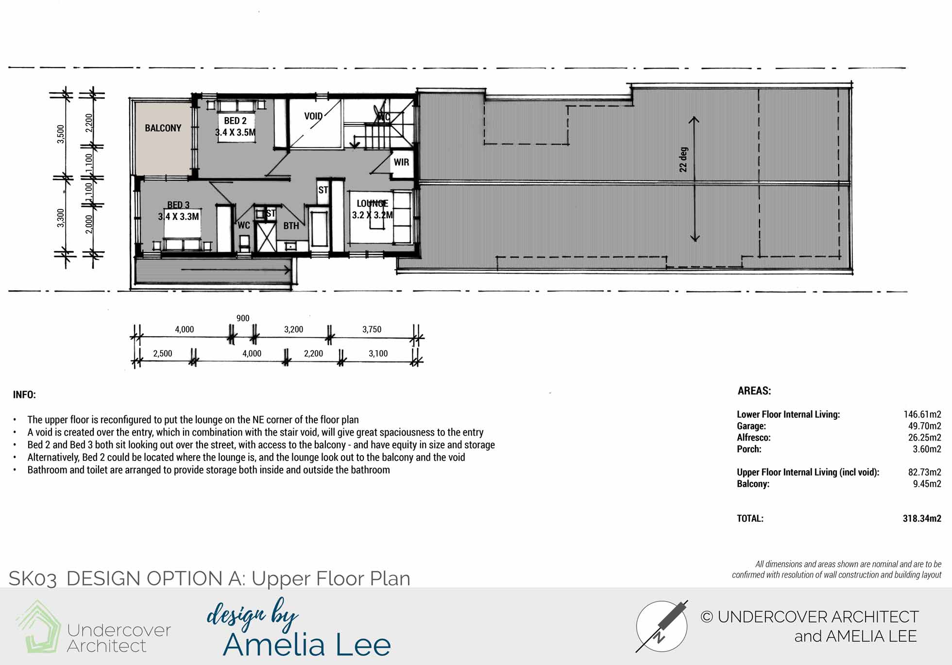
Option A Upper Floor locates the lounge on the north-east corner of the floor plan. A void is created over the entry. The lounge can have doors on it to close off to a 4th bedroom if required.
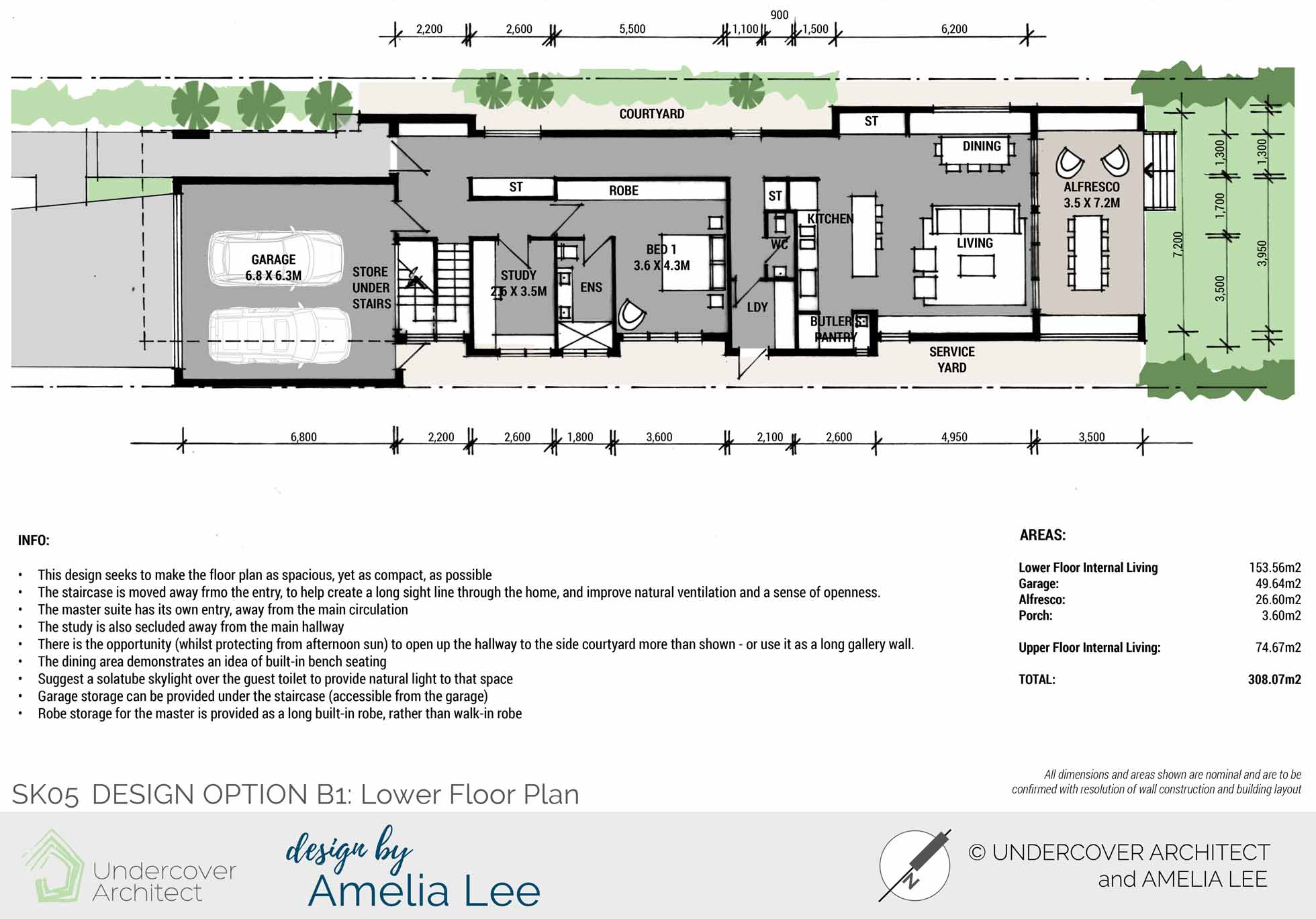
Option B1 Lower Floor Plan relocates the stair away from the entry. This provides a long sight line through the home, and improves opportunity for natural ventilation and sense of openness. Garage storage can be provided under the stairs. A built-in robe is provided to the master bedroom for a more compact design.
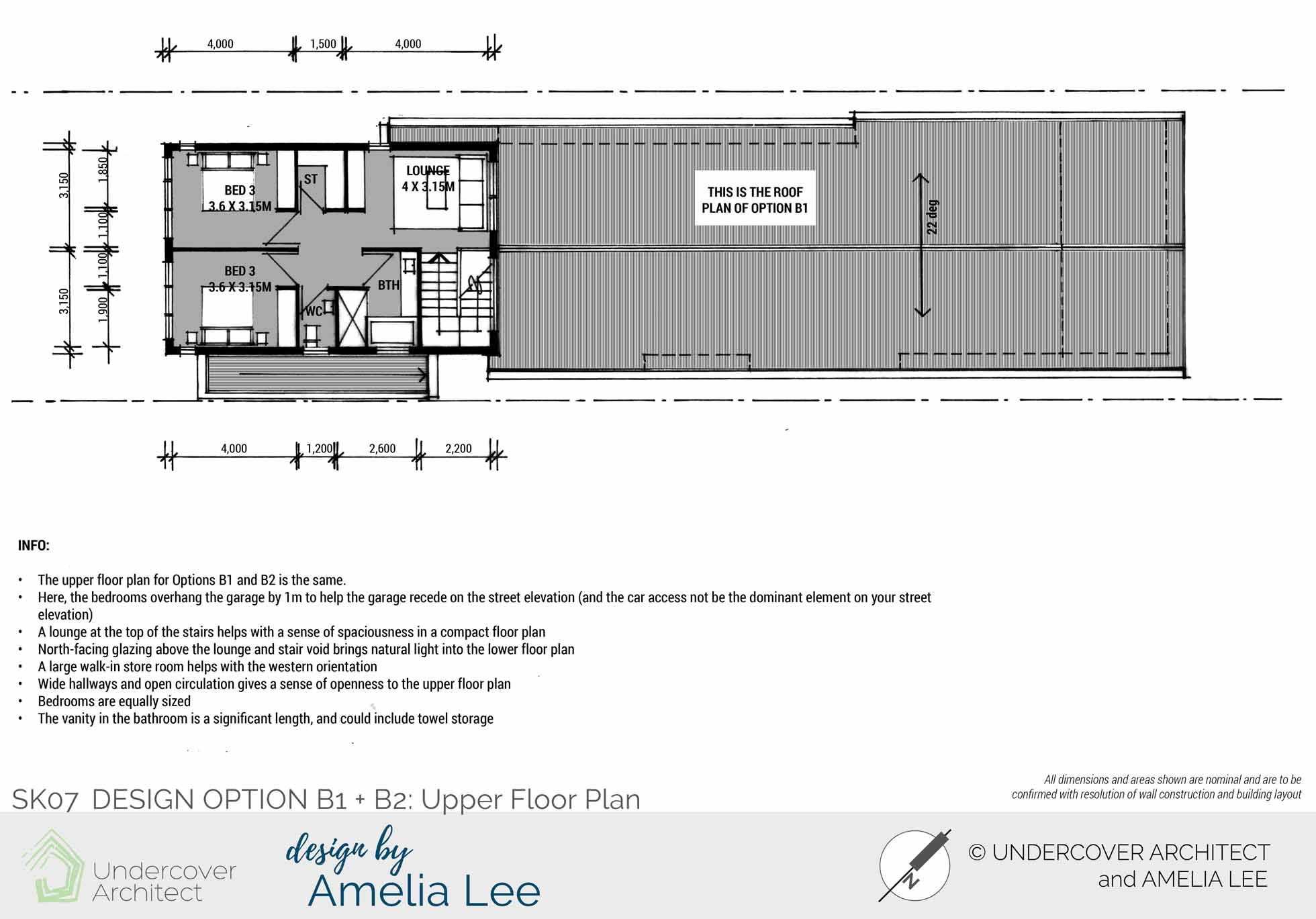
Option B1 + B2 Upper Floor eliminates the verandah, and overhangs the lower floor garage to help the garage recede in the street elevation. A lounge at the top of the stairs helps with a sense of spaciousness. Windows facing north-east bring light into the staircase.
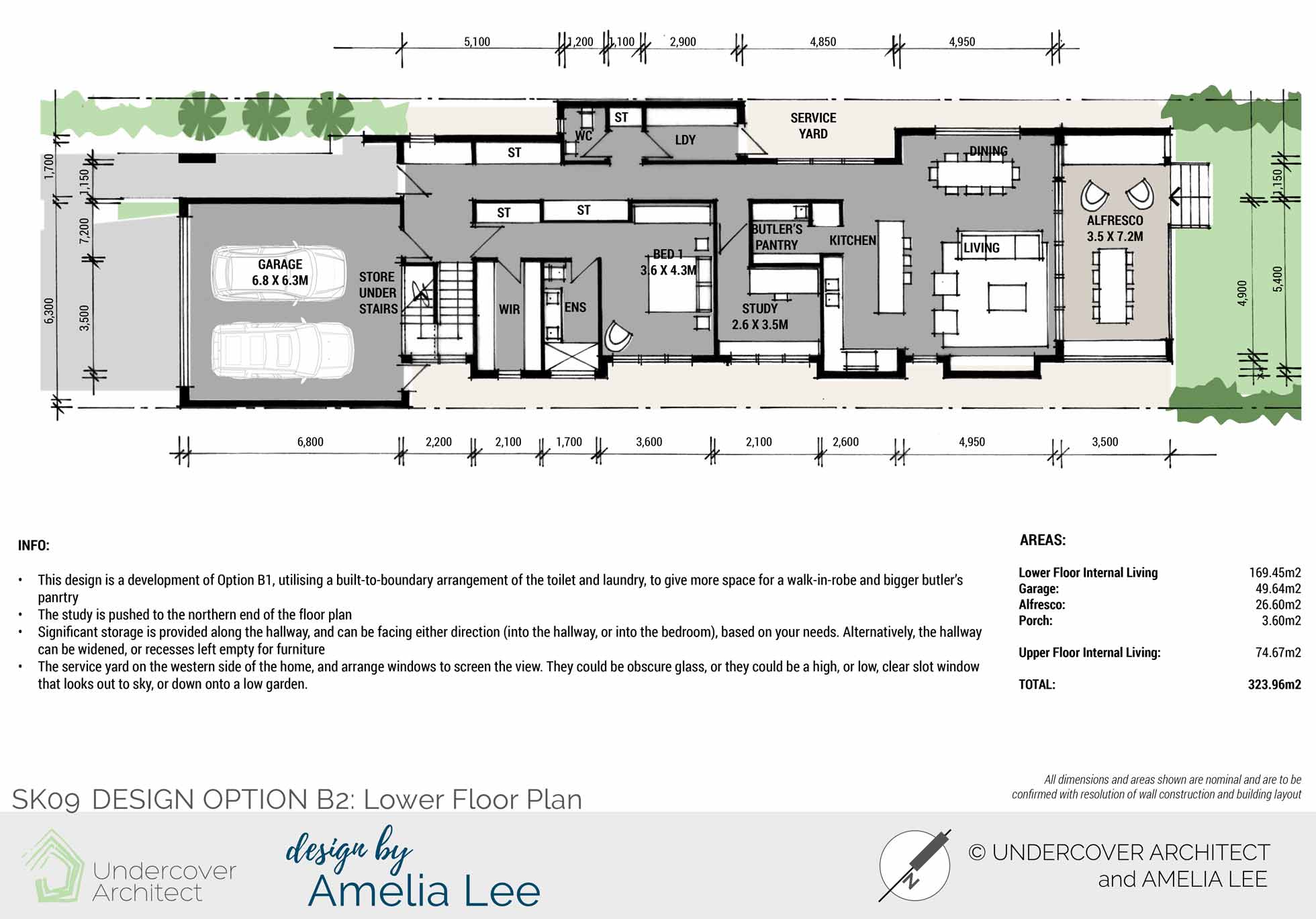
Option B2 Lower Floor Plan develops B1, utilising a built-to-boundary arrangement of the toilet and laundry, to give more space for a walk-in robe and bigger butler’s pantry. The study tucks behind the kitchen with its own entry. This design shares the same upper floor plan version as B1.
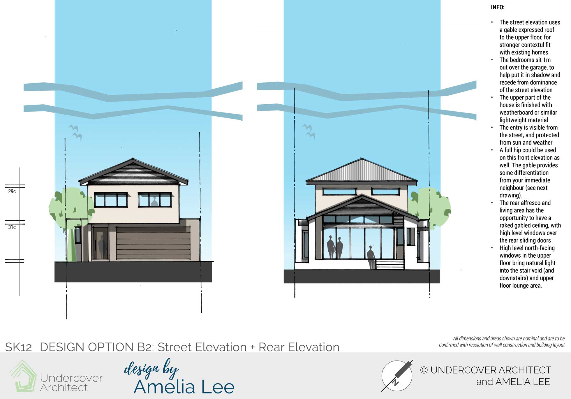
Option B2 Street Elevation and Rear Elevation uses a gable expressed roof to the upper floor, which contextually fits with the other homes in the street. The upper floor sits out over the lower floor by 1m, which helps the garage be less dominant on the street elevation. The elevation is broken up with lightweight cladding to the upper wall area.
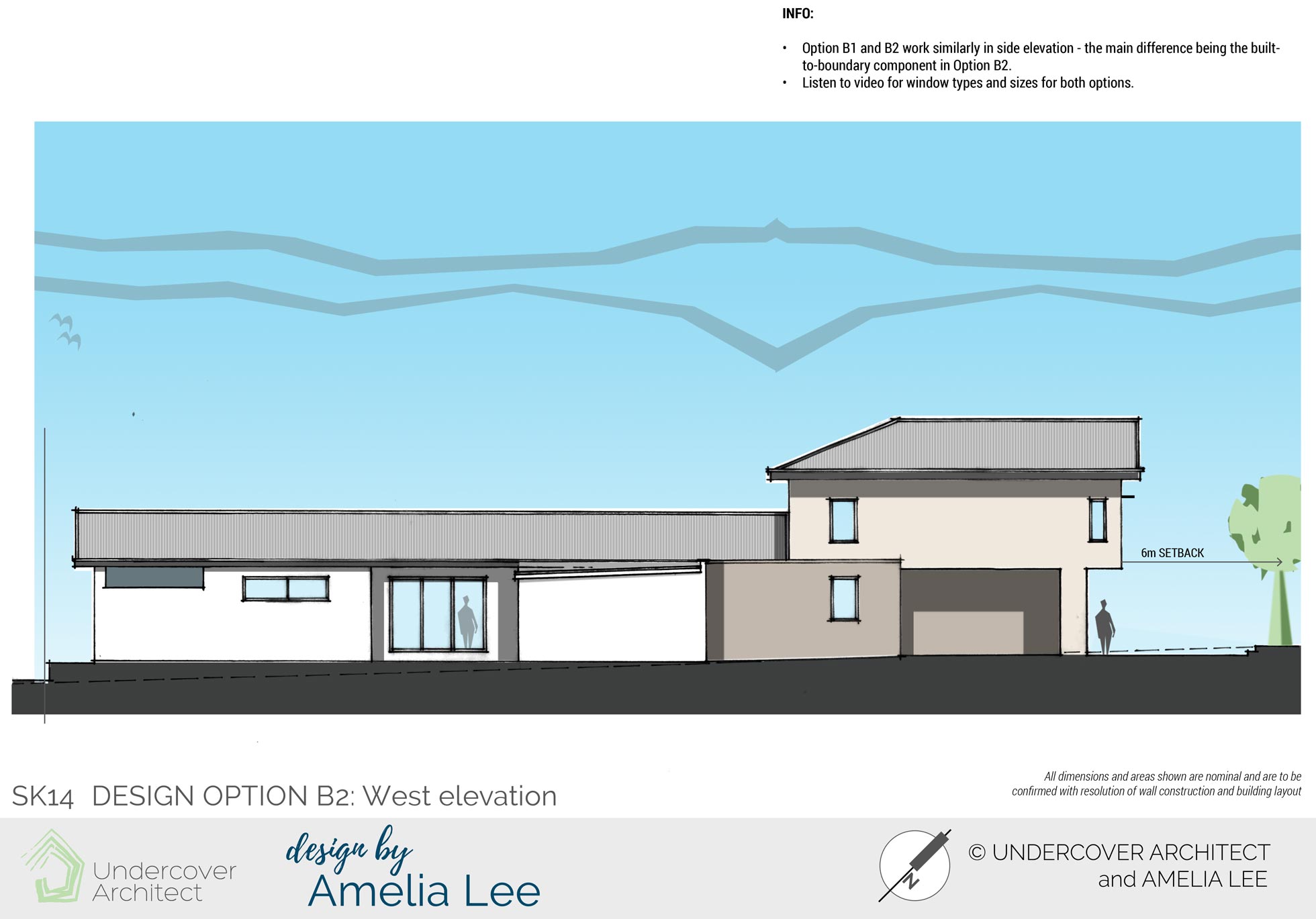
Option B2 West Elevation shows how the entry sits under the upper floor, and the built-to-boundary laundry and toilet (which screens the courtyard space behind it from the street).
The Verdict?
This is what the clients had to say about working with Amelia …
“Amelia had a very special ability to combine practical and innovative approaches to resolving problems and providing insights into various issues that we’d not yet considered. The Skype consultation was comprehensive, and through her targeted questioning and honest professional expertise we were able to clarify both our general and specific requirements.
The resulting service provided three well-designed and comprehensive alternative plans with inspired solutions to all of the issues that we’d not been able to resolve with our building designer. They forced us to critically evaluate what we really wanted, and why.
Amelia’s very practical approach, mixed with a dash of genius and seasoned liberally with inspiration really worked for us.
The video talk-throughs in the service were a very informative, easily comprehended method of stepping through the design and outlining why things were sized or arranged in a particular way.
What was particularly reassuring was Amelia’s attention to detail and her ability to successfully juggle our competing requirements.
We were expecting possibly one of two “why on earth did she do that” moments. But there were none! Zero. We pored over every part of every plan and could appreciate the reasons behind every design decision…. it all made sense. There were logical reasons for each one, and no leftover bits that had been too hard to resolve.
As well as being both an honest and very approachable person, we would highly recommend Amelia’s experience, professionalism and architectural skills in achieving an outcome that exceeds all expectations.”
Due to my commitment to educating homeowners to get it right in their own projects, I no longer provide 1:1 design services. Instead, you can access my expert guidance and support inside my flagship program, HOME Method. Learn what’s included here.
 With over 30 years industry experience, Amelia Lee founded Undercover Architect in 2014 as an award-winning online resource to help and teach you how to get it right when designing, building or renovating your home. You are the key to unlocking what’s possible for your home. Undercover Architect is your secret ally
So…which did they choose !? I like the pop out loo and wir on last plan best.
Hey Nicola
Thanks for your comment!
Their preference was Option B2 as well. They’re project is still being developed, so looking forward to seeing it complete!
– Amelia, UA