UPDATE: Due to her mission to educate ALL homeowners to get it right in their own projects, Amelia no longer provides 1:1 design services. The best way to access Amelia’s expertise, experience, support and guidance (plus get her answers to your regular questions), is via her flagship program: HOME Method. Learn more here.
The homeowners and their land
A couple with 3 kids in their 30s (who are beginning to have kids of their own), this home is an opportunity to create a hub for the whole family. And a beautiful refuge for them as a couple as well.
The land is in Northern NSW, and has stunning hinterland views. There’s an existing house pad leveled by the previous owner. There’s an existing shed on the property as well which sits to the north of the house pad, but at a lower level.
The best views are to the north-west and west of the house pad. The homeowners’ daughter and husband also live on the property in their own dwelling – so you can see it already lends itself to being a great setup for all generations to share their homes.
The house pad sits fairly close to the road, but below it. So there’s the opportunity to almost conceal the home from passer-by traffic and protect the home both visually and acoustically.
The homeowners love the view, elevation and privacy – and in fact, there’s nothing they dislike about the land!
The Brief
There’s a big opportunity to connect with the picturesque quality of the site, and to create great indoor-outdoor connections that help expand the home.
They would like to create a house that is:
- for the two of them, but also a family base for celebrations and visitors
- a functional home with a difference
- where the whole family can feel at home
- is a refuge
- a beautiful space that fits them perfectly
- a haven in the raw, that enjoys the mood of the light
Their wants for the house are:
- 3 beds – 1 master with an ensuite, 1 guest room, and 1 bunkroom (for all the grandkids they plan to have!)
- to get views around the shed located to the northern side of the home’s site
- an open plan living / dining / kitchen
- a butler’s pantry
- floor to ceiling glass to open up to the views
- breezeways to connect the guest bedrooms and spaces to the house
- mud room
- good storage
- study / sewing room
The Budget
Their budget is $250,000 – $300,000. They have the capacity to do some (or a lot based on time availability!) of the work themselves, and also source materials at more economical rates due to connections from a previous business.
Main Observations about the Brief
There’s a desire to celebrate the rural location of this home, and create what I began to think of as “an elegant shed”.
Something with a rustic quality that could handle robust family gatherings and a grand-kid or several bouncing about. But could also have a refinement about it, with beautiful natural interiors that give warmth and texture. And no plasterboard! It’s a messy trade, and the clients and I thought it would be interesting to explore alternatives for interior linings.
These were my main observations about the clients’ brief.
Making the most of the northern orientation
This site is near where I live, so I visited site on my own a few weeks ago and spent some time there in the afternoon wandering around.
The main view, and most spectacular (and relaxing) view is (in my opinion) is the one ranging from north-west and west. Looking in this direction, you’re looking past the sheds out to expansive views of undulating landscape and farmland.
There are also some other lovely views to the north over the shed rooftops.
The position of the sheds sits them below the house pad. Within the home, they will get a view over them, however I was also keen to see how the design could capture that uninterrupted / unobstructed view to the north-west / west.
Flexible pavilion pods are the key
This budget / brief balance also impacts the overall design of the home. A traditional pavilion will be one or two rooms wide, and long and thin in design. It assists in creating fantastic cross-ventilation opportunities, and orders the floor plan easily into zones you move through.
The design direction they initially showed me was one of pods, connected by breezeways. This initial idea has been the driving force behind the design.
There are 3 pods – a master bedroom / study pod, a living / dining kitchen / service pod, and a guest pod. They are arranged and connected across the site by breezeways, which may or may not be enclosed based on their desire. They can be spread further apart than shown, and pivoted as desired. It’s even possible to flip the two sleeping pods 90 degrees. The aim is to give them flexibility in how they arrange them on the site – and construct them also.
These pods are connected under one roof form to help the home have mass and presence on the site, and for the roof to appear as another landscape from the road.
A western / north-western aspect can be a challenging aspect to deal with, as hot afternoon sun can wreak havoc with the desire to capture that view. So the design also seeks to capture sunlight from other orientations – especially north. It also creates deep reveals and overhangs to shade the interiors from the afternoon sun.
The home as a sentinel
I was keen to explore this idea of the home hiding its interior … until anyone walks into it. The home will be bunkered into the landscape on its eastern side, which will buffer it from the road visually and acoustically. However, I wanted to see how a design could open to the northern aspect, whilst shielding itself from passerby traffic and visitors arriving. When I visited the site for the first time, and when I was back there on my own, I wanted to see how the design could frame that view, and almost protect it from being discovered until you’re brought into the home. By doing that, it presents itself to the viewer each time, and reminds them how special it is.
So, the design seeks to create a sense of shielding along its long road boundary. It will be possible to look right over the rooftop, but that unobstructed view that’s so special now needs to be saved for you as the homeowners. So, as the home invites you and your visitors in, it reveals the magic of the unobstructed view through the interior.
I also wanted to explore this idea of sentinel … that the home could project out into the landscape to frame and claim the view. The living pod does this by setting itself off the edge of the topography, so the deck feels that it pushes out into the view (yet the home is still connected to the ground for constructability and ease of inside/outside movement for little ones).
Some Main Design Aims
When I started preparing the design concept, I had these aims …
- To maximise the functionality and flexibility of the floor plan design – in a compact size
- Optimise your views and outlook – so they will derive true enjoyment and value from being in their home.
- Find ways to bring northern light into your floor plan, as well as making the most of the western outlook and views.
- Explore what was possible with conventional residential building methodology and materials to add some specialness to the home – and avoid plasterboard and tiling!!
- Seek ways to create spaces that will be wow, special and dramatic, whilst super functional and simple in their design
- Make it great when occupied by 1 or 2 of you, through to large groups of family and friends.
- Find sensible locations for all the service paraphanalia that happens on rural lots – as well as the movement of people in and out of the home (with boots and gear etc).
The Design Options
I created two design options for this home, as well as a series of elevations to demonstrate the design ideas.
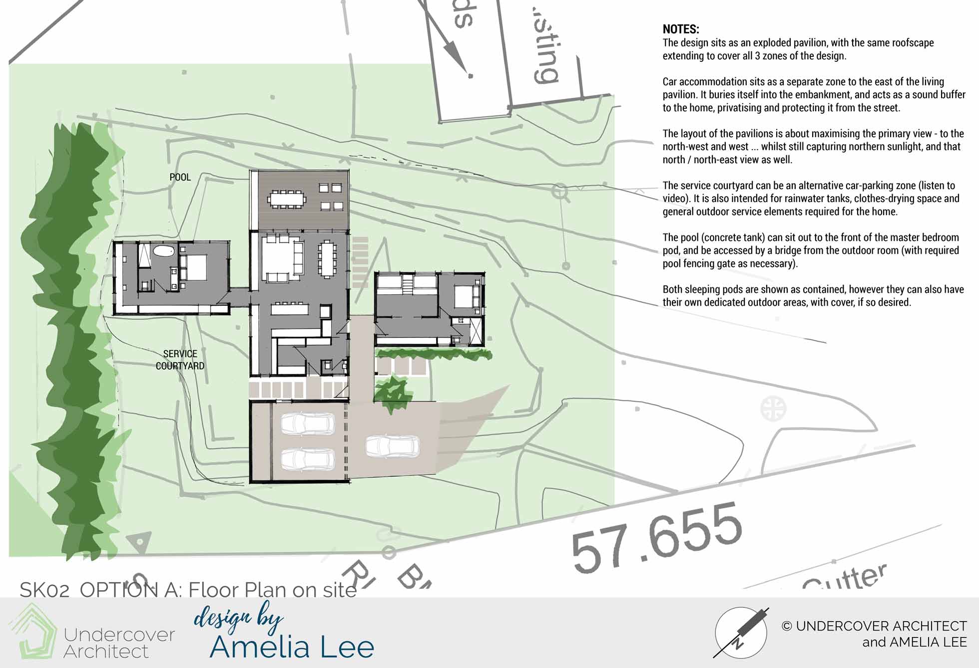
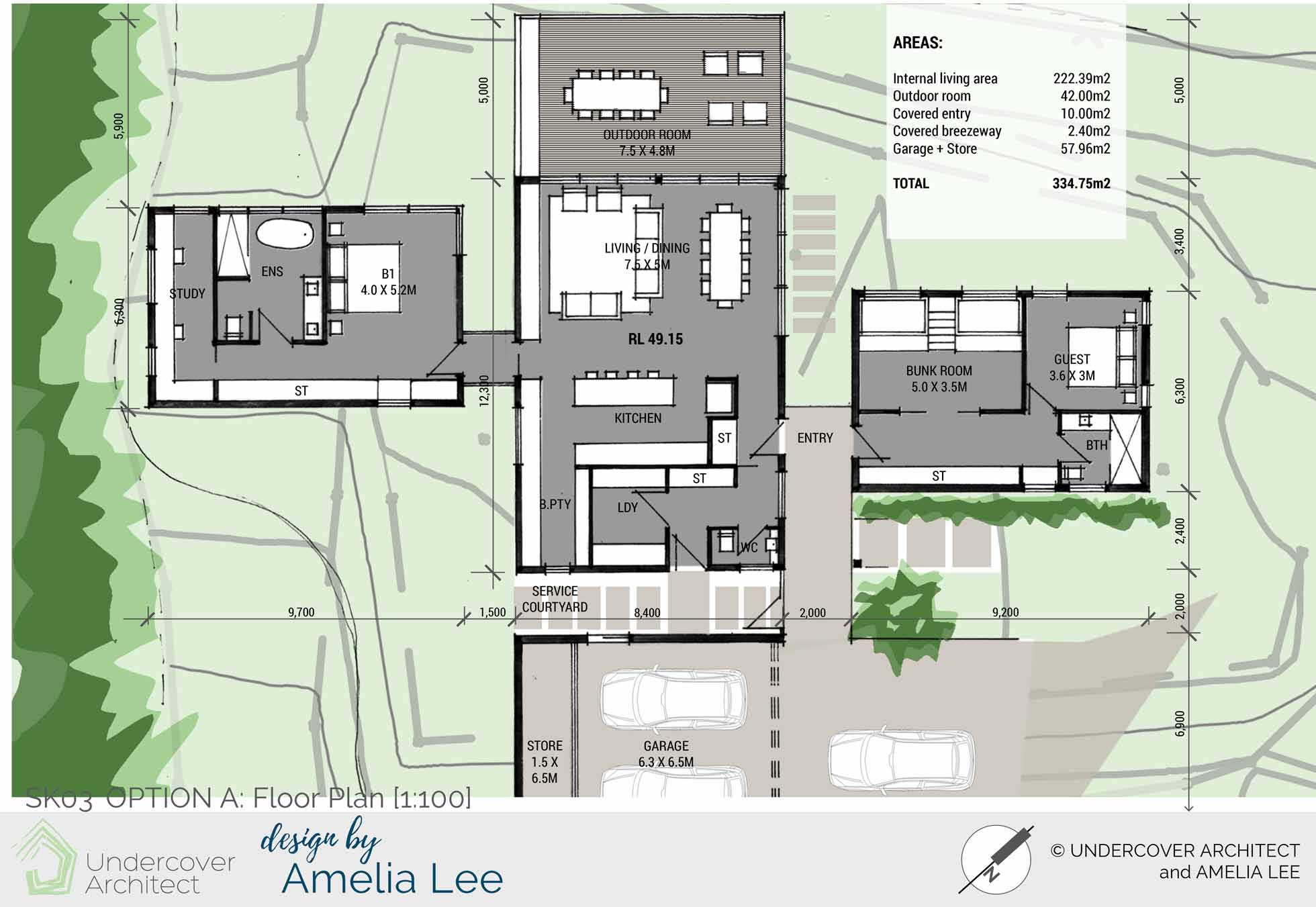
Option A is about maximizing the primary view to the north-west and west … whilst still capturing northern sunlight, and the north / north-east view as well.
The carport / garage buffers the home from the street and brings the home forward to its outlook.
Sleeping pods are separate pavilions but connected under the same roof.
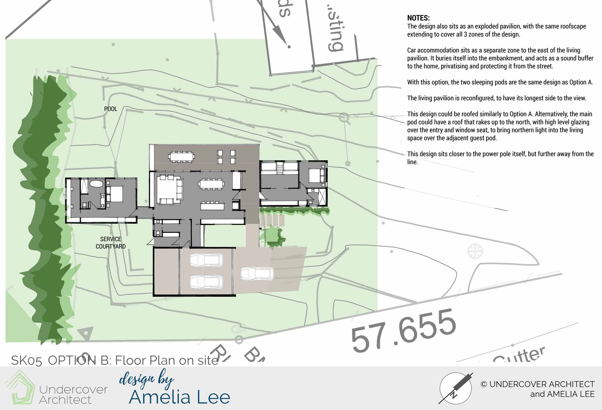
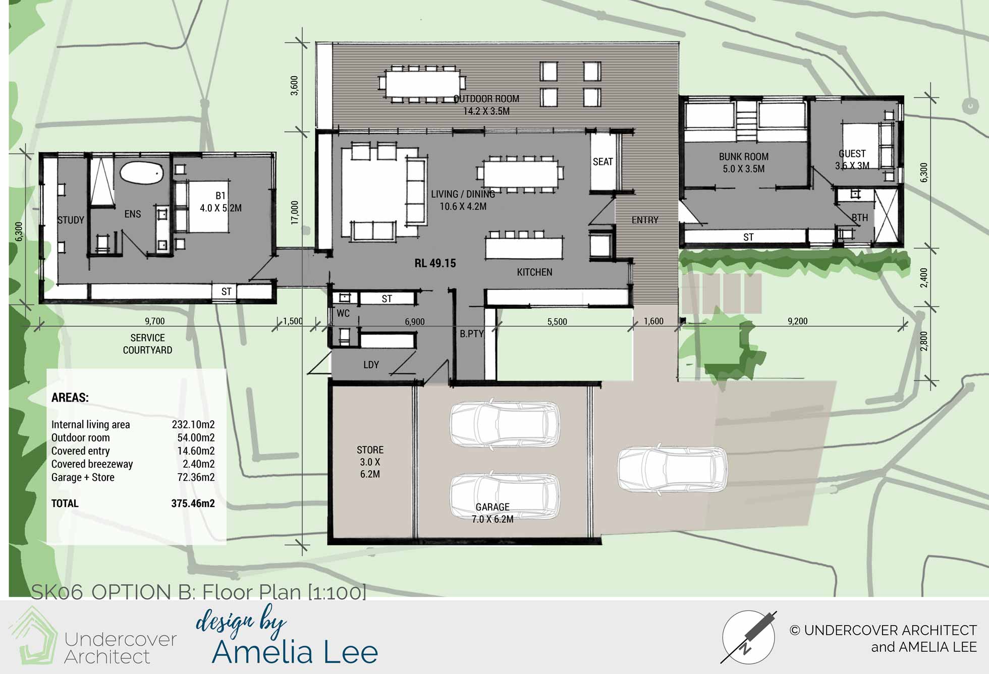
Option B widens the frontage to the view and aspect. It requires more sun protection as a result, however it also opens more of the home up to the view. The sleeping pavilions are similarly planned to Option A. In both Option A and Option B, internal and external areas can accommodate large dining areas for entertaining bigger groups.
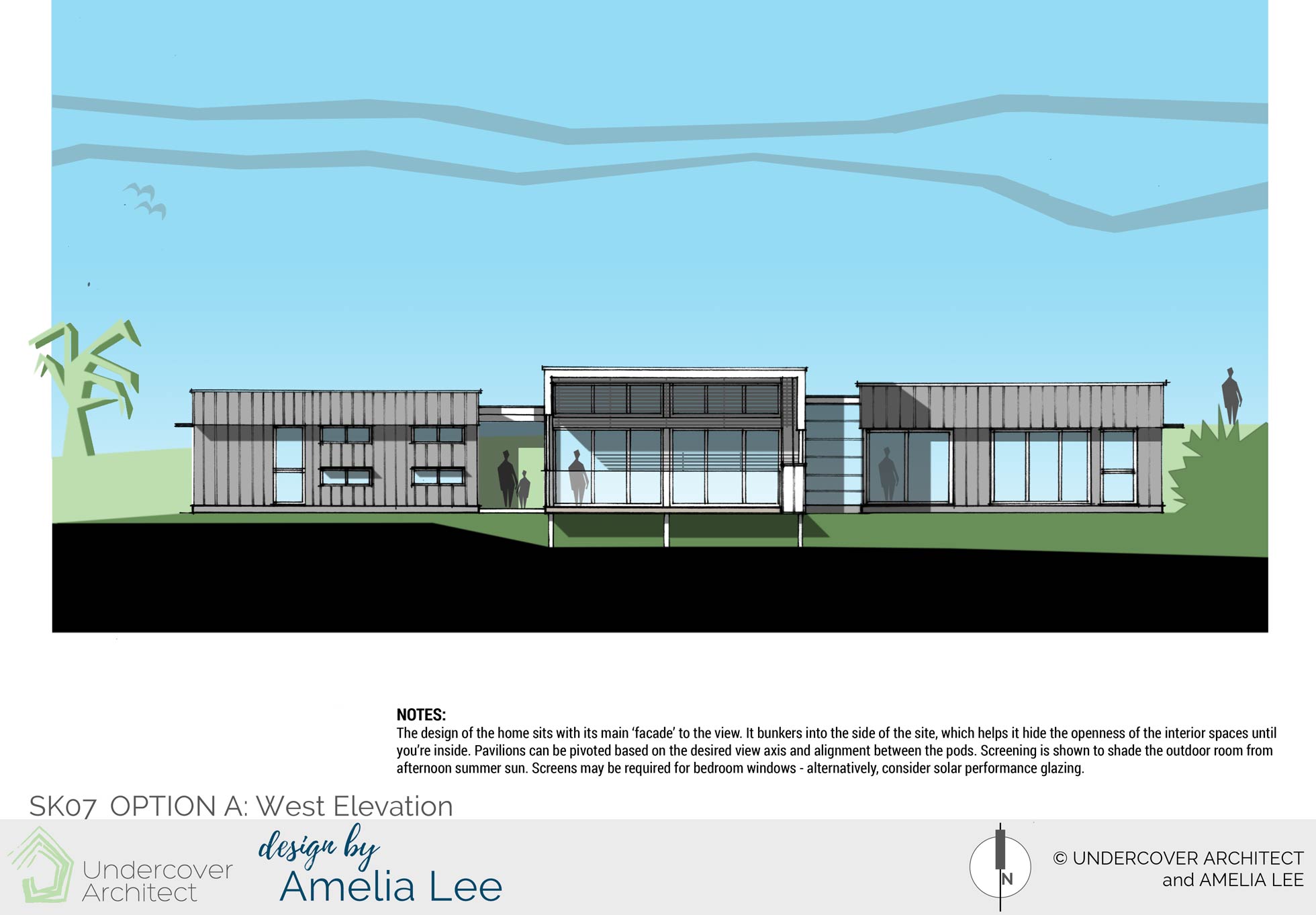
Option A: West Elevation shows how the sleeping pods sit as more contained spaces, whilst the living pod opens up to the view. External screening is shown to shade the outdoor room and living spaces from the afternoon sun. Walls wrap down over the deck area to also help with shade and weather protection, and to help with containment of the open volume of the deck space.
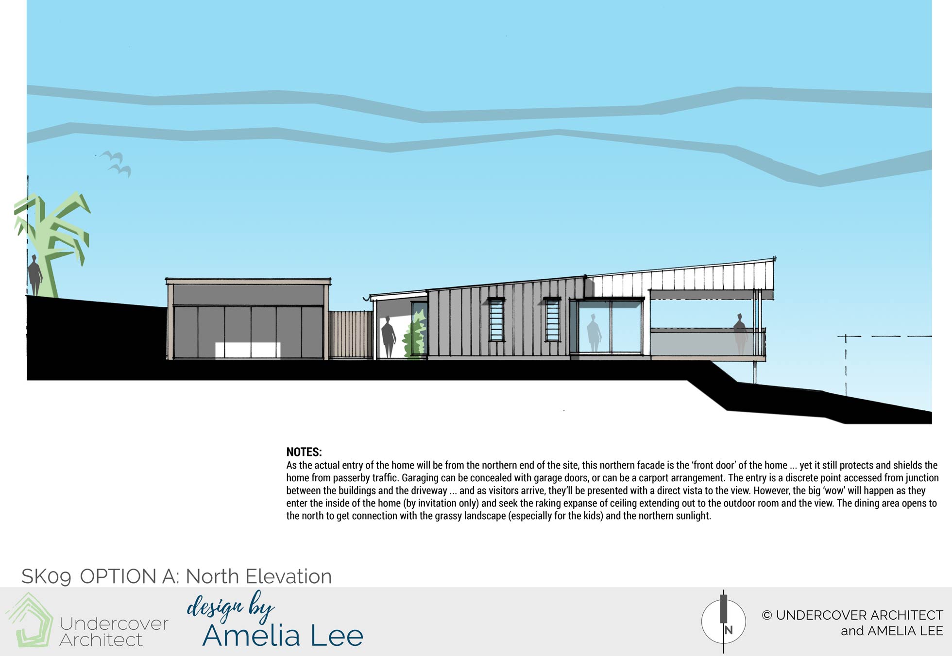
Option A: North Elevation shows the view of the home on approach into the site. The entry is visible between the car accommodation and the main part of the building. The living pavilion projects off the site into the view…
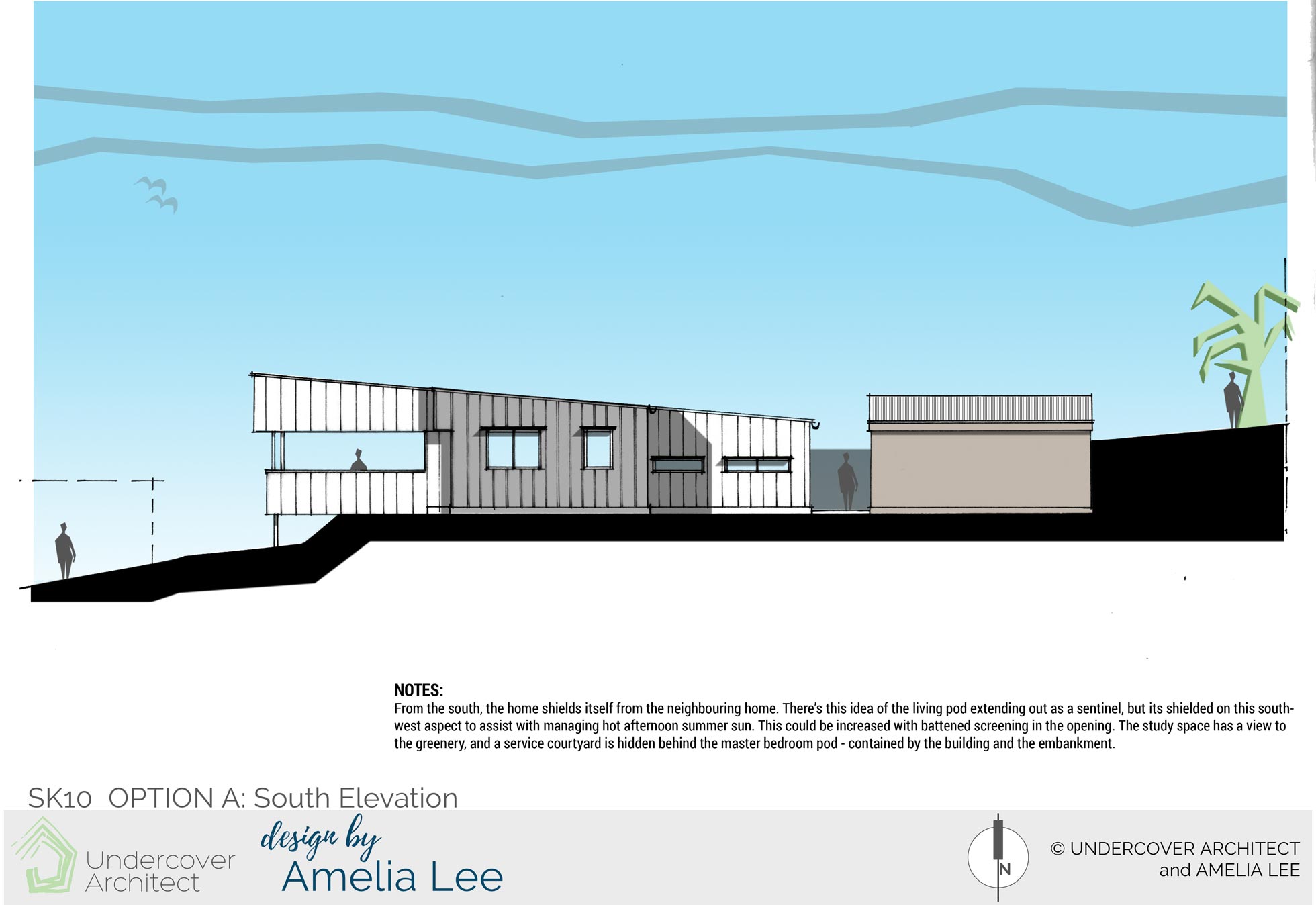
Option A: South Elevation shows the design of the outdoor room to help shade those external and internal living spaces from the afternoon sun. There is greenery along the southern boundary, and so outlook from the master bedroom pod captures this.
The Verdict?
Almost at the same time that I issued the New Home Design Report to these lovely homeowners, a friend of theirs sent a photo of a home that was for sale near her (but far away from this location!)
This friend prefaced it by saying “this isn’t a home I think you’d ordinarily like, but I think it would really suit you”. The homeowners loved the photos, and agreed. And then they received my Design Report … with (coincidentally) a similarly designed home! A series of pods, sitting on the landscape, and projecting out to claim and shape the view and light. Needless to say, they were a little spun out that their architect and friend had simultaneously chosen / created similar houses that, they realised, suited them so well!
They loved the designs, and are currently finalising some other projects before moving onto this one.
Due to my commitment to educating homeowners to get it right in their own projects, I no longer provide 1:1 design services. Instead, you can access my expert guidance and support inside my flagship program, HOME Method. Learn what’s included here.
 With over 30 years industry experience, Amelia Lee founded Undercover Architect in 2014 as an award-winning online resource to help and teach you how to get it right when designing, building or renovating your home. You are the key to unlocking what’s possible for your home. Undercover Architect is your secret ally
Love the idea of the pods, and your attention to detail in maximising that view. I also like the idea of no plasterboard – did you get to explore that in the end and is there an existing or upcoming blog with your ideas?
Thanks for sharing your considerable talents Amelia.
Can’t believe how close this brief is to what my husband and I are trying to achieve at our rural residence. Only difference being ours was built in the 80’s, renovated in the 90’s and is on a huge scale. I’m looking forward to letting in the Northern light, warming it up in Winter and cooling it down in Summer. Those beautiful Westerly views are a pain but worth it.
Hi Nicole,
Yes, there’s definitely work to be done when your main view is to the West – but oh so great for those sunsets if you can design a home that is still comfortable thermally!
– Amelia, UA x