A new pavilion home for this family of 5 has the potential to transform their lifestyles. With a stunning location, and a home that currently does not work for them, building a custom home presents an amazing opportunity.
Often when Amelia first speaks with homeowners, she gets an insight into just how transformative their future home will be for them. It’s clear that their existing home is doing very little to help them live well. It feels like being on the cusp of this extraordinary adventure where she can see how powerful a new home will be in changing their lives. Working with these clients definitely felt like this.
UPDATE: Due to her mission to educate ALL homeowners to get it right in their own projects, Amelia no longer provides 1:1 design services. The best way to access Amelia’s expertise, experience, support and guidance (plus get her answers to your regular questions), is via her flagship program: HOME Method. Learn more here.
In this Spotlight, Amelia worked with these homeowners to improve their existing design, plus show a couple of quite different options to explore as alternatives.
The homeowners and their land
This fantastic family have lived in their existing 1950s home for 10 years, and for some time they considered a renovation and extension. However, it became clear that wouldn’t be the best choice for them.
Their block is around 50 acres, and located in regional NSW. They love the location and the views – and the views are stunning, uninterrupted regional views.
They’re a busy family, with working parents and three active kids who love sport. They love being at home together to chill out, and yet so much about their existing house prevents this from being comfortable. Brendan has to take lots of phonecalls for work, and audio privacy is difficult (so kids are then being told to be quiet). And they have sentimental belongings that don’t have the space to be properly honoured in their current home.
They’ve created a design themselves, and had a family member convert it into drafted plans. They love the idea of a series of connected pavilions, separating the different functions and spaces of the home. And they want to do something different to the standard spec home you’d choose from a catalogue.
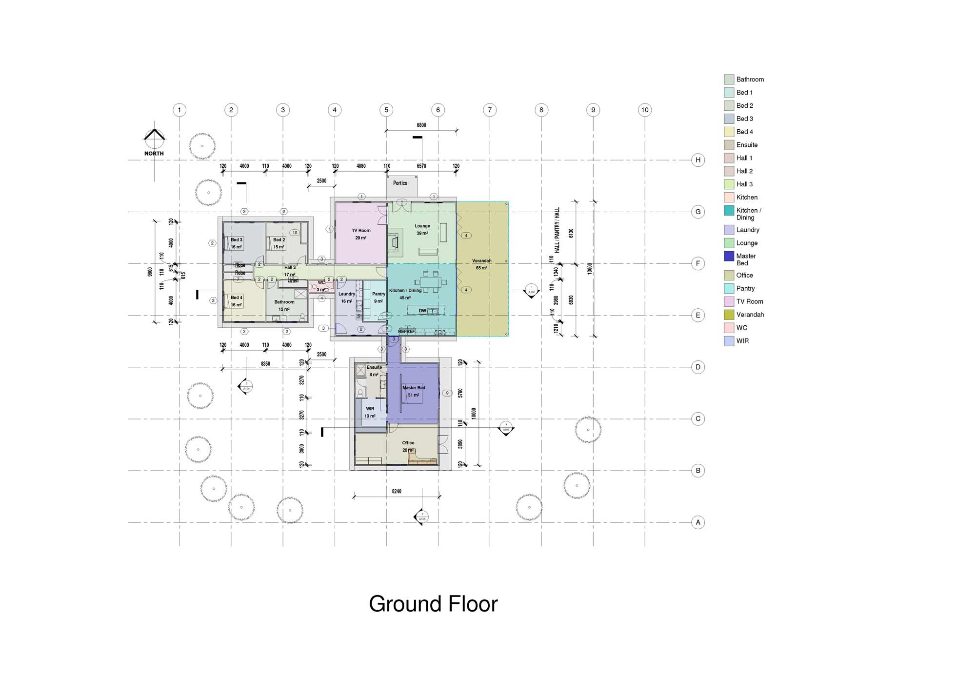
This is the home design they’ve created, which creates 3 pavilions connected by enclosed walkways. A living pavilion, a kids’ pavilion and a parents’ pavilion (with a home office).
The Brief
They would like to create a house that:
- has a great flow
- is really functional
- brings some industrial feel to the main living area (think exposed trusses, rustic material choices)
- feels organised
- gives space to spread out, and for Brendan to be able to work peacefully
- is where their family wants to be
Their wants for the house are:
- large open plan kitchen / living / family are opening onto a large deck and making the most of the easterly views
- two separate sleeping zones – one for kids, and one for Brendan and Kara with their bedroom and the office
- home office to provide space to get away, get work done, and be a retreat for Brendan
- large internal dining area
- 4 bedrooms in total (including the master)
- great outdoor kitchen and deck area
- access into the home from the car
- good laundry area
The Budget
$300,000 – $350,000 to $400,000
The challenge with pavilion style homes is that they have a high floor to wall ratio. This can increase the cost of construction. In addition, the home is quite large, and these clients are seeking some features like clerestory windows, high ceilings and large areas of glazing. So I suggested that this budget may not be sufficient. They’re willing to review their budget for the right design outcome.
Main Observations about the Proposed Design
The circulation through the home compromises the functionality of spaces
Clear circulation paths through homes assists in helping spaces be functional and homes feel spacious. When circulation occurs through areas or via busy zones in the home, it can compromise this.
Currently access to the master bed wing is via the kitchen. Access to the office is via the master bedroom. Access into the rear of the home is via the laundry. Visitor access into the home diagonally crosses the lounge room.
All these types of movement will have an impact on the furnishability and functionality of those rooms. They also will change how those rooms feel – and how the family feels in them. This can be improved with clear circulation paths that direct movement through the home, without compromising the spaces around it.
The opportunity is there to zone your family home rather than creating separate pods
The clients’ preferred aesthetic is to create a main pavilion, with satellite pods (smaller buildings) off it. My main concern with this strategy is that there will be distinct separation between the zones of the home.
Whilst it helps to separate areas for sleeping / living / parents / kids, etc … a family home, I believe, still needs to feel like one entity or overall space to create connection between family members. The alternative design approaches I take seek to bring these zones together a little more. There is still the option to push them away more strongly from each other if they so choose.
The kids’ wing gets no access to the view
With the space available, and the view they have access to, it would be great for all the main sleeping and living spaces of the home to benefit from view and natural light. Currently, two of the kids’ bedrooms have long walls facing west, which will need to be managed to help them be thermally comfortable rooms at bedtime.
Living spaces adjacent to each other can be challenging to use at the same time
Many family homes now use 2 living spaces to manage the competing demands of how kids and parents like to spend their TV viewing time! Or to provide space to entertain different age groups, or use rooms seasonally.
When these spaces work, however, is when they have distinct uses. When they’re located in the floor plan to be separately identified, and to function as separate spaces. They also require a measure of surveillance and interactivity so they can feel part of the one family home.
It’s a tricky balance, however, locating them next door to each other may compromise the functionality of both of them, as well as the important role they can play in your home.
Making the most of the northern orientation
With the view to the east, it’s a lovely opportunity to open up the home to beautiful morning sun as this family watches each day begin (on full display!)
Eastern sun is low and horizontal. For the home to be enjoyable year-round, throughout the day, it’s important that we help it shield from high-glare morning summer sun. We also want to give access to northern sunlight year-round – managing the heat in Summer, and letting it in, in Winter. And then shielding the home from afternoon western sun as required.
The planning of the home has taken this into consideration, as well as the design of the roof and volumes.
Some Main Design Aims
When I started preparing the design concept, I had these aims …
- Ultimately functionality is a priority. Regional homes have slightly different demands to urban / suburban ones. They have the benefit of open views and less constraints, but it’s important that the home stays functional … rather than expanding for its own sake.
- This functionality means great natural light, and the ability for spaces to connect the family and provide them with the opportunity to retreat as well. It also means creating spaces that support them in their daily (super busy) lifestyle.
- Working from home requires specific solutions so it doesn’t challenge the family’s enjoyment of the home – yet still enables focussed and productive work space that feels connected to the family when desired.
- And this home has the potential to create a relaxing sanctuary for this family. The location is beautiful, and it’s important this home makes the most of the views, and connection with the landscape around.
- Car accommodation also requires consideration. In regional locations, where there’s often sheds for storage, a carport can be a great inclusion to provide some extra undercover play space, and give parking close to the home – without dominating the home and site with more enclosed car accommodation.
- Homes in these types of locations don’t always require a ‘front door’ as well, and entry to the home can be designed differently.
The alternative design options
I prepared one design that was a reworked version of the existing design, and then I also prepared two alternative options. And then these options had some elevation variations. Click to enlarge the floor plans.
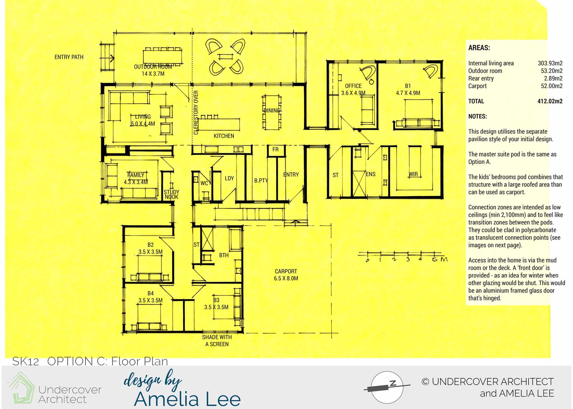
Option C Floor Plan shows an amended version of the existing floor plan. The separate pavilion style is used here, and the kids’ bedroom pod incorporates a covered carport area to the south. Access into the home is via a mudroom. A ‘front door’ is provided to the deck – as an idea for winter when the other glazing may be shut. The office is located with the master bedroom, but is separately entered to give some differentiation from the sleeping area.
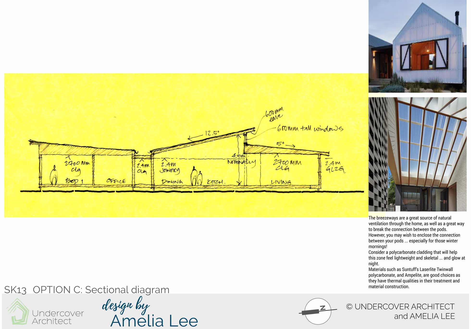
Option C Sectional Diagram shows how ceiling heights can work to create a some north-facing clerestory glazing, and how connection zones can be clad as lightweight elements.
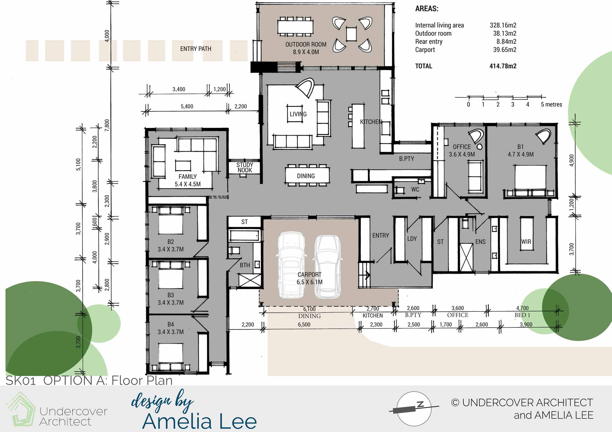
Option A Floor Plan uses zoning instead of complete separation to create differentiation between the areas of the floor plan. The living / kitchen / dining area sits to the east, with a double-sided fireplace for the living area and deck. Entry to the home from the carport is via the laundry or entry zone. Visitor entry is off the deck. All rooms get access to the view, and the two living areas are separated but both able to access northern light.
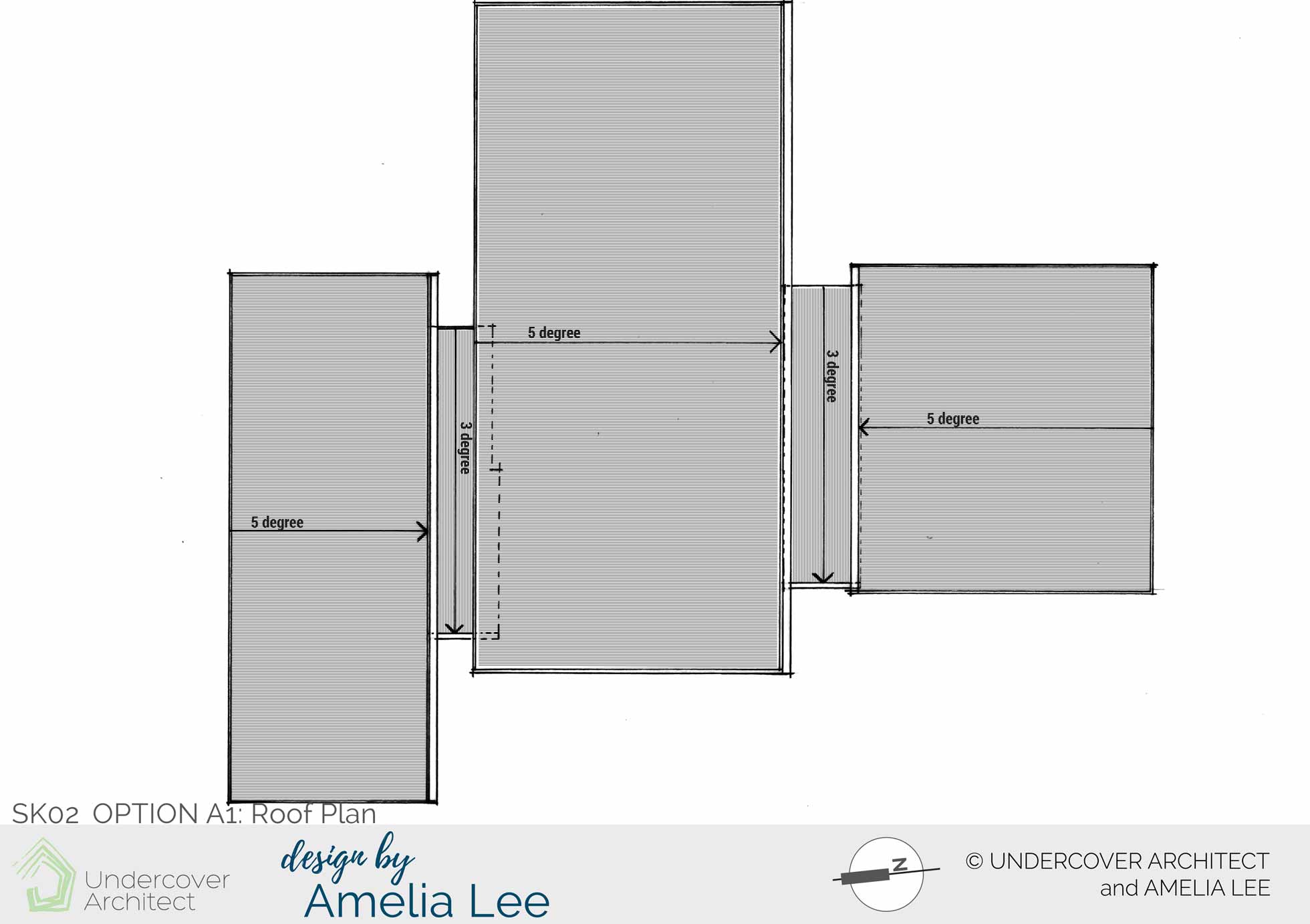
Option A1 East Elevation still expresses the zones of the home as a collection of pods. Connections have lower ceiling heights to help with the feeling of threshold between the zones.
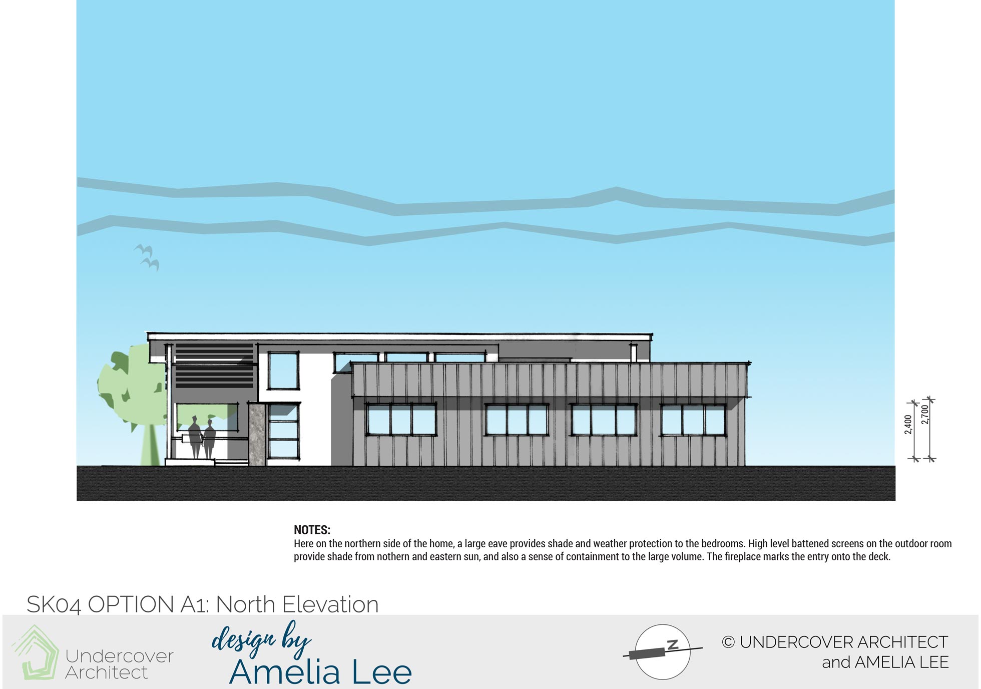
Option A1 North Elevation shows how the building form can be used to create weather and shade protection over window openings. Materials are used to differentiate the pods, and high level northern glazing brings natural light into all of the floor plan.
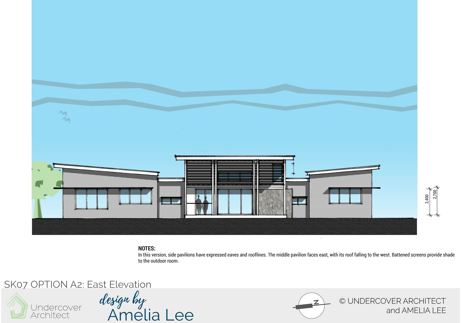
Option A2 East Elevation shows an alternative elevation design. The main pavilion rakes its roof to the east. Side pavilions (or pods) have expressed eaves and rooflines, with hoods over the window openings.
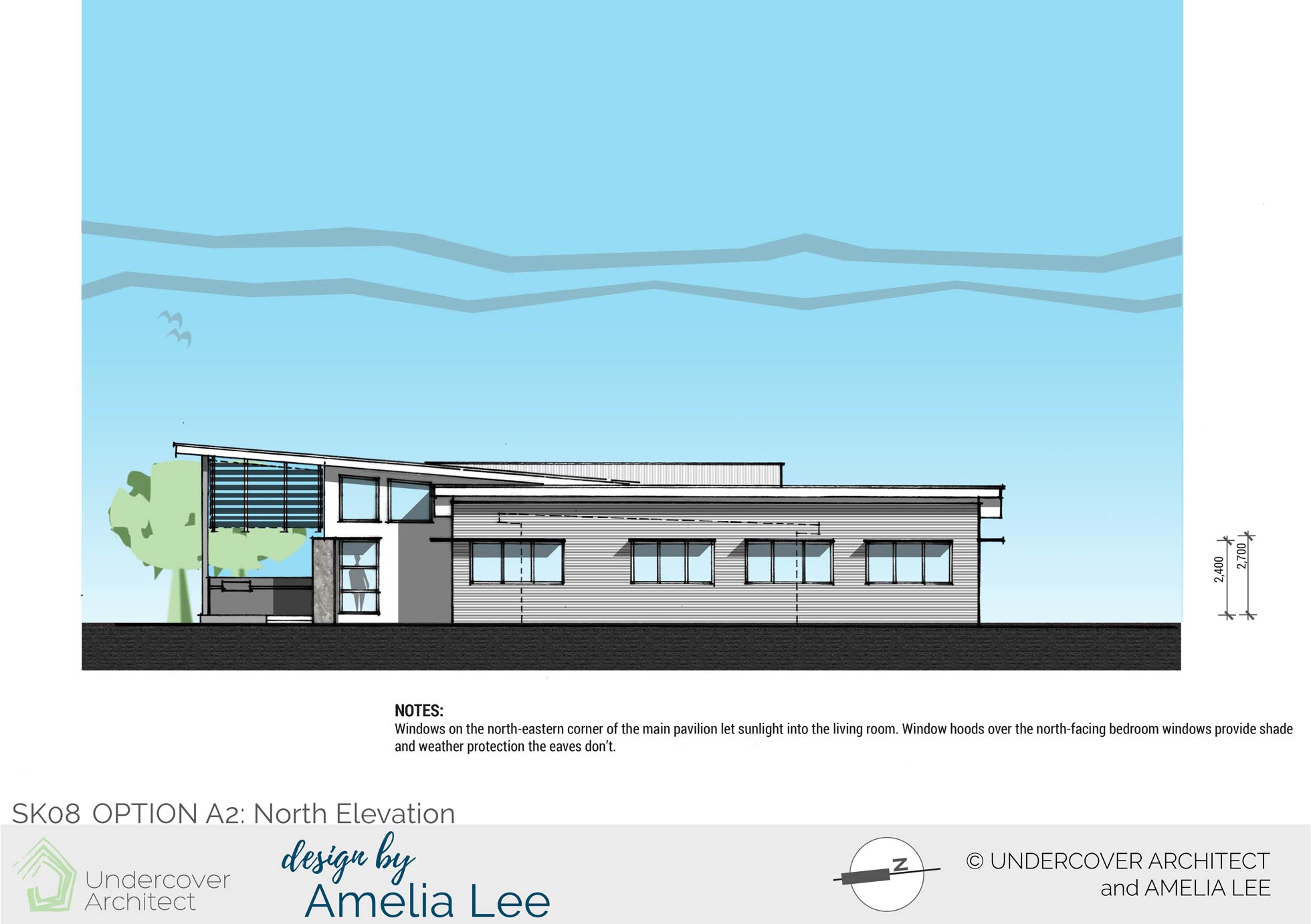
Option A2 North Elevation shows windows on the north-eastern corner of the living area bringing sunlight into the living room.
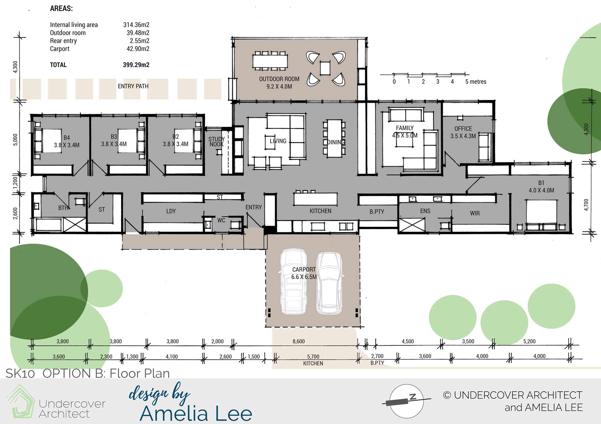
Option B Floor Plan arranges the layout along the north-south axis. This is to enable all living and sleeping areas to face out to the eastern view.
The carport sits on the western side, and enables entry into the home via the laundry or a dedicated entry zone.
All ‘wet’ services (bathrooms, kitchen and laundry) are arranged along the western edge for solar protection and plumbing efficiency.
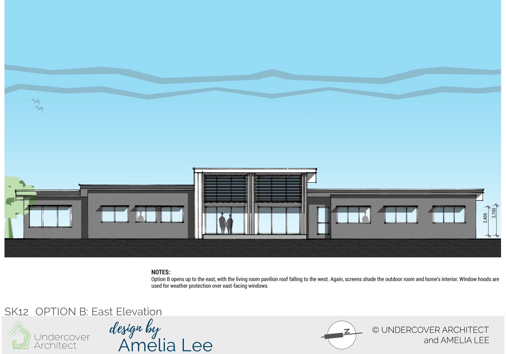
Option B East Elevation shows the home opening up to the east. Screens shade from horizontal rising sun, and hoods protect from overhead sun. Hierarchy is given to the living zone with a higher roof form.
The Verdict?
Initially when Amelia sent the designs through, it was with a little nervousness. Options A and B were a big departure from their existing proposal. And when you’ve been working on an existing design for sometime, it can be confronting to see something that’s very different.
However, as these clients said, “the reason we went to you is we needed help and you have delivered”
Their preference was for Option A, and they’re currently working with a local draftsperson to move their project forward. Looking forward to a progress update!
Due to my commitment to educating homeowners to get it right in their own projects, I no longer provide 1:1 design services. Instead, you can access my expert guidance and support inside my flagship program, HOME Method. Learn what’s included here.
 With over 30 years industry experience, Amelia Lee founded Undercover Architect in 2014 as an award-winning online resource to help and teach you how to get it right when designing, building or renovating your home. You are the key to unlocking what’s possible for your home. Undercover Architect is your secret ally
I love how your share your design thoughts ( all of them!) On paper…with us. Thank you.
I love seeing what you come up with
Its never just one design. LOVE THAT !!
Hi Nicola,
Thanks for the kind feedback. Yes, there is never one option, and I find it’s great to see the possibilities because it helps you sort out your own priorities and then choose your preferred option. When designers only show one option, I find that often homeowners are left wondering what else could be.
– Amelia, UA