What are the two images that get all of UA’s Pinterest love? I share them here, and why I think they get all this attention …
Undercover Architect has a Pinterest account.
I have set up a few boards there and populated some of them with design examples I think work well, and why. I don’t spend a lot of time on it, I’ll be honest, but I’ve found some interesting images that now have a home there.
What I’ve found amazing is this. There are 2 images in the 82 I have there that have received 50 times and 100 times more ‘pinning’ than anything else. Clearly, there’s something that resonates with a large audience about the design in these two images. And so, I thought it was worthwhile to share these images with you, the UA Community.
THIS IS THE FIRST IMAGE …

The image I’ve pinned is from OneKindDesign and is from an article they’ve written on this home, designed by BARK Design Architects at Marcus Beach, QLD. (Photography by Christopher Frederick Jones)
You can see the original article here.
They write:
The Marcus Beach House is sited in a natural, coastal setting providing its occupants with an inextricable relationship to the landscape and sensitive surrounding environment. Designed by BARK Design Architects, the dwelling explores lightness, filtering natural breezes, layers of transparency and integrating indoor / outdoor spaces within dynamic patterns of light and shadow, being a simple frame to enable a contemporary sustainable lifestyle to unfold.
Interestingly, BARK Design Architects have now worked on this home twice, designing it for another client 7 years prior. Check the project review on their website here.
The whole home has a beautiful lightweight, lantern appearance, enhanced by the selection of materials and in particular, the translucent polycarbonate cladding used on part of the home.
This outdoor room is a fantastic volume, with filtered light and weather protection, and strong connection with the landscape as well as surveillance of the pool.
A double height outdoor room can be a beautiful addition to a home, particularly if you have rooms on the upper floor that you would rather have looking INTO an space like this, than OVER the top of a roof below (as with a one-storey outdoor room).
However, the key to making these spaces work and not feel awkward to be in, is in ensuring the scale of the space feels in proportion, and that it still provides shelter and shade. The battening that wraps down vertically on the outer edge does a great job of ensuring this protection.
The elevation of the pool also provides some containment to the outdoor room by giving the outdoor area an edge, and puts those in the pool closer to eye level with you whilst sitting down outside. The elevation of the pool may be to do with levels on the site, however, it’s actually a great resolution here for these other reasons as well.
The ‘green’ around this outdoor rooms also enhances how it feels. Remember, this is an outdoor room – so it’s important that you feel outdoors and connected to your natural environment.
Even in an urban location, this is possible through planting at the edges, and vertical planting on boundary walls. Here, trees have been retained, and areas planted around them – with a bench seat added to provide an opportunity to enjoy these spaces fully.
THE SECOND MOST POPULAR IMAGE IS THIS ONE …

Designer Michaela Le Compte – Image Source
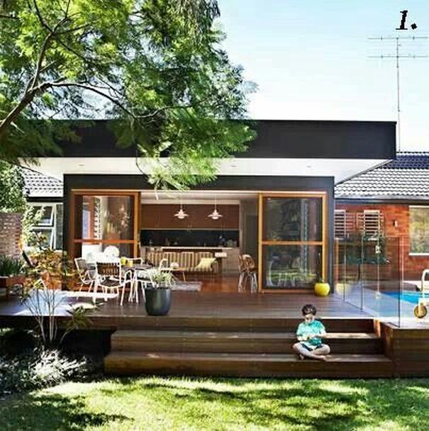
What I love about this image and why it has got so much pinning love is that it is such a simple design to achieve and so thoroughly effective.
It is great, when designing an outdoor room or area that you provide other spaces to sit beside the chairs around your outdoor table. Stair treads (when designed appropriately) are a perfect opportunity for this.
You can imagine people migrating away from the table and sitting casually on these stairs whilst they stretch out their legs more casually, or may want to watch the kids in the garden. The deck itself isn’t actually that large an area, however the use of the stairs in this way radically improves the quality of it as a functional, enjoyable space.
Again, the pool here is raised, and the choice has been made to keep the deck level with the pool area, resulting in these transitional stairs down into the grassed yard. The continuation of the decking timber around the pool plinth and these stairs is a great effect for tying these areas together and celebrating all the components of the outdoor design.
If you need to transition a level change from inside your home, to outside onto your garden, look how you can use your deck to make this transition an enjoyable journey. A step of 400 – 5000mm is about 3 steps, but makes the deck about ‘chair-seat’ height above the garden area.
So you could put those 3 steps off to the side, but people can then sit on the edge of your deck with their feet in the grass. If the level change is bigger, think about a stool height, that you can comfortably perch your bottom on whilst standing on the grass.
Once you can fall a metre from the deck onto your garden (in fact from any one area, to another), you are required to balustrade the edge. If you have little kids around, you will probably want balustrading on falls less than that.
You could consider using planters or other non-climbable elements to protect from falls that you think pose a risk (and are less than a metre).
SO WHY DO THESE IMAGES GET SO MUCH LOVE?
What I love about both these images is the immediacy with which you can feel relaxed and rested when you view them. I think that they visually represent how people want to feel in their own outdoor areas at home.
Ultimately, that’s what great design is about – how a space feels, and how it makes you feel when you’re in it.
It’s a great place to start when thinking about how you’ll design your home and the spaces in it.
Focus on how you want to feel, and then create spaces that evoke those feelings.
As you move through creating your home, test your decisions and choices against whether it will help you achieve those feelings in the spaces you’re creating.
Use this as your framework, and let it carry you to creating a home that is your heaven and haven, all wrapped into one.
Head to Undercover Architect’s Pinterest … so much inspiration for your reno or new home. CLICK HERE
 With over 30 years industry experience, Amelia Lee founded Undercover Architect in 2014 as an award-winning online resource to help and teach you how to get it right when designing, building or renovating your home. You are the key to unlocking what’s possible for your home. Undercover Architect is your secret ally
Leave a Reply