
Clare and Darren begin working with UA on the design of their home …
So last time we got a great snapshot, in Clare’s words, of where things were at, and how they were finding the process so far.
This instalment, I’m going to take you through the two designs that Clare referenced in her outline, so you can see how this process develops whilst they’re working with me.[Read here to catch up on where things have progressed so far …. and if you just want a brief summary – head to the Hit List here.]
Designing without a site visit … or a client meeting!
As an aside, this has all been done remotely.
Clare and Darren live in Brisbane, and I live in Northern NSW. We’ve handled 99% of our communication via email, with some text messaging!
I’ve created videos (as screen recordings) to simulate meetings, so they can hear me explain the design as I’ve created it, and then we can discuss questions and ideas.
I’ve not seen the site (gasp, shock, horror). However, I firmly believe I don’t need to. I have studied it extensively online, and it is a simple, fairly regular block, with a slight fall from front to rear. I can see the neighbours. I can see how tall they are. I can see the topography. I can review the council conditions. I can understand the orientation, the local breezes, the site’s natural conditions. As for privacy, well, it’s a small-lot home, so regardless of where the neighbours are, I will always design things a certain way to protect from overlooking and maintain privacy.
It is amazing how much you can do from your laptop. This approach won’t work with every site – something challenging topographically, or with a particularly interesting site condition, incredible view, etc, should always be experienced and viewed in person.
However, most of surburban Australia isn’t like this. And frankly, what I’ve done isn’t radically, or significantly more than the project-home builders will ever do in working out if the house they’re building for you is the best fit for your site.
From the work I’ve been doing with Clare and Darren to date, and the reviews of project homes they’ve considered, I’ve got a good handle on what they’re seeking in their home. I also have a good understanding of what a family home ‘should’ generally contain – in terms of rooms, room sizes, functionality and arrangement. My 7 years at Mirvac, one of Australia’s leading residential developers at the time, has given me a lot of experience in this. Whilst there, I was Project Architect on a development that contained over 150 homes. You definitely get a good handle on how to put a family home together so it a) appeals to lots of people so it sells well, and b) is a great place to live.
The house plans that Clare and Darren had been reviewing were generally: 4 Bed (master with ensuite and walk-in-robe), 2 bath, 3 living areas (or 2 with a study/theatre space), an outdoor living area and 2 car garage. Remember the Plantation and Ausbuild home designs they were looking at? Click here to see …
Clare and Darren are commissioning a formal survey of their property. This is your first step when building. At a bare minimum, it checks the boundary locations (fences aren’t always built on boundaries), and can also measure the topography (or slope and levels) of the site. It will also mark services that you need to be aware of when building, and can mark tree locations and a range of other items existing on your site. At the moment, I’m working off nominal plans of their site, and being conservative about its dimensions (so underestimating its width and length).
The first UA Design for the Anderson home …
So let’s get designing! These are the big design hits I always aim for in any house:
- getting the design to maximise the conditions of the site, in particular the orientation
- a great connection between indoors and outdoors – not just in moving between them but in a strong visual connection also, for surveillance and expanding the experience of your home
- creating a feeling of spaciousness – even when the overall house is compact in design and size
- functional, well-sized spaces that logically arranged and connected to each other in the way you use a home, and that are easy to furnish, use and circulate around and through
- lots of functional storage
My first go at the design specifically sought to:
- Open plan and spacious-feeling kitchen/living/dining with great connection to outdoors, living area on northern face, and outdoor area to north-east.
- big kitchen design, with butler’s pantry. Standard joinery is 600mm deep, so I’ve kept the fridges out of the kitchen joinery (they’re located in their own recess – the boxes with crosses in them). Fridges are around 800mm deep, so they’ll either sit proud of kitchen joinery (ugh) or kitchen joinery needs to be packed out to match fridge recess depth ($$).
- Great laundry with clean storage/bench layout and direct access to outside
- Homecoming dumping ground for schoolbags and work gear for easy entry and exit of home (without panicking about where things are).
- Uniformity in kids’ bedroom sizes, and sized to fit bed and desk. Minimum dimension 3m in each direction (not including the robe).
- Big linen storage – and lots of storage generally
- Great upstairs living space, with good orientation, that doesn’t just feel like a landing at the top of the stairs – and creates spaciousness in the feeling of upstairs.
- Privatisation of entry to master suite from stair circulation
- Arrangement of kids’ bedrooms with their bathroom
- Fifth bedroom downstairs, which is a 3rd living space similar to Ausbuild Ellison 31 solution, with privacy and ability to close off.
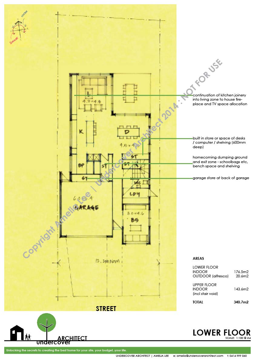
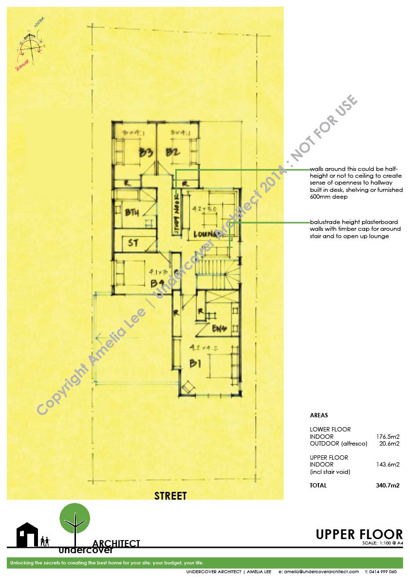
So here are the floor plans I first presented to Clare and Darren for their review (click on the images to get larger versions). As you can see, the design snuck up in size to be 340m2 overall. This is 40m2 over the area of homes we’d been reviewing together. My feeling was that it was worth presenting as I find that working with clients can be a process of elimination more than anything else. I believe I’m commissioned to explore options on behalf of my clients – test their ideas, and exceed their expectations – unlock what’s possible!
So I present ideas and concepts for dismissal as much as for inclusion. This often opens up conversations where it’s just as important to talk about what clients DON’T want, as much as what they DO want. And sometimes, there are things that haven’t even occurred to them, that until they’re drawn, they can’t know about them – let alone the fact that they then want to include or dismiss them.
So we explore, test and decide. This is what the design process ultimately is! I guide my clients – you – through a process of exploring, testing and deciding how you want your home to be and how you want to live in it. Generally where the design was ‘larger’ than the comparable project homes was in the kids’ bedrooms, and the living and dining spaces. So not expensive areas like bathrooms etc where wet area finishes like tiling push square metre rates up overall.
The feedback comes, and a second design option is prepared by UA
Clare and Darren’s feedback in a nutshell is below … and this is where the brief changed slightly (as it can during this process). I don’t work in a vacuum – time doesn’t stand still whilst I draw – and so often the client is seeing other things, getting other ideas, and they then feed into the brief as we go.
- don’t need a fifth bedroom / living area downstairs
- want to reduce the overall length of the house as much as possible to maximise the backyard space for pool and garden
- happy to reduce the size of the dining area
- had some ideas about the kitchen design and its layout, including the island
- would prefer a separate walk-in-robe to the master bedroom than the solution I proposed (which was more apartment-like)
- separate toilet to upstairs bathroom (with basin if possible)
- main entry process a little long and narrow (which I’d commented on in describing the design).
Their feedback was written in more detail than this, via email. It’s great, because it gives me a really clear understanding of where their thoughts are at with what I’ve proposed. They also provided a sketch idea of how things could be rearranged. Again, this is always helpful as it is again about exploring, testing and deciding – and it illustrates clearly for me what they’re thinking. This including relocating the entry to the side of the house, as they’d seen in a Kalka display, and putting some of the services/storage areas adjacent to the garage at the front of the house. Taking this on board, I created a second revision of the design that sought to do the following:
- reduce the area to max 300m2, but still maintain the sense of openness and spaciousness
- keep the kitchen large
- maintain storage areas and function
- maximise rear yard space
- enable upstairs living area to be closed off (with the deletion of the downstairs secondary living, this upstairs living area would become the kids’ dedicated zone, and so to be able to close it off visually and acoustically is helpful)
- ensure garage has storage capacity (Clare gave me a detailed list of what needed to be housed)
- separate toilet to upstairs bathroom
- an optional study downstairs – even though Clare and Darren said they didn’t want the third living area, I wanted to give them the option (if their budget and desires allowed it) of a study space. It particularly creates flexibility for resale and increases appeal to a larger market – for those purchasers who may want a home office, or a separate space to have the computer, or a fold out sofa for when guests come. If it fits in the budget, and works in the plan, it is worth considering, as I believe it improves the salability of the home (and also gives them some additional functionality in their use of it whilst they live there).
Again, I created videos of me ‘talking through the design’ that I sent to Clare and Darren as a pseudo meeting! About 20 minutes in total, it gives me the opportunity to describe how I see the areas working, specific details like joinery design, window sizes and finishes, and what you will see as you walk through the home.
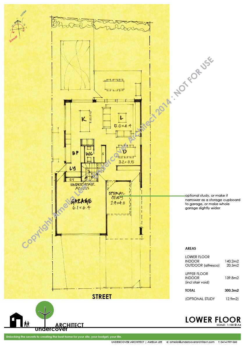
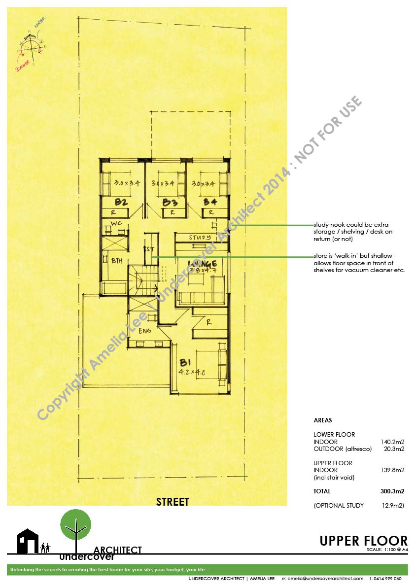
And what was Clare and Darren’s verdict on this design?
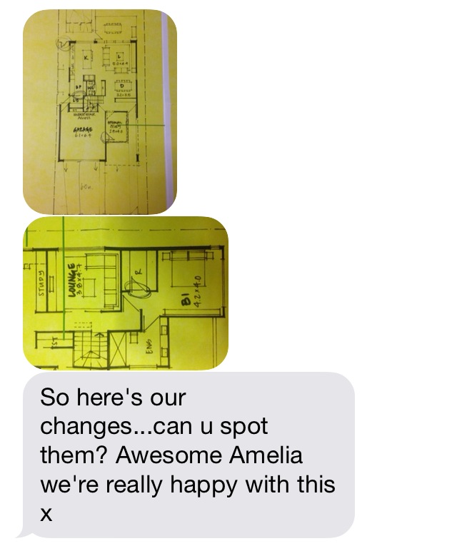
I madly did this before heading off to Sydney on a work trip, getting up at sparrow’s fart to finish off the drawings, prepare the video and get it all through to Clare and Darren. It was really satisfying, as I had a good feeling about the plans – the design was working well and I could see it would be a great living environment and good family home. Whilst away, I got this hilarious text message from Clare …Photographs above (from the text message) showed my sketches with a couple of door types changed from swinging to sliders, a door added from the garage into the optional study, and the downstairs toilet mirrored within the room so it backed onto the fridge recess. They decided to get it priced with the study too – so the house designs sits at around 312m2. They’ll tile it and use it as a store-room for the garage, with an additional door between the two rooms.
I find I normally get to a resolution like this by the third design review, so it was great to improve on my average! Of course, we had a head start having worked together right from the start of their search for a home design.
Next instalment … we’ll take a look at how this home is looking from the outside, and look at what our next steps are in moving along the journey of getting it built.
 With over 30 years industry experience, Amelia Lee founded Undercover Architect in 2014 as an award-winning online resource to help and teach you how to get it right when designing, building or renovating your home. You are the key to unlocking what’s possible for your home. Undercover Architect is your secret ally
Leave a Reply