Want 5 tips to get it right when choosing the external colour scheme for your home?
Choosing paint colours for your home’s external colour scheme can feel like a big commitment. Getting your home painted professionally can be an expensive undertaking, and physically it can require scaffolding, ladders and a lot of time and mess!
So, ideally, you want to get it right the first time you do it. I’ve chosen external colour schemes for more houses than I’d like to recall (!) and here’s my top 5 tips for doing it well the first time.
Tip number 1: What does your taste, and the building form, tell you?
This is a fancy way of saying that the house itself will tell you what type of colours to choose, and where they need to go. You’ll also have your own style preferences, and colours and aesthetics you’re naturally drawn to.
So firstly, think about how the house has been designed and shaped. For example:
- Do you want your home to look grounded? Choose a darker colour for the base of the home, so it feels solid and grounded.
- Are there any parts of the home you want to stand out more? Paint them in a contrast colour to the main house colour, to help them be more prominent.
- Are there parts of the building that feel a bit bitsy-piecey or piecemeal? Choose one colour for those elements – they’ll seem bigger, and less cluttered, through their association with each other.
Then think about whether you want the house to have a particular aesthetic.
It may be that you want the home to have a Hamptons feel. Or a coastal style. Or to seem edgy and contemporary. Each of these styles will have a particular colour association.
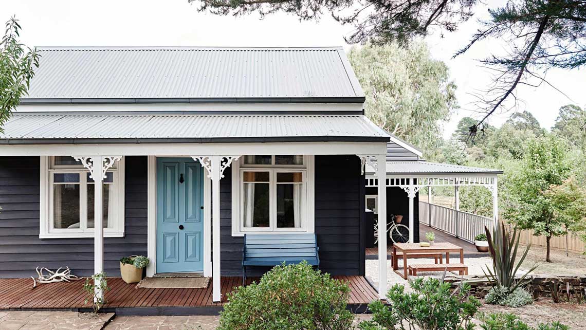
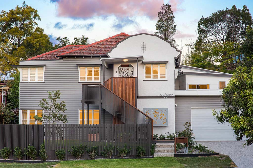
Often you can paint a home (regardless of its architectural style) in a particular colour scheme to help it have a strong aesthetic more to your personal taste. This is often why you will see old Queenslander cottages painted in dark colours. Blacks and dark greys are often more associated with edgy, modern buildings. When you use them on a traditional Queenslander, you help it have a more contemporary feel.
Daylesford Cottage from Inside Out [Image Source]
Tip number 2: Choose where you change colours
Although it’s still possible, it seems rare these days that homeowners choose one colour for their entire house exterior.
Think of your home in base, middle and top …
The proportions of a home – both single and double storey – can often be read as ‘base’, ‘middle’ and ‘top’. A very straightforward way to think about external colour schemes is to arrange them this way.
For example, by accentuating the ‘top’ – or ‘roof’ of your home – in a strong contrast colour, you can give your home a top that is visible. This can cap the top of your home.
If possible, don’t change colours on an external corner …
A home is a three-dimensional object, and the forms or shapes in it are too. In my opinion, when you change colours on an external corner – that is where a corner pushes out (rather than recedes in) – you break down this idea of the three-dimensional shapes and forms that make up your home, into two-dimensional planes and surfaces.
This may sound like architectural gobbledygook! Forms … Shapes … Planes … Surfaces … However, I know the way I approach designing homes is that I create volumes – that have edges and shape. Not a plan that walls are tilted up on as surfaces. So when thinking about the home in three-dimensional volumes and shapes, I think also about the colour in three-dimensions – as a continuous wrapper to that volume.
It’s also difficult for any painter to finish an external corner on a house exterior in a neat way – often because they’re painting over render or lightweight cladding that won’t have a perfectly straight edge.
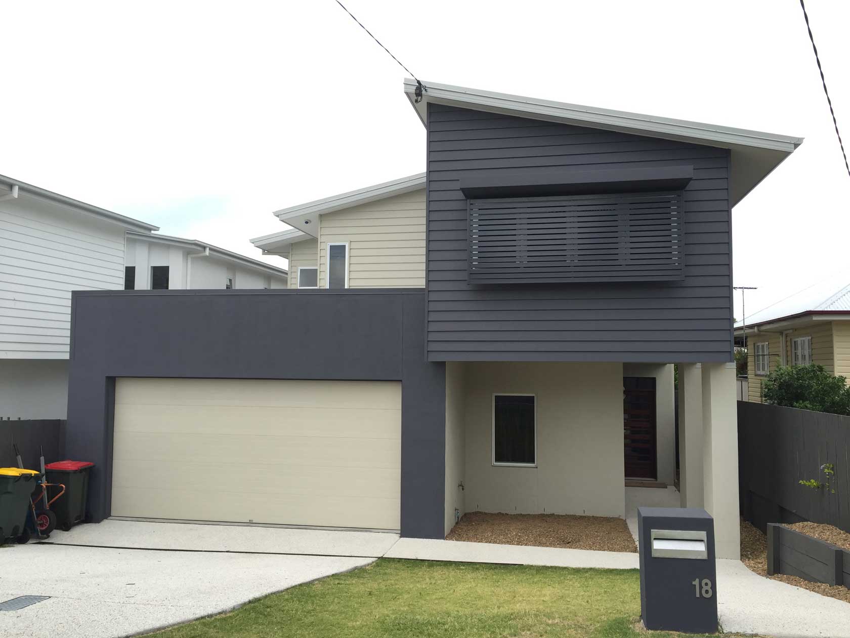
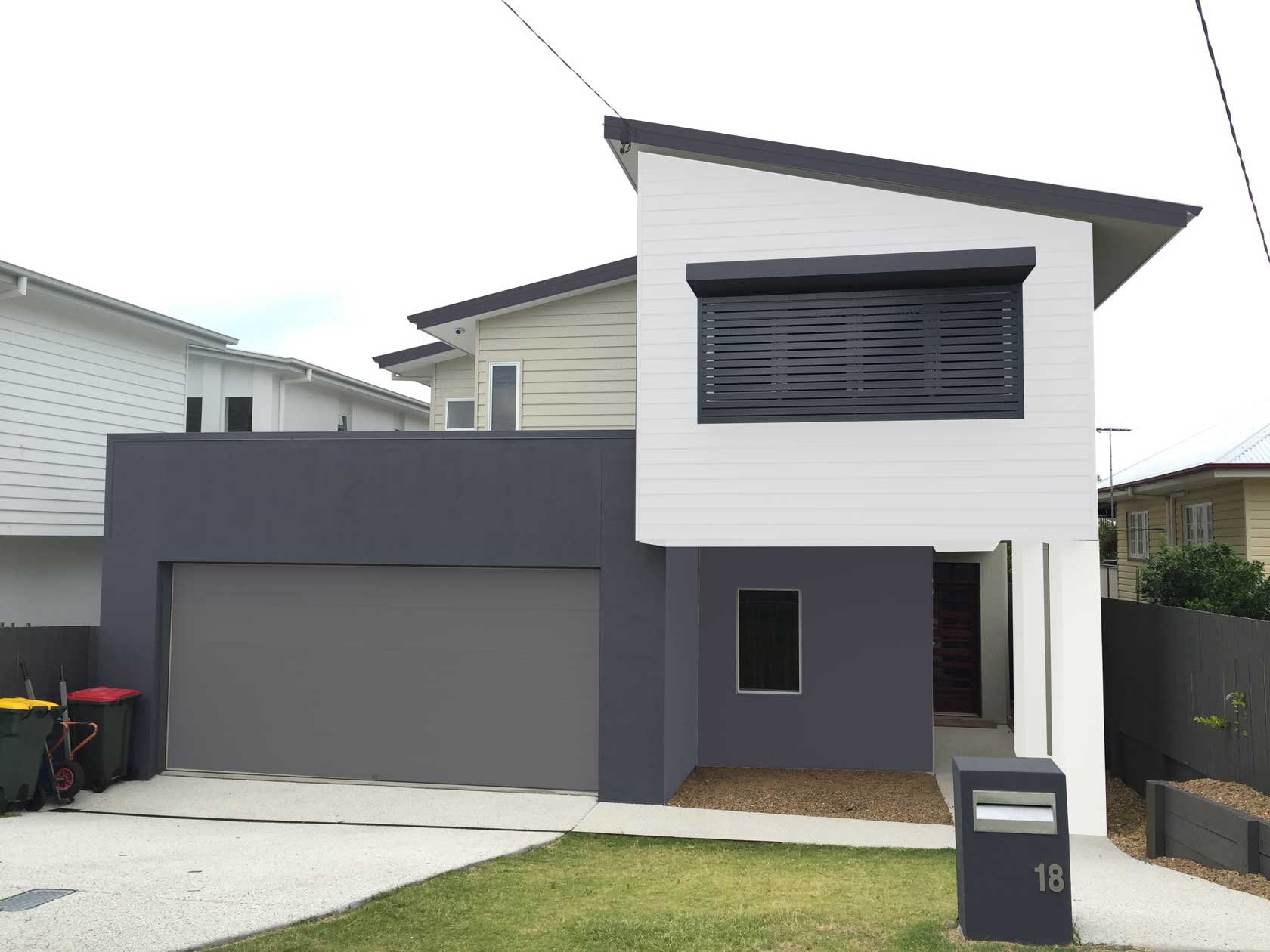
This is the exterior of the Anderson’s home from Undercover Architect’s Project Diary. The Andersons worked with Interior Designer, TD Creative Agency, to select their exterior and interior colour schemes. Clare Anderson loved this dark inky navy colour and has used it both inside and outside. It’s applied to the face of the garage, and then upstairs to the master bedroom, which projects out over the entry to the home. The dark navy changes to the lighter beige on an external corner at the side of the garage.
An alternative could be to use the dark navy across the base of the home, continuing it on the lower floor around to the entry door, to ground the ‘base’ of the home. A darker garage door colour could have been used to make the garage door and walls appear as one object. Then the master bedroom could have been painted in a white or off-white, to highlight the ‘middle’ of the home, and accentuate this area over the entry – drawing focus away from the garaging and to the front door and entry. Fascias are again dark, to ‘cap’ the home. (This is a photo of the home edited in Photoshop).
Tip number 3: Trends change, so if choosing a feature colour, apply it where you can access it easily
If you have a love of bright colours, or stand out feature colours that you want to bring into your exterior, don’t go overboard.
Painting the outside of your home is a big undertaking. When getting it done professionally, it can be costly too. With current paint technology meaning you can get 10 years from a good quality exterior paint finish, that’s a long time to commit to that bright teal, or vivid fuscia you absolutely fell in love with.
Use a feature colour – by all means. Just locate it somewhere where it’s contained, and easy to repaint if and when you get sick of it (or sell the home to someone else).
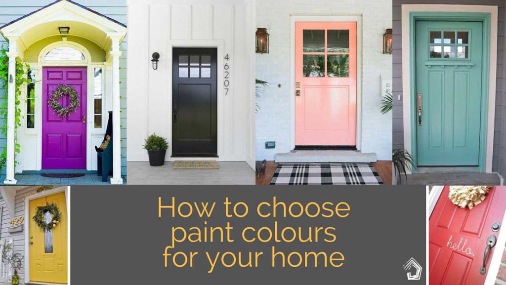
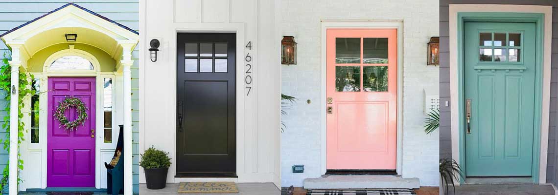
For example, front doors are a great way to bring colour pops into your home. Low walls in landscaping are another. You don’t have to hire a professional, or get up a ladder to paint them. Get sick of it, and a well-spent weekend can totally change the look of your home.
The rainbowed sky is your limit when choosing a colour for your front door [Image Source: Pinterest]
Tip number 4: Create that flow
Many homeowners tell me that they want a feeling of flow in their homes – and of calm and relaxation.
One sure-fire way to do this, is in the colours you choose for your home’s exterior AND interior.
Choosing a similar colour palette for both the exterior and interior will help your home feel connected to the outdoors. It will help create that seamless flow between inside and outside, and create a sense of calm and continuity that begins the moment someone arrives at your front door.
If your external colours are too strong to use internally, consider using half or quarter strength versions. They’ll then be from a similar palette, which will work well too.
This colour scheme uses Dulux’s Bushland Grey on the weatherboards, and highlights the stucco art deco feature of the home in Dulux’s Grey Pebble. We used a half-strength of the Grey Pebble internally in the original part of the home to tie the exterior to the interior. Design by Undercover Architect.
Tip number 5: Don’t forget other materials can be in your palette
Often we forget that there’s the opportunity to use natural materials and their colours, as part of the palette for our home’s exterior.
This doesn’t have to be in the way our home is built. Remember your landscaping as well. A natural tile to the front door, or a low landscape wall in a great brick colour, or even a natural timber fence.
Alternatively, you may choose a metal cladding for part of your home, or a select area of timber paneling, or a feature panel of brickwork or concrete.
All of these provide opportunity to enrich a simple exterior colour palette.
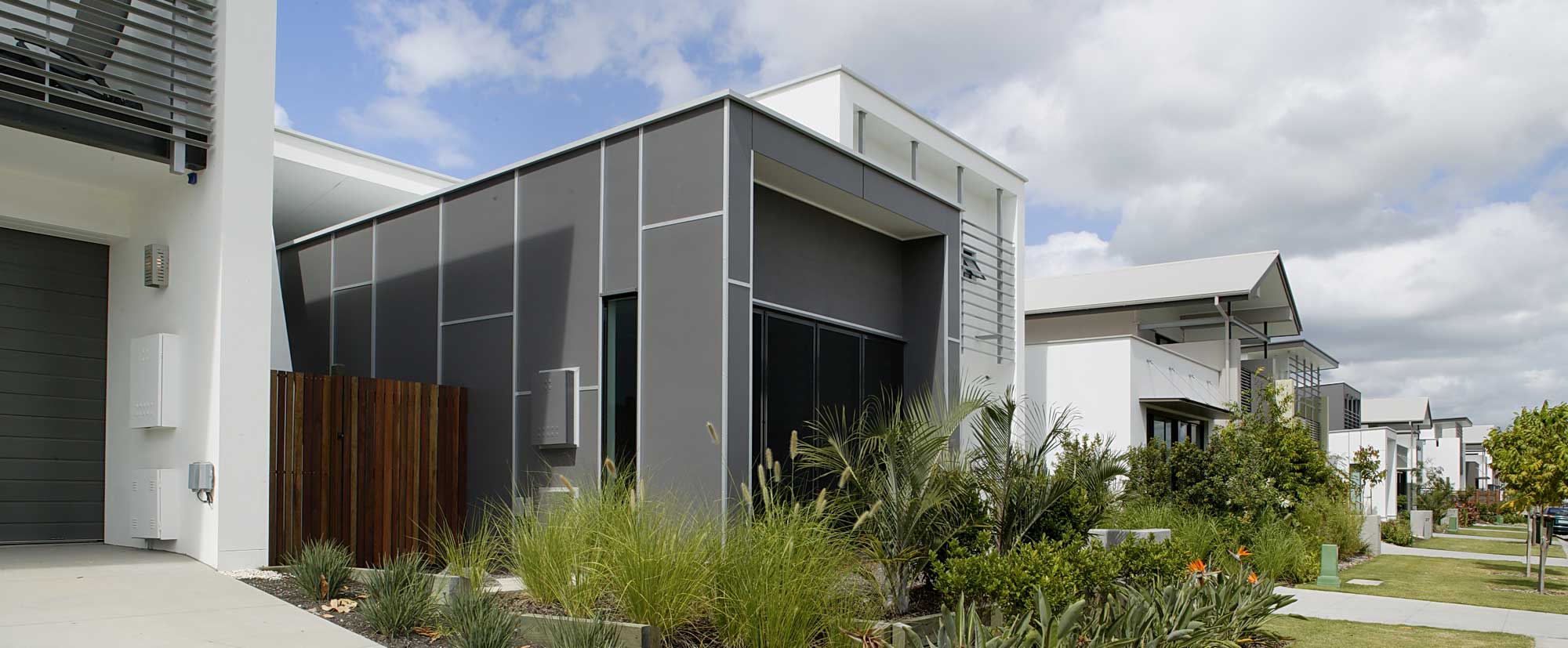
This home at Waterline uses small aluminium sections to cover the joints in the lightweight fibre cement cladding (the dark grey) to create a pattern on the exterior. There’s also naturally finished hardwood used in fencing.
Helpful Resources
Design Seeds
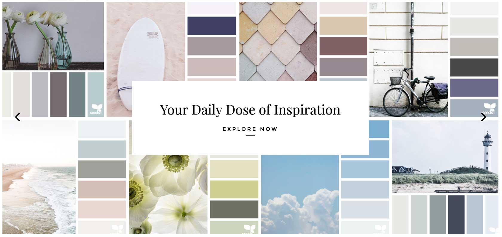
If you don’t know this site, bookmark it now – and follow on Instagram. One of my total faves. Jessica creates stunning colour palettes, inspired by photographs of just about anything. The range of colours she has put together will surprise you, and there is literally something for every style and taste. You can search by colour, or just swoon over the photos you love, and the colour palettes that come from them.
Dulux
Dulux have a great colour gallery you can view online to see how colour combos will work to create that look or style you’re chasing.
See more of Dulux’s Colour Gallery here.
Resene
Resene has an incredible range of colours, and a wealth of real life examples of their colour schemes on their site. They have great environmental credibility for a lot of their products too.
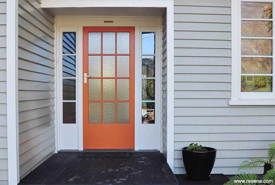
See Resene Exterior Colour schemes here.
Brickworks Building Products and Austral Bricks
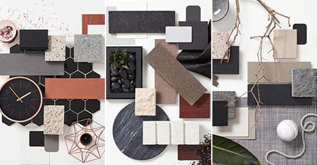
Brickworks Building Products have offices / showrooms all around Australia, and are your go-to destination if you’re thinking about using brick, concrete blockwork, concrete or roof tiles in your home. Austral Bricks, one of the businesses they represent, has a great feature online in their Style Boards – which show you how to put together natural materials in your exterior colour scheme.
See Austral Brickworks Style Boards here
What about you? Have you found any helpful resources for inspiration for your external colour schemes? Please share in the comments below!
Other blogs you may find useful …
This one will help you with communicating your wants and desires for your home.
This one gives you my top 5 ingredients for stress-free renovating and building.
Do women make better architects? You be the judge.

 With over 30 years industry experience, Amelia Lee founded Undercover Architect in 2014 as an award-winning online resource to help and teach you how to get it right when designing, building or renovating your home. You are the key to unlocking what’s possible for your home. Undercover Architect is your secret ally
Do dark external house colours make the internal temperature warmer? I’m finding conflicting information, from what I understand that dark colours absorb heat rather than reflect it however it comes down to the heat transferring which is apparently minimal.
We have a high set weatherboard house in Brisbane and keen to paint it a dark shade of grey.
Hi Jody,
Thanks for your comment – great question.
Dark colours to absorb heat more, but if you’re managing the temperature levels internally with insulation, good wall construction, orientation and ventilation, my experience is that the darker colours don’t have much of an impact. Where they do, however, is in the performance of the paint. Because dark colours absorb more heat, I find they will show wear sooner than a light colour. So, I wouldn’t recommend them on anything that is exposed to full sun. The image I’ve shown of the dark Queenslander has well shaded verandahs. I know Corinthian, the door manufacturer, won’t warrant their external doors if they’re painted in a dark colour, and don’t have a set amount of coverage over them to shade them from full sunlight.
I hope that helps you!
– Amelia, UA x
Thanks for your prompt reply, that’s really helpful. As our house is on a corner block and very exposed, I think we will use the dark on the trims and go with a light colour for the boards.
This article is really helpful! I have a 2 storey rendered brick home (traditional style). I’d love to update the pallette (currently beige with black window frames). Grey colour schemes are really popular now and look amazing. I’m wondering what you think the *next* colour trend for a more “traditional” looking rendered home might be?
Hi Nicola,
Thanks for your comment – I’m glad you found the article helpful. As for your question, I’d recommend checking out the paint manufacturers themselves. They’re great at tracking colour trends overseas and bringing that information locally to their colour palettes. Pantone also release a colour of the year each year – and this year, it’s “Greenery”. I’m also wary of painting the outside of our homes ‘on trend’ given that the paint jobs are expensive and can last a decade or more. So, choosing timeless colour combinations is always a good way to go.
– Amelia, UA x
Thanks for this, Amelia. We are looking at colours too. I’d love a dark grey bug out full western sun exposure seems too harsh for longevity.
Hi Natalie,
Check out Shaun Lockyer’s work. You’ll see he uses a lot of dark colours on Brisbane homes, and finds (when the surface is prepped properly and good quality products are used), it can still perform.
– Amelia, UA x
Hi
I am having so much trouble with colours I have a brick home and going to re spray the roof dark grey I am currently painting the doors black and a window awning black the windows are western cedar which I’m leaving alone I don’t know what colour to do the facia board or the balustrade on the patio could you please give me advice on theses colour schemes or recommend other colours
Hi Maryanne,
Firstly, I would recommend not painting the roof in a dark colour. It will make for a very warm home. I would suggest doing the roof in a paler tone (such as Colorbond’s Shale Grey or similar) and then doing the fascias in the dark grey to ‘trim’ the house. You can always take a photo of your home to a Dulux paint centre or other paint supplier and get help from their in-store staff to choose colours. But definitely not a dark roof.
– Amelia, UA x
Please can you guide me on colours for our Queenslander. The roof is a fading Colourbond Ironstone. The garage door is Jasper. The house has 2 tones – the front is a Wattyl “Slate” mix (greige), & has a feature Ironstone wall on the verandah; the rear is all Ironstone. Trims are Slate. Can you perhaps recommend a grey-green (sage) palette, or a complementing scheme that’ll blend with the roof?
Hi Heather,
It’s difficult for me to make recommendations as how a colour looks and sits with other colours is so dependent on the home, location, orientation and light levels. I really recommend using the resources outlined in this blog to find the best colour scheme for you. Dulux in particular has paint colours that match Colorbond’s colours (and use the same names) and have some sample colour schemes that team up with those colours. Your local Dulux trade centre can always help, or check out their website online.
– Amelia, UA x
My designer has suggested using brick for the exterior of my new home. Can you recommend any impartial sites, articles or similar that can help me make an informed choice for colours, textures and costs?
Hi Julz,
Brickworks represents lots of businesses in the brick and paver industry, and it’s a great resource for seeing a variety in one place. They also have design studios you can visit, and see the materials in person (and take home samples). You can also speak to one of their Design Consultants to get advice.
Otherwise, I’d suggest Lunchbox Architect for lots of examples of brick architecturally designed homes in their “Brick Collections” album, to see the different colours.
As for costs – the best way is to speak to the supplier.
– Amelia, UA x
Is there any golden rule on choosing a new external house color when you have a silver / white roof? Our house is rendered block with corrugate roof. I have an idea of light grey and some dark grey on the pillars in the entrance. The front of the house also has some pillars built on to it at the sides to give it some shape and i was thinking of doing them too.
Your thoughts?
Hi Matt,
A silver / white roof is a great colour roof for most colour schemes – so really no golden rule. Ideally you want colours working from the same base, or from complimentary colours (remember the colour wheel you learnt at school?) Head to your local Bunnings, or Dulux store, and check out how they’ve teamed those roof colours with other colour schemes. You’ll probably see dark grey houses, houses in more earthy (but still cool) tones. Even white and pale houses. A light grey would work well – perhaps you can tie the dark grey up onto the fascias as well, so the pillars don’t feel bitsy in the darker colour. Best wishes with it!
– Amelia, UA
We just moved and need to improve the curb appeal. We will be painting our home a bit more modern like the Anderson home, where there will be grays, navy, and cool colors. We want to contrast that with a brick driveway and hopefully we can find a bricklayer soon, so we can choose the right color to go with everything. Thanks for the tips and leading me in the right direction.
These tips are awesome. Thanks for sharing.
Help please with mission brown brick home built across the block. Full width verandah faces north highlighted by 5 brick pillars each 2 bricks width from foundations t0 gutter line (9 metres high) with inside glass doors.
Does a possible .feature colour change to the pillars seem practical as the bricks feature deep grouting same colour.
Hi John,
It’s challenging to give an opinion based on a written description. On face value, it sounds like it is possible. You may wish to look at elements such as fascias, front doors, front fencing, garage doors, and landscaping. Changing the colour / choosing the colour of these items can change the look of your home dramatically.
– Amelia, UA
Hi Amelia,
An interesting article. We have to paint our roof asap because we are getting solar panels put in and need to paint our colourbond roof first. Just trying to select a colour. I was thinking of basalt but you recommended someone not to use dark grey. Our house is textured brick sort of terracotta and browns and we have terracotta pavers on the driveway, paths and front and rear patios. We plan to render the house at some point and had thought to paint the pavers. Just trying to think ahead about a total colour scheme and especially a colour for the roof that will work now with all the brick and terracotta as well as down the track when we paint. Our house is east facing and we don’t have insulation right now. We like greys and stone colours – something modern. Any suggestions?
KInd regards,
Melinda
Hey Melinda,
I’d suggest Shale Grey or Windspray – both are Colorbond colours and a great base for your future palette (plus on the lighter side).
– Amelia, UA
Thanks Amelia : )
Hi Amelia, Great website
I am in process of building new double story house , I have selected all the colour except rendered and cladding colour for facade , which i am stuck and confuse
Brick colour finalised – Austral everyday life unwind with off white Mortar
Roof , fascia , gutters colour finalised- colorbond Woodland Grey
Garage door – Classic Cedar
Entrance door Classic Cedar
Drive ways – Gun metal
Windows Surfmist
rendered colour we liked so far Surfmist so far but not sure if this is the right colour
cladding colour i am confuse
Any suggestions?
Supreet
Hi Supreet,
It is difficult for me to advise as I’m not familiar with all the brands / colours you’ve selected for each component. I would suggest gathering samples of all the materials and colours together in one spot – as it will very quickly become clear to you what will be the best colour for your render and cladding colour. If still confused, Dulux Trade Centres usually have a Colour Consultant on staff who can help. Surfmist is a Colorbond colour – so I would actually suggest finding a paint colour from Dulux, or Taubmanns, or your preferred paint supplier, in lieu of Surfmist. For example, Dulux’s “Natural White” or “Whisper White” may be a good alternative.
– Amelia, UA
Hi Amelia,
We are from Brisbane & trying to achieve a Hamptons style: exterior cladding in a light grey (Dulux Miller Mood), whites with windows, posts, balustrades & trims – timber decking. We have a roof that is very visible as it is a house that is 1 story on the front half and 2 story towards the back with the roof line slanting towards the street. I had always thought that dark colours receded and light colours popped so thought that Colorbond Ironstone roofing would made the white trims and miller mood colour scheme pop and the roof recede. Is this incorrect, and should I be considering a lighter roof? I want the roof to disappear as much as possible?
As a side note I was thinking half strength Dulux Equanimity for the from door (an ocean grey green colour) but am a little nervous on doing this? I have a lot of the interior accent colours in these ocean green shades.
Thank you in advance,
Sherri
Hi Sherri,
I feel in that colour scheme, your dark roof will contrast the house palette significantly, and as a result, stand out far more than you intend it to. I would look for something that works more tonally with your main colour scheme. As for the front door, I think it’s an opportunity to have fun, as it’s easy to repaint should you wish to down the track. And the idea of taking the colour through the home from the entry door, into accent colours, and then even out to the garden, is a lovely way to create flow and indoor / outdoor connection in your home, as it leads the eye.
Hope that helps!
– Amelia, UA
Thanks Amelia – surfmist it is!
Hi Amelia
I have a hertage beach cottage that needs repainting The roof is colourbond indian red and the walls are new cream with closed in verandah windows deep brunswick green and indian red. Posts and architrave deep brunswick. Have you a suggestion for beachy, cleaner colour theme that will fit in with red roof. I do not like grey at all. Jacki
Hi Jacki,
It’s difficult to recommend specific colours because so much is impacted by the light, context and materials in each individual home. I would highly recommend using one of the tools I mentioned in the blog. Whilst you may not like grey, you may find that a beige, or white (that has a cool base) will help provide that beachy colour scheme, and knock back some of the red’s intensity.
– Amelia, UA x
Hi we have just bought a house that is a rendered brick mustard colour with dark red alliminum windows and roof what colour would you recommend for a colour change on the render
Beck
Hi Rebecca
It’s difficult to say because it’s so heavily impacted by your home, your location, what else is going on in your street, the type of light, etc! I would be looking for something that helps the dark red not be orange, so possibly something very neutral and lighter in colour to freshen it all up. Dulux have an app where you can take a photo and then play with their colours on your actual image. That’s a good way to test it.
– Amelia, UA
I think it’s a great idea to make the connection between the interior and exterior. Like you said, having the same color scheme would create a feeling of continuity. I never thought of that since I have been planning on having a different color for the outside of my future house. I would keep this mind. Thanks!
You’re welcome Millie – I’m glad you found the blog post helpful!
– Amelia, UA
Hi I need one help, we are going to build a house soon. I am confuse between the
1) brick colour weather to go with everyday life leisure brick with oak roof and terrain garage door color or
2) everyday life unwind brick color with sanctuary or magnum roof with terrain garage door?
Hi Rashmi,
I’m not able to help you with colour selections as it’s so dependent on your site and home. If you’re in Australia, Brickworks have design studios in many of the capital cities and can help you with colour / material selections if using their brick products. Google “Brickworks Design Studio” and you’ll find your nearest one.
– Amelia, UA
I have 15 year old double story house with a small balcony with two pillars on the front I have red brick house , and burgundy roof, red and cream paved driveway and steps that leads to the front door.Windows, gutters garage door, and front door is in cream colour. I only want to render front of the house, and we only get morning sun . What colour render would you recommend to suit my house
Thank you
Hi Elizabeth,
I’m unable to make colour recommendations, as it’s so dependent on location, light etc. I’d recommend you check out the resources mentioned in the blog and get some advice from a local paint supplier or colour specialist. Best wishes for your project
– Amelia, UA
We are building a weatherboard house, shale grey house, vivid white trim, surf mist roof. Similar to Hampton’s style. We are doing a black door for contrast. My query is about our garage, we have to do a brick garage because of fire code. Since we are having a black front door thinking to do a dark charcoal brick garage, white mortar and a black garage door. Or could you suggest something else, don’t want to render the bricks shale grey.
Hi Wendy,
Unfortunately, I’m unable to provide advice on colour schemes. I’d suggest heading to a Brickworks Design Studio if you’re in Australia – they can provide advice on colour selections when it comes to brickwork.
– Amelia, UA