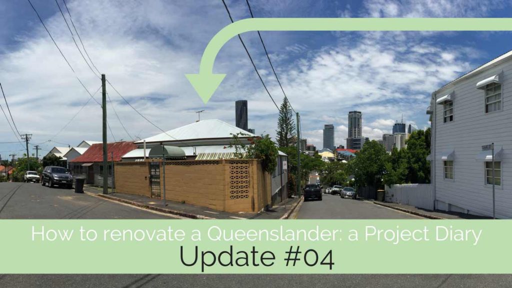
Renovating a Queenslander: Back to the drawing board (but not back to square one)
The last time we caught up with Michelle and Sarah, we found out that their inner Brisbane Queenslander cottage was pre-1911. In fact, it was built in the late 1800s, and their research uncovered lots of interesting history about the home.
Given Brisbane City Council’s update to the Local Plan, and its fierce protection of pre-1911 homes, it was clear that our original design proposal (which included demolishing the rear verandah space), was going to be difficult to get approved.
Not impossible … but difficult. And time consuming. It would push the project into an Impact Assessable Development Approval process, which can take up to 12 months to get approved, and invites objections from the public. (Cue eye-rolls all round).
Timing can sometimes be the most important factor
Michelle and Sarah had always been clear about wanting to get this project completed asap.
They’re living in a home they’re about to put on the market. They have somewhere to move to, but ideally, would be moving into this finished renovation in just over 12 months from now.
They also want to rent out this cottage so it isn’t sitting empty whilst we finish design, drawings and approvals.
That’s a few moving parts to bring together. What it ultimately means, is that we don’t have 12 months to sit in council, waiting for an approval. We need to create a design that can achieve approval as simply and quickly as possible. So it needs to comply with all the rules. This means keeping all 1911-building components.
It’s important to realise that there are many design solutions for a single project that can still satisfy your brief. The one you choose for yours will sometimes be driven by larger strategies … around budget, timing, planning legislation to name a few.
Back to the drawing board – but not back to the beginning
Each design iteration can seem bit like you’re starting again. However, when you’re working off the base of an existing design, and a process you’ve been through to get there, you’re never starting from the beginning. The process is more informed, faster and simpler. As a homeowner, it can be tricky to understand it’s what we, as designers, do every day … develop the design, questioning and testing our choices, and changing things a lot – or a little.
Michelle and Sarah had chosen their preferred option from the two I’d initially designed. It located the master bedroom on the north-east corner of the home, and had an ensuited second bedroom. It also put the living / dining room on the side facing the view.
Taking this option, I created an alternative design that retained the rear verandah.
The challenge with this was twofold:
- the new extension floor level sits higher than the existing home, to provide sufficient height for the garage on the lower floor
- the verandah roof was already quite low – around 2,200mm above floor level. In addition, we didn’t know how much structure was in that verandah roof, and whether it would need additional structure to support it once we started pulling things apart to add the extension.
- The strategy of the ‘bolt-on’ extension relied on introducing a connecting zone of roof which would tuck under the existing verandah roof to the separate the extension with its own roof.
This meant that, whatever I put under that verandah edge, had to be something that didn’t need a normal (or legal) ceiling height.
These were the design options I came up with.
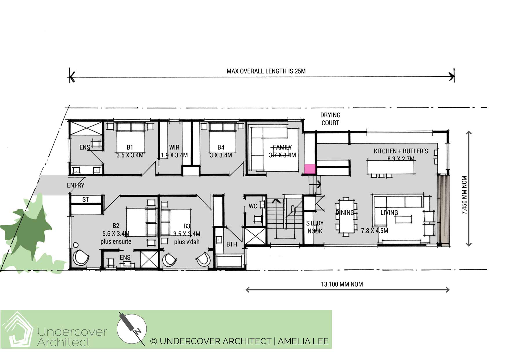
Upper Floor Plan – Option A (ensuited bedrooms to both sides of hallway, with master on north-east) Click to enlarge
The key to dealing with the verandah at the back of the home was to locate the internal stairs and storage area under this connecting area of roof.
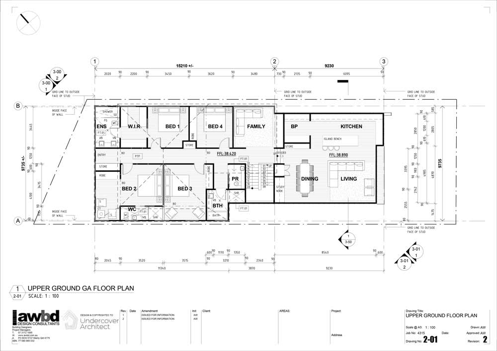
In this option, the family bathroom and powder room sits within the existing verandah space. These areas can have a ceiling height of 2,100mm (whereas bedrooms and living spaces need to be 2,400mm).
Ensuited bedrooms are located either side of the entry hallway – with the master being on the north-east corner.
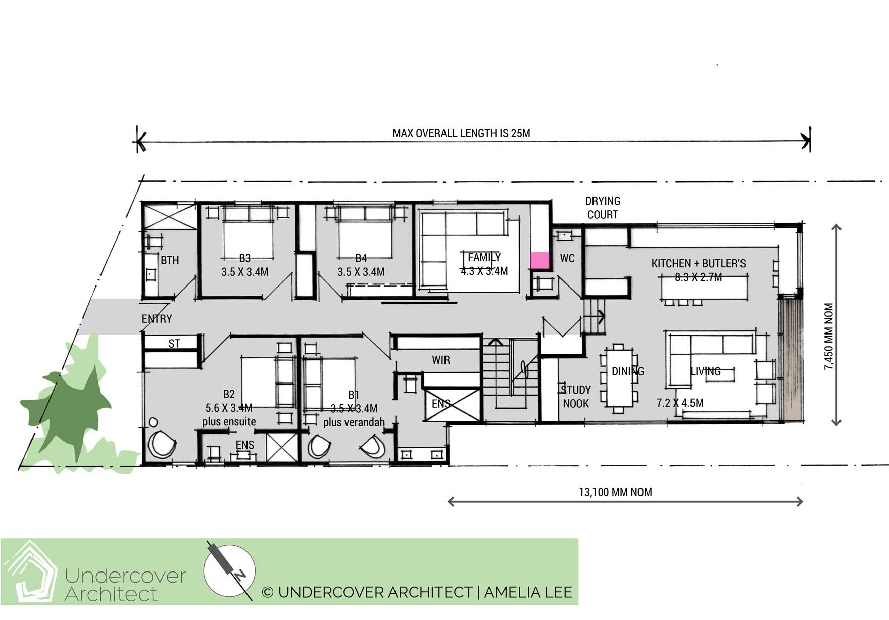
Upper Floor Plan – Option B (here, both ensuited bedrooms are on the southern side of the floor plan – with the master capturing the city view in the ensuite) Click to enlarge
In this option, both ensuited bedrooms are located on the southern side of the floor plan. The ensuite to the master can capture the city view. The living / dining / kitchen arrangement is fairly similar, with both options adding a study nook off the dining area (for a home command centre / homework nook).
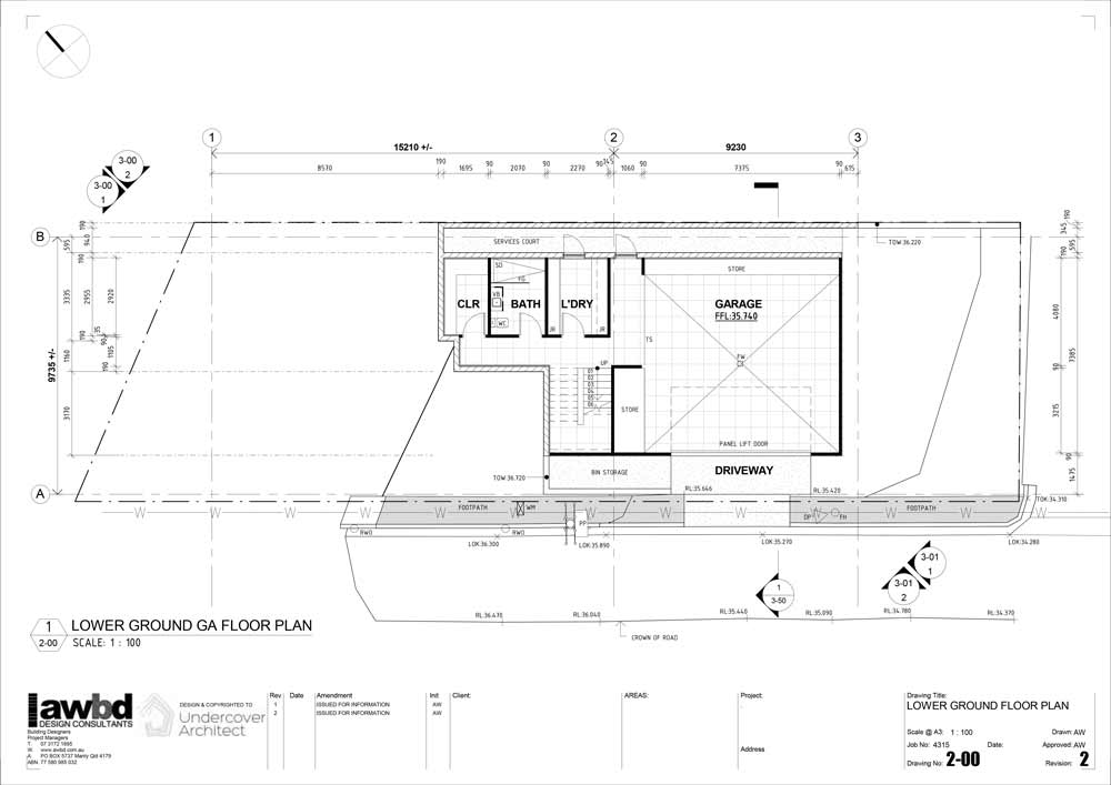
Downstairs, the laundry, bathroom and cellar tuck in under the existing house. A laundry chute makes life easier for dirty washing! The garage can still double as a party zone, with glass sliding doors to the eastern side opening to the garden.
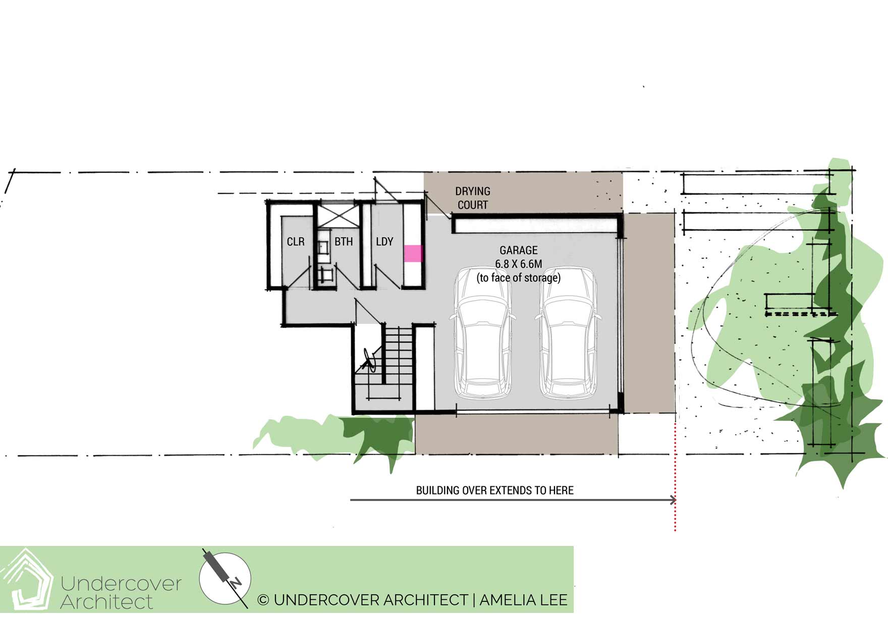
Lower Floor Plan – both options (the pink square shows where the laundry chute is located) Click to enlarge
The verdict …
Michelle and Sarah chose the first option, with some tweaks. The next step was to move it into the computer. This is where Aaron Wailes, of Aaron Wailes Building Design, stepped in … to take my hand drawings into Revit, and start drawing this project up formally.
This is what this looked like.
But what about the outside?
The thing about computer drawings – especially ones done in a 3D tool such as Revit – is that they test things to millimeter perfection. This helps us resolve the design (and constructibility) at a detail level as we keep developing it.
One key decision about resolving this design was determining the actual level of the extension. What did this look like? Here’s the process …
- Michelle and Sarah had specific requests about the height of their garage to accommodate their vehicle and camping gear.
- We also had a very short driveway, with existing kerb levels to work with.
- So playing with all of that in the computer helped us (with great accuracy) work out the ideal level of the garage.
- Then the ceiling height was determined
- Then we added floor structure
- Then we had the living level of the extension.
Based on these explorations, all done in the computer and with Aaron and I conferring on the process, we could see how the extension was going to sit in relation to the existing home.
This was important for determining how to design the connecting roofs, and in working out what the outside looked like.
Of course, I’d already had some ideas about that as part of designing the plans. Now it was a case of putting those ideas to the test on the drawing board. This is what I came up with.
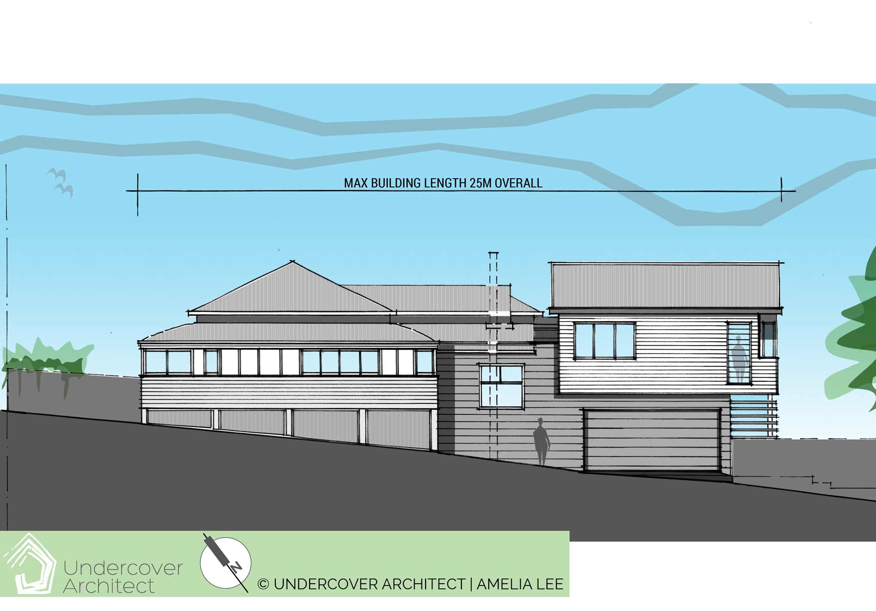
The new extension is expressed as a contemporary design, using materials associated with the Queenslander style. There’s a clear connection between the old and the new. Click to enlarge
There was a strong desire to ensure this extension / renovation didn’t mimic the existing home. It needed to sit next to it in a complimentary way, and satisfy Council’s requirements for homes built in character areas. I’m a big believer though, that our homes need to tell the story of all of their history- and that includes the additions we add over time.
Being on a corner, this home has two street elevations. The extension was really only going to be visible from the street that ran along side the home – where the extension would be on full display. The design seeks to tie the old to the new with material choices, using weatherboard on both. However, the connection zone will be clad in another lightweight cladding material (Scyon Stria), to express the connection between the two parts of the home.
The design of the elevations also meant a slight adjustment to the floor plan – to push the garage façade back a little so it was recessed under the upper floor.
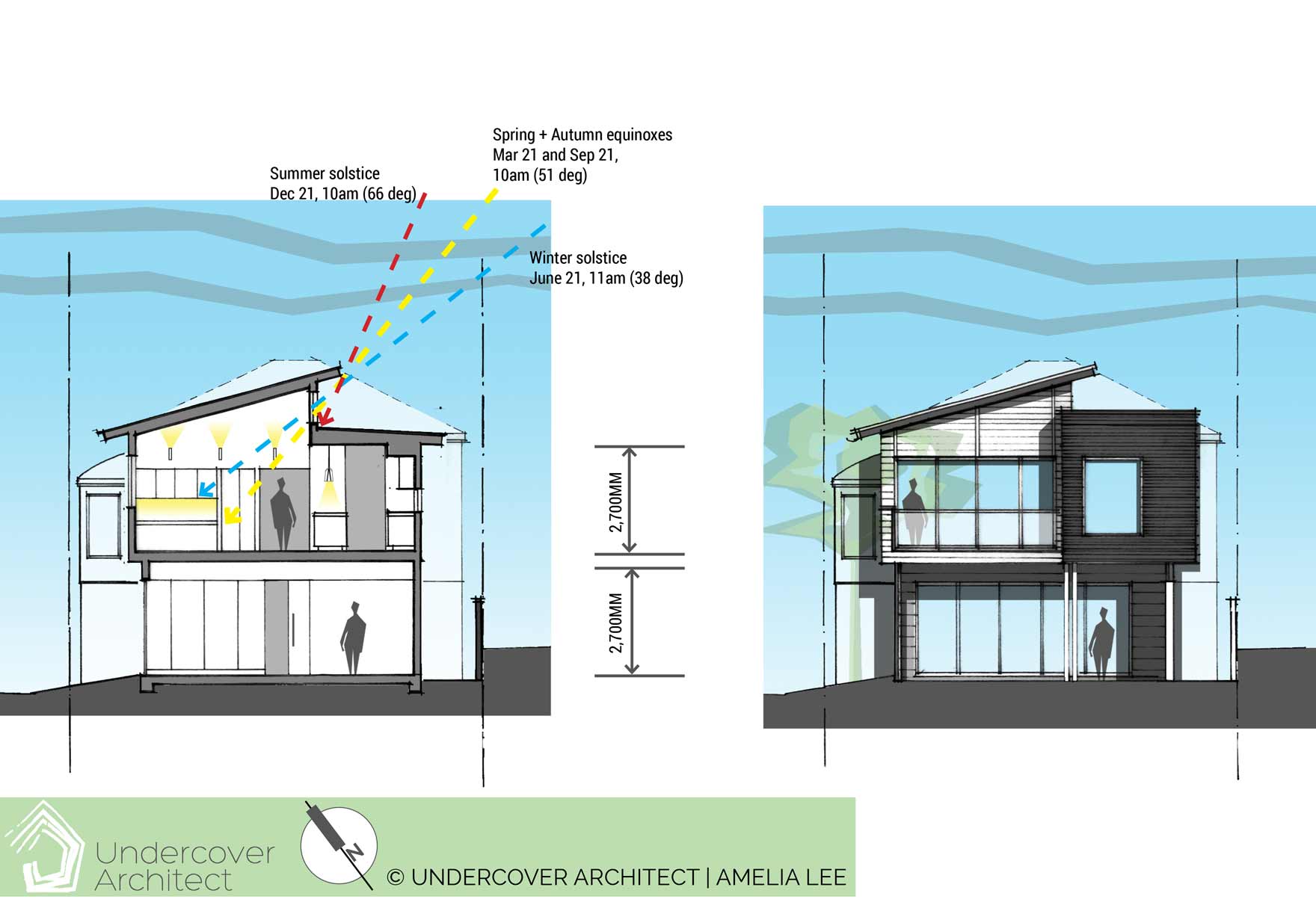
The split roof design for the extension helps northern light reach the interior, whilst the layout can still access the city view to the south and south-east. Click to enlarge.
A big part of designing the exterior form of the renovation was looking for opportunities to get northern sunlight into the extension. Given that the city view was to the south and east, the outlook was always guaranteed to be great. However, the space wasn’t going to feel great, or be comfortable thermally, unless I designed for natural light as well.
So, the extension roof was split, to create a large volume over the living / dining room side, which raked up to the north. Clerestory glazing allows northern light to spill into the extension, and the eave over it is sized to cut out high-level summer sun. A lower roof sits over the kitchen. The southern end of the kitchen is wrapped in a feature material (metal cladding).
Michelle and Sarah immediately said yes to these elevations. Which was great for moving things along! We are cracking through this project at great speed – and a lot of that is due to having proactive clients who turn around their reviews in a super speedy and decisive way.
Next time:
Timing is of the essence with this project, so I’ll take you through how we created a program for this project that would enable us to meet the moving-back-in deadlines. (There’s specific and important strategies we adopted that shaved months off this project). We’ll also look at the council approval process.
Other blogs you may find useful …
Have you read the Project Diary series from the beginning? Here’s the first entry.
The design process can be exciting, and also challenging. Here’s how to avoid a bad outcome.
Are you planning your renovation effectively? Or procrastinating? Be sure here.
 With over 30 years industry experience, Amelia Lee founded Undercover Architect in 2014 as an award-winning online resource to help and teach you how to get it right when designing, building or renovating your home. You are the key to unlocking what’s possible for your home. Undercover Architect is your secret ally
Leave a Reply