How can you create a spacious home? There are 4 tools to use, and the first is “volume”.
This is Episode 8 of Season 1.
This season has been all about what matters most in designing your new home or renovation.
Many homeowners dream of a home that feels spacious. And they fall into the trap of believing that this means their home has to be bigger.
And it’s understandable. Especially when we’re renovating or building family homes. Often the need to renovate or build will be brought about because we feel we need more space. This might be because of the addition of new family members. Or it will be because our existing family members are growing and becoming more active.
So ‘spaciousness’ becomes about creating ‘more space’ or ‘extra space’. Bigger rooms, and extra rooms.
There are a few ways to achieve spaciousness. Even in the most compact of homes. And not all of them are about ‘more space’ or ‘extra space’. In fact, it’s worth knowing that ‘more space’ won’t necessarily bring a feeling of spaciousness to your home.
I believe that when our homes are designed well, they make our lives better. Simpler, more convenient, more beautiful, more fun. They work so well, and enable us to seamlessly integrate them into our everyday live. In short, our homes get out of our way. They support us being the best version of ourselves.
It may be hard to imagine this is possible if you’re living in a home that is a daily inconvenience. Where your home is another hurdle you have to overcome each day to go about your life of juggling family, friends, work and other commitments.
It is possible though. It’s actually the aim.
Listen to the podcast to learn how to use volume in your home to create spaciousness. I’ll outline 3 mistakes homeowners make that are volume killers, and 4 fantastic design tips to get it right in your home.
Some images to inspire you when thinking about volume
These projects use volume to create spaciousness in different ways …
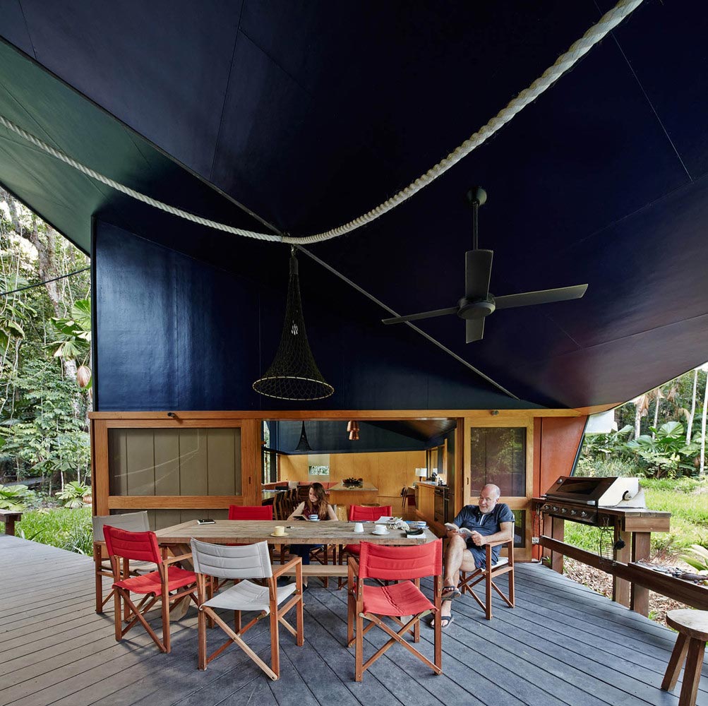
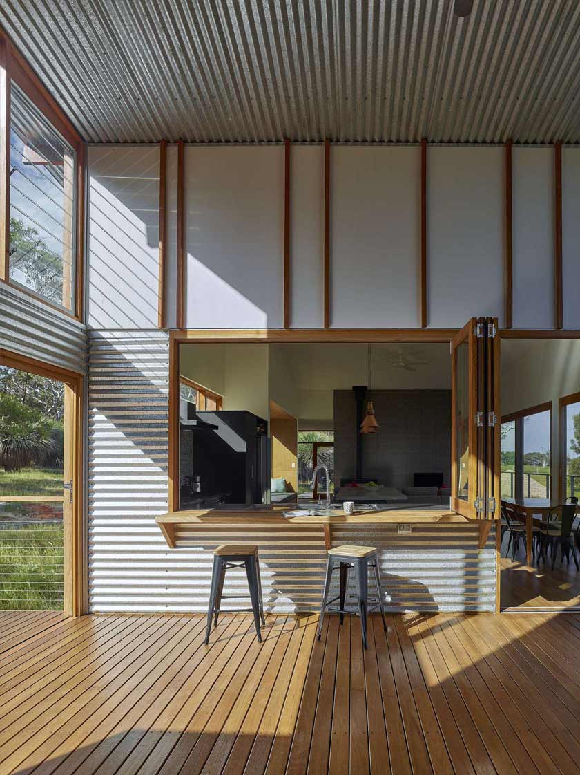
This Cape Tribulation home designed by M3 Architecture uses a folding ceiling form to create spaciousness and drama throughout this home. Here, on the deck, where a big volume could make the space feel too exposed to the elements, the edges are brought down to a lower height. This helps with weather protection, and keeps the intimacy of these spaces so sitting in them still feels comfortable. [Image Source]
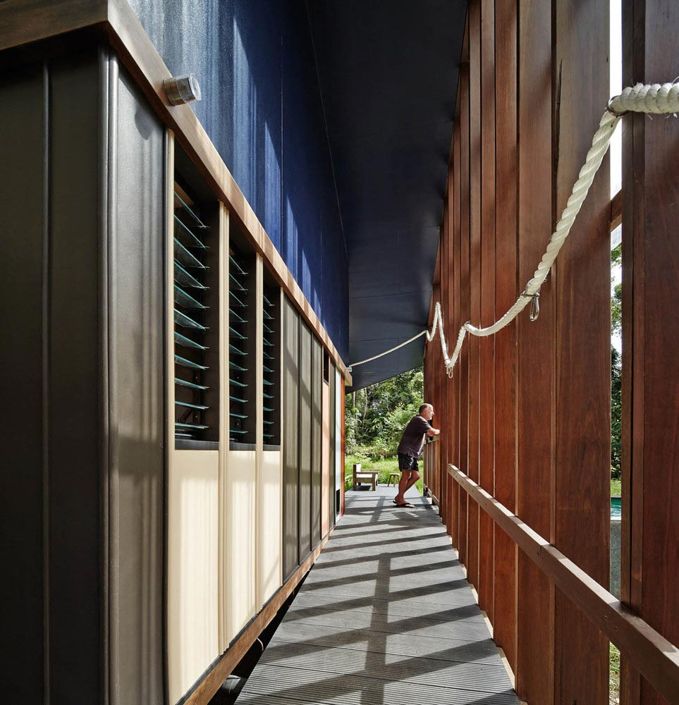
Given the climate in Cape Tribulation, open spaces and ventilation is important to keeping the home cool. External passageways still feel part of the interior of the home, and filtered from the environment, with this battened screen along the edge. This helps contain the volume, and claim space at the edges of the home. [Image Source]
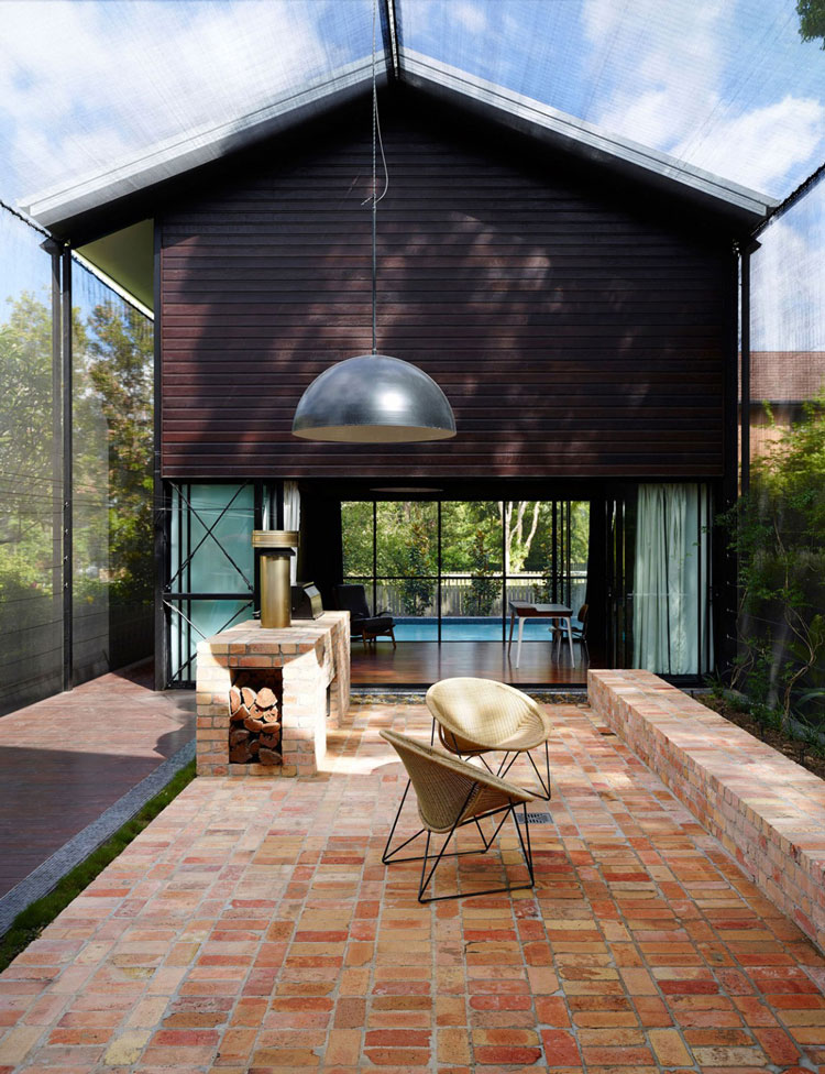
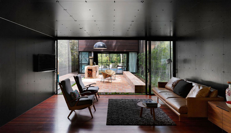
This Oxlade Drive home by James Russell Architects uses a fantastic design device to claim external space as a volume in this outdoor room. Screening material is wrapped around a light-weight frame. The space is two stories in size, Functionally, it does an amazing job of providing shade, bug protection and ventilation. Aesthetically, it provides an ‘edge’ to the volume on all sides, making this outdoor area feel like an extension of the interior of the home. [Image Source]
By contrast, the spaces beside the expansive outdoor room feel like intimate and contained volumes. This is definitely enhanced by the colour choice of black walls and ceilings. You can imagine how it would feel to move from this space into the big, 2-storey outdoor room. And then how protected you’d feel to move back into this space. The sense of spaciousness in the outdoor room is dramatically increased because of this. [Image Source]
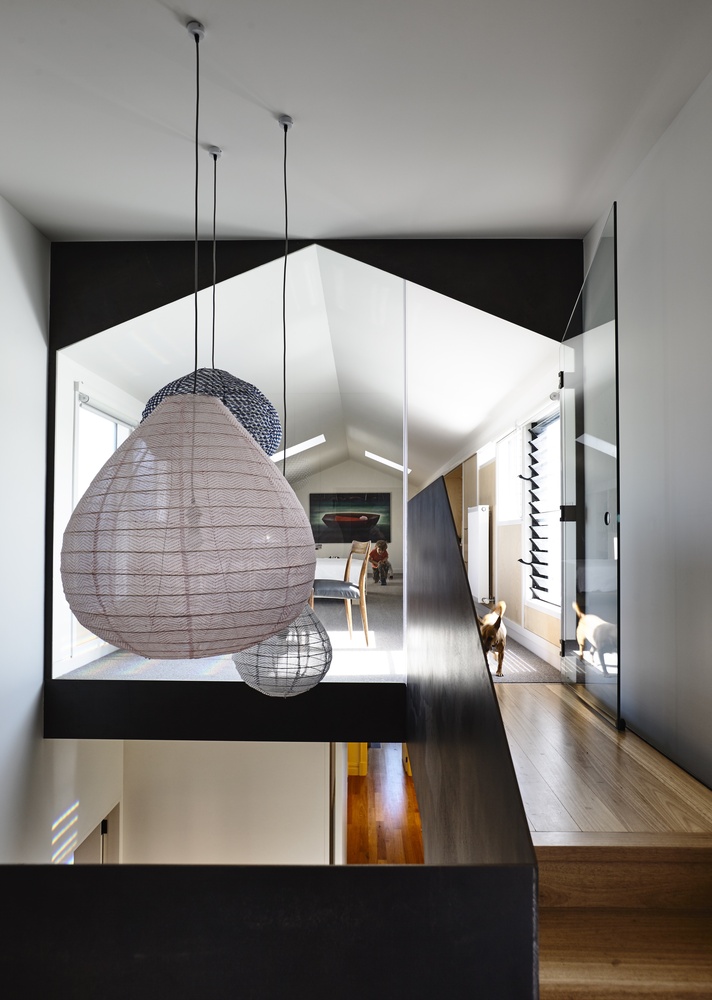
Stair voids are a great way to explore volume in your home, and create a sense of spaciousness. They give you the ability to see and experience a volume as you move through it, which helps emphasise it. However, to avoid the ‘vertical tunnel’ problem that can occur with voids like this, large light fittings have been used to break up the void. They’re dropped to a lower level as well, so you walk past them (rather than always looking up to them). This is a great way to improve the way a volume can feel. This home is in Melbourne, and by Ola Architecture Studio. [Image Source]
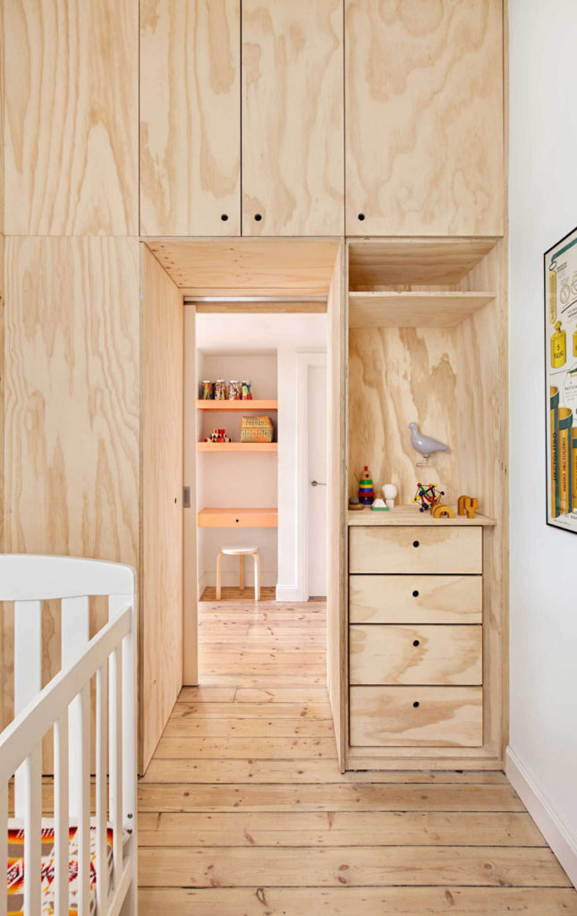
Here, the entry to the this room has been turned into a constrained volume that also provides storage. Located in a 75m2 apartment designed by Clare Cousins Architects, where all space needs to be super functional, what this use of storage also does is create a threshold into this room. Zoning like this helps with changing how people move from one space to another, and how they also mentally feel in that movement. You feel you’re entering a more intimate space. This is different to if you’d just walked through a door. Sound strange? Start noticing how the way a volume changes as you move through a space makes you feel. [Image Source]
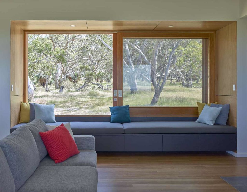
Again, volume is used here to create a contrast between the main living area, and this window seat. This home is designed by Mountford Williamson Architecture. There is a sense of intimacy about the window seat, and a threshold between indoors and outdoors. You can see how this changes the way you experience that window seat, and how much more contained and protected you feel there – even though you get an expansive view to the outdoors from it. [Image Source]
By contrast, the outdoor room in this same home (designed by Mountford Williamson Architecture) is an expansive volume. It sits within the home, which opens into it from both sides. The open volume of the outdoor area is contained though, as high level windows on both sides protect it. In fact – you can actually close off this outdoor area, helping it act as a breezeway, but doubling as an interior space when needed. The sliding doors disappear completely though, so open the space to the exterior. The flexibility in changing this volume would add functionality and interest to this home. [Image Source]
I could keep going … there are so many examples of homes that have used volume effectively in their design, to create a sense of spaciousness and help you feel a certain way in those spaces. Lunchbox Architect is a great source of inspiration to explore – lots of beautifully designed homes there of all budgets (and it’s where I sourced these projects from).
Remember to check out the rest of Season 01 to learn What Matters Most when designing your new home or renovation.

 With over 30 years industry experience, Amelia Lee founded Undercover Architect in 2014 as an award-winning online resource to help and teach you how to get it right when designing, building or renovating your home. You are the key to unlocking what’s possible for your home. Undercover Architect is your secret ally
Leave a Reply