Want to create a spacious, light and airy home? Here’s how.
This is Episode 9 of Season 1.
In this episode, I’ll share how light can be used to create a spacious home. Light is the second tool we have in our toolkit to create spaciousness in our homes.
When talking about light, we need to think about both natural and electric night. After all, you want your home to feel spacious during the day, and after dark, don’t you!
Many homeowners, when describing how they want their homes to be, use the words ‘airy’ and ‘light’ or ‘light-filled’.
And we know intuitively that filling our spaces with light will make them feel great. And we also know that natural light does wonders for our moods and sense of comfort in our home.
We can create a feeling of relaxation that we can tap into when we walk into our homes. That make us feel ‘at home’.
In this podcast, I’ll identify the main mistakes homeowners make when using light in their homes, and how to avoid them killing that spacious feeling.
I’ll also outline 3 design strategies you can use to create spaciousness in your home, using both natural and electrical light.
Listen to the podcast to learn how to use light to create spaciousness in your home.
Some images to inspire you when thinking about light
Tip #1: Use light to guide the eye and open up space in your home
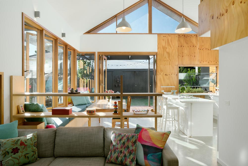
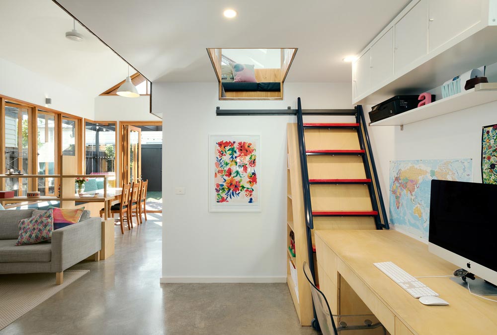
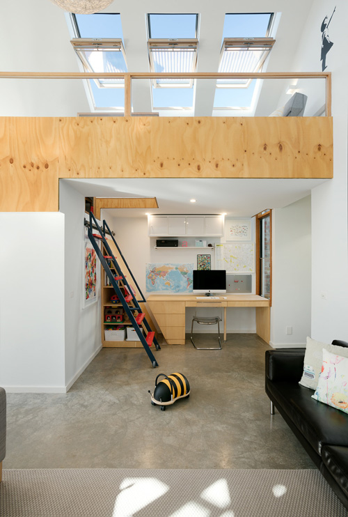
This addition to a Melbourne home uses light to create spaciousness and lead the eye to locations within and outside the home. A well lit opening in the ceiling above the study nook leads the eye up into the small loft space. A high, triangular window, opens up the space by leading the eye over the top of the neighbouring property and out to sky. Skylights in the loft space lead the eye well beyond the limits of the extension, and into open space. All of these design devices greatly enhance the sense of spaciousness in this compact extension. Design by Green Sheep Collective. [Image Source]
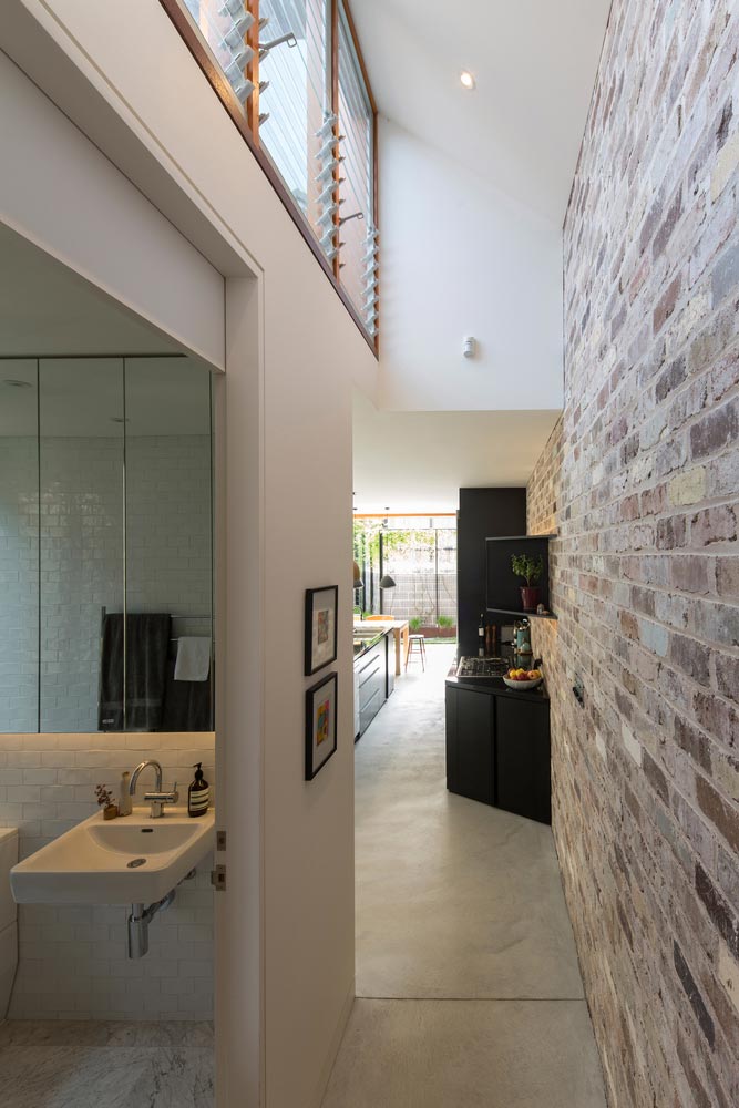
Here, a high level clerestory window guides the eye up and out, in what would otherwise be a constrained hallway. It also enables the brick wall to be a beautiful feature in this space, as its washed with natural light. If this clerestory wasn’t here, this hallway would be dark, and the contrast between this space, and the light-filled kitchen area it leads to, may be too stark to be an enjoyable experience. Project designed by Carterwilliamson Architects [Image Source].
Tip #2: Use light as a feature at night. Wash up walls, create spotlight features, and create spaciousness, mood and experience
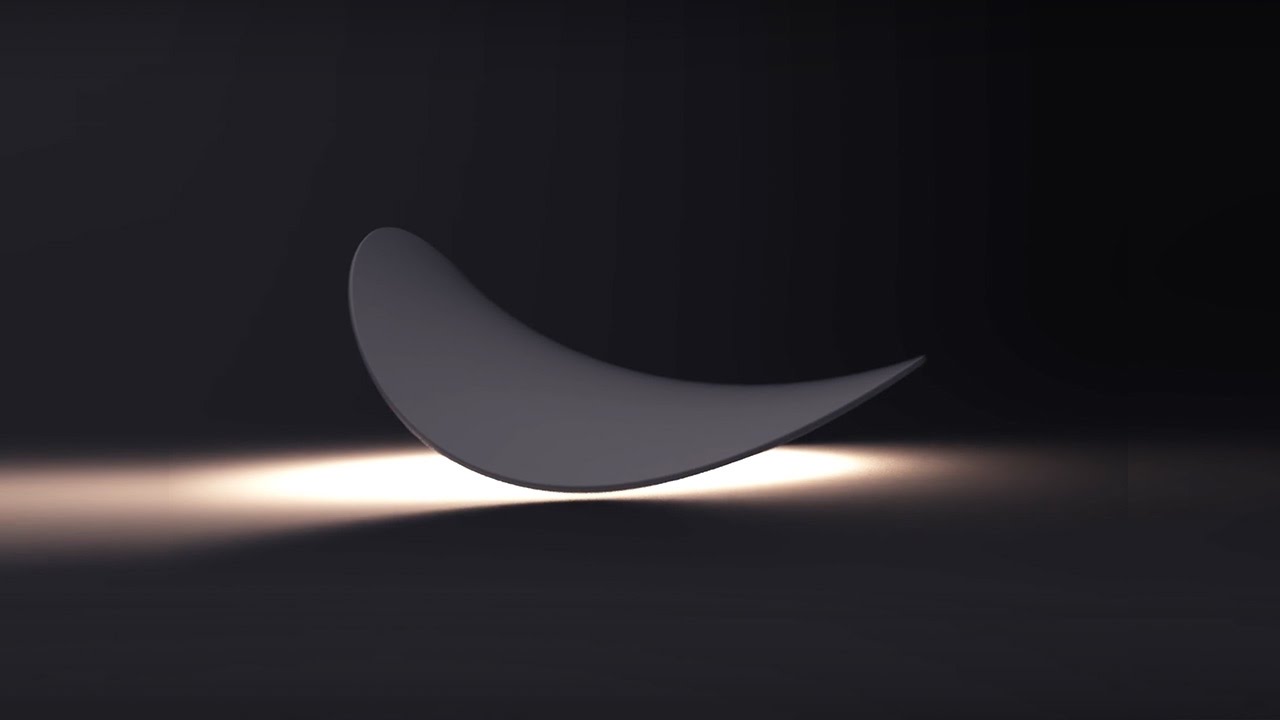
Wall lights can be a simple fixture with a wash of light pointing up, or down, or both (or even sideways too!) Yet, there’s so many options available that can turn your light into much more. This video shows a fantastic, flexible wall light fitting made by BrightGreen. You can see the dramatic impact a solution like this could have in creating mood, lighting your interiors, and enhancing the spaciousness of your home [Source]
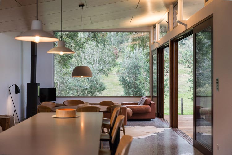
Pendant lighting highlights the dining table, and keeps this feature ceiling free of downlights. Wall lights above the sliding doors wash light onto the ceiling as well. These help enlarge the space at night, and highlight the feature ceiling during the evening as well. Project designed by Bourne Blue Architecture [Image Source]
Tip #3: Get help with designing your night-lighting
BrightGreen is an Australian manufacturer that provides free lighting designs with their light fittings, and assembles quote estimates based on what they design. Upload your floor plans here to get yours designed.
Beacon Lighting have a lighting consultation service they charge $100 for – which is redeemable on in-store purchases. Head here for more info.
Get quotes from other lighting design services by heading here.


 With over 30 years industry experience, Amelia Lee founded Undercover Architect in 2014 as an award-winning online resource to help and teach you how to get it right when designing, building or renovating your home. You are the key to unlocking what’s possible for your home. Undercover Architect is your secret ally
Leave a Reply