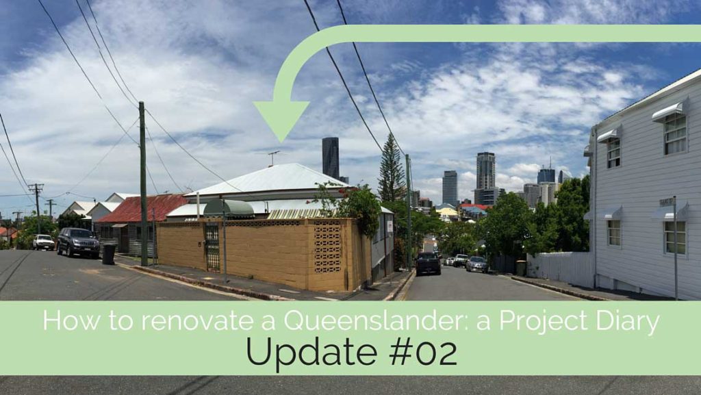
In our last project diary entry, I introduced you to Michelle and Sarah, the new owners of this Queenslander cottage in inner Brisbane. They are planning a renovation that will provide them with their desired city pad – and also be a saleable asset down the track.
To kick off this process, Michelle and Sarah worked with me with the Reno Rescue package.
First things first
For design work to occur on the proposed renovation and extension, we need drawings of the existing home. Sometimes I work from real estate drawings (which I check and confirm for dimensions). However, they’re not the most accurate form of drawings. They’re a good start if you’re testing ideas, and checking the feasibility and cost of renovating to determine if you’ll proceed or not.
However, if you plan to renovate, proper existing drawings (or ‘measured drawings’) is something you’ll need. So it’s worth investing in them up front, so any design work you have done from the start is based in reliable realism!
I organised for Aaron Wailes, of Aaron Wailes Building Design to prepare the existing drawings for Michelle and Sarah. This basically means he spends a few hours at the property with a tape measure, a clipboard, and a willingness to crawl into dark and dirty roof spaces. He documents what he sees, and then heads back to his computer, and turns it all into computer-drafted drawings.
Collecting the brief
The beginning of any design process requires a brief – a means of communicating what you want in your design.
Different designers have different ways of collecting this information from their clients. And some clients come fully prepared with a list of wants, needs and desires, all bundled up in documents and sample images.
My way of collecting a brief is to have clients answer a series of questions in a document that I supply them. This questionnaire I’ve created is designed to take clients through a process of thinking about how they live now, and how they wish to live in the future. It aligns this with the type of things they enjoy doing, and what they love (and loathe) about their home and its site. Of course, budget is also included, as well as drawing out info about any prior knowledge of the home’s history.
The benefit of the questionnaire, and that the client has to complete it themselves, is the process the client goes through to do this. Firstly, they have to make time for it. If they’re a couple, they have to choose whether they’ll do it together, or separately (I give them the option – which can be great for couples who are not on the same page to then feel they both have voice in their project).
I’ve had clients tell me, time and time again, that the process of completing the questionnaire is incredibly worthwhile in itself.
The fact finding mission
Once the questionnaire is completed and returned (Michelle and Sarah opted to complete separate ones), and the existing drawings are finalised, I met up with Michelle and Sarah. I ordinarily do this remotely, over Skype, however given the project is in Brissy, I scheduled an in-person meeting on site.
Over the course of an hour or so, my job then is to go through the questionnaire answers, and fill the gaps. To test ideas. To make suggestions. To challenge some of Michelle and Sarah’s preconceptions about the project. This helps me complete the brief and build a full picture of how Michelle and Sarah need for this home to function and feel – both now, and into the future.
Starting the design work
Once our consultation is complete, I go away and prepare the Reno Rescue report. This includes preparing design options – usually 2 – that test and respond to the brief for the project.
The Reno Rescue report also includes written information. This brings together a few things:
- findings their questionnaire and consultation in a summary
- my observations of what is working (and not working) with the home and plans for it
- an outline of my main objectives for the design
- action steps to help with ‘what’s next’
The main observations for this project were …
- the corner site is an asset in giving the site exposure and access
- the corner site is a challenge in ensuring privacy and in dealing with planning constraints – as required street setbacks are usually larger than side setback rules
- building under may use a big chunk of the budget, and not give a great return
- planning constraints present some challenges – it’s a pre-1946 home, may be older, and there are local rules for the area that are even more restrictive
- the main view is to the south and south-west – which will require strategies to capture, and get northern sunlight as well
- storage will be key – we’re creating a compact, urban home – and homeowners often believe they can’t have space for decent storage and a city location
- we want ‘wow’ … wow at the view, the spaciousness, the functionality, the natural light, the sense of calm and peace … and we want to back up that ‘wow’ with ‘this really works’.
- The site is compact, and we have a 60% max site coverage rule – so we need to get it working hard design wise.
That last item particularly impact my approach for the design. So, although the design needed to be compact, we needed to get spaces working harder. Ideas like not having indoor and outdoor dining (so no deck), and car accommodation that is more than that.
My main design motivations were:
- To avoid setting us up for headaches with Council that bog down approval timelines
- Work with the existing structure and roofline wherever possible
- Work with existing wall locations wherever possible
- Optimise your views and outlook – and make them available to more parts of your home
- Find ways to bring northern light further into your floor plan
- Celebrate the character quality of your home
- Ensure that the new work can be contemporary, and maximise its value in terms of presentation to the street
- and what it adds to the living quality of the home
- Accommodate your desires in terms of spaces, functions, rooms and flow
- Seek ways to create spaces that will be multi-functional, so their use can change as the families of future
- owners grows in age and have different demands of your home
- Eek every bit of value from this home – in terms of making it a really saleable and appealing home, whilst not
- going over the top in budgetary commitments or destroying the quality of the existing home.
The designs
I found as I worked on the designs, that there were two main strategies – or choices.
The main choice was about how the living / dining / kitchen area is arranged, and how it accesses the view.
These spaces are added as a new, bolt-on extension – so they can be open plan, have desired ceiling heights and arrangement, and access the view. They’re not limited by the style and shape of the existing home – and we’re not pulling apart the existing house to make them be how we want.
Then the existing house is reconfigured into the sleeping zone. The two options for this were relatively interchangeable between the two extension options.
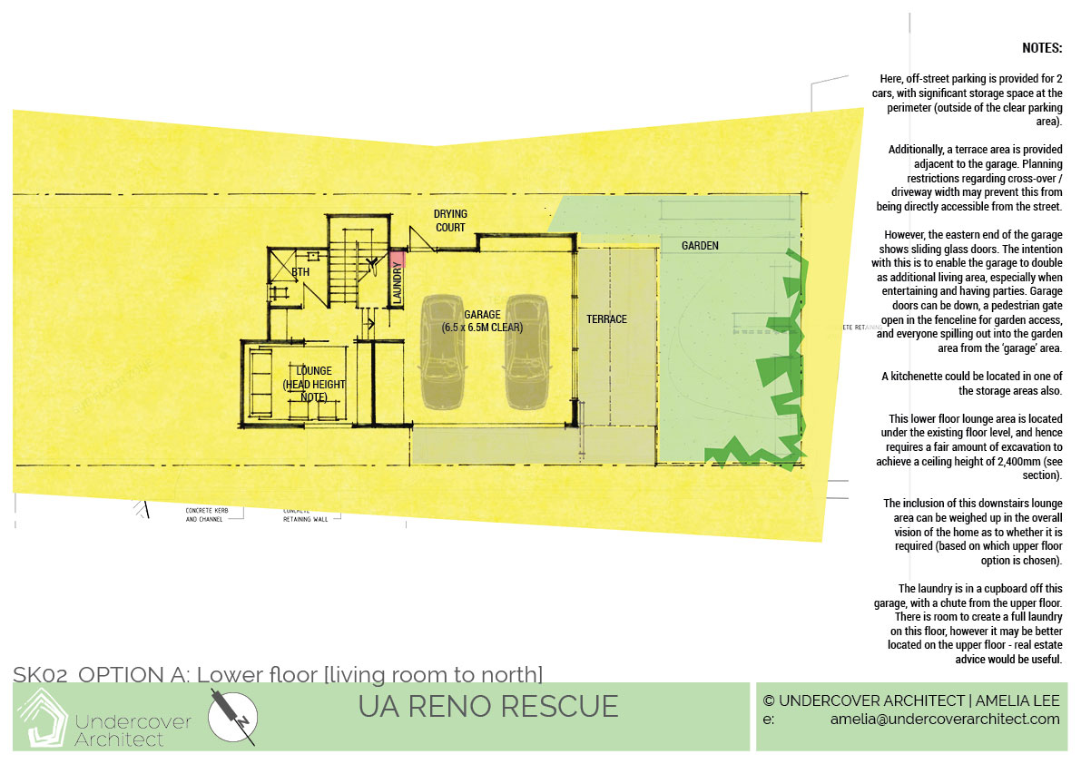
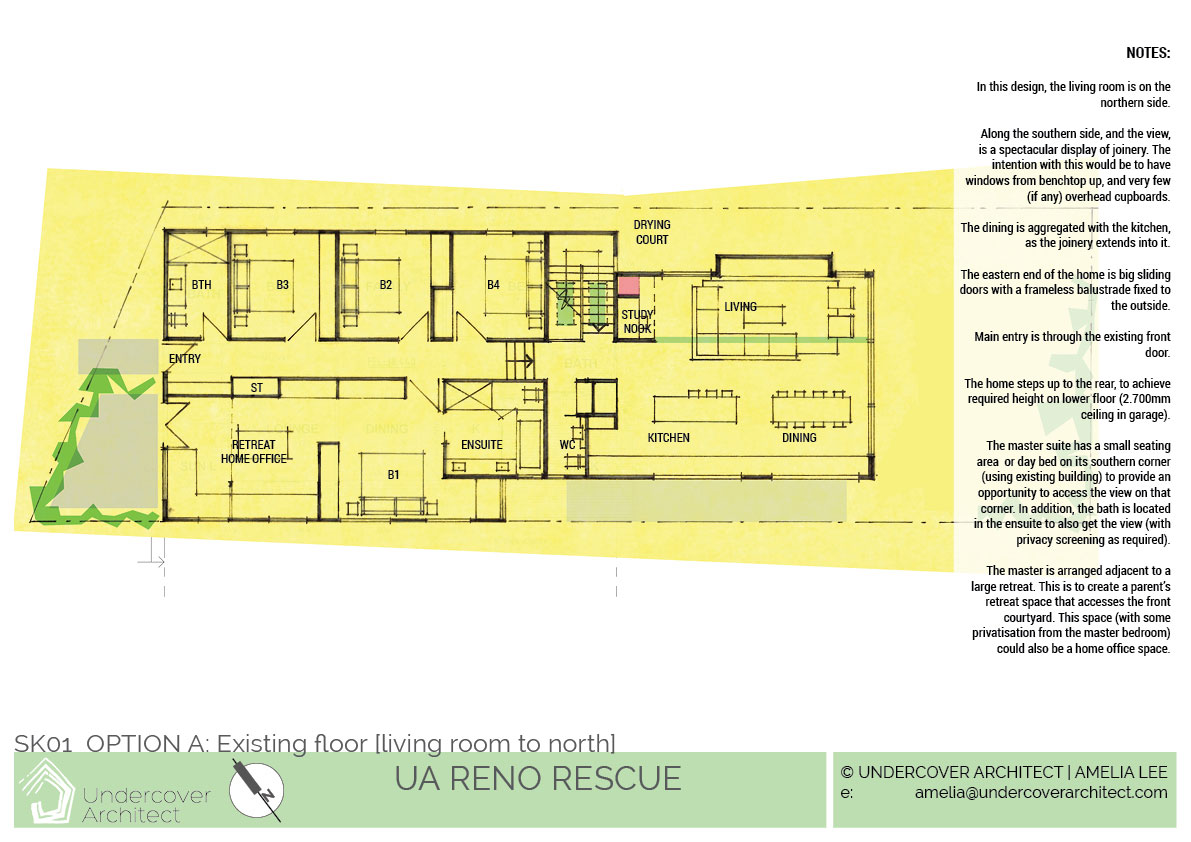
So OPTION A
Option A shows the living on the north side, and a wall of joinery that aggregates the kitchen and dining area.
The stair is then on the northern side. The master suite has the opportunity to access the view also, along the side street. It is arranged as a large parents’ retreat space, with its own living space (which could also double as a home office if access and planning was slightly reconfigured.
And OPTION B
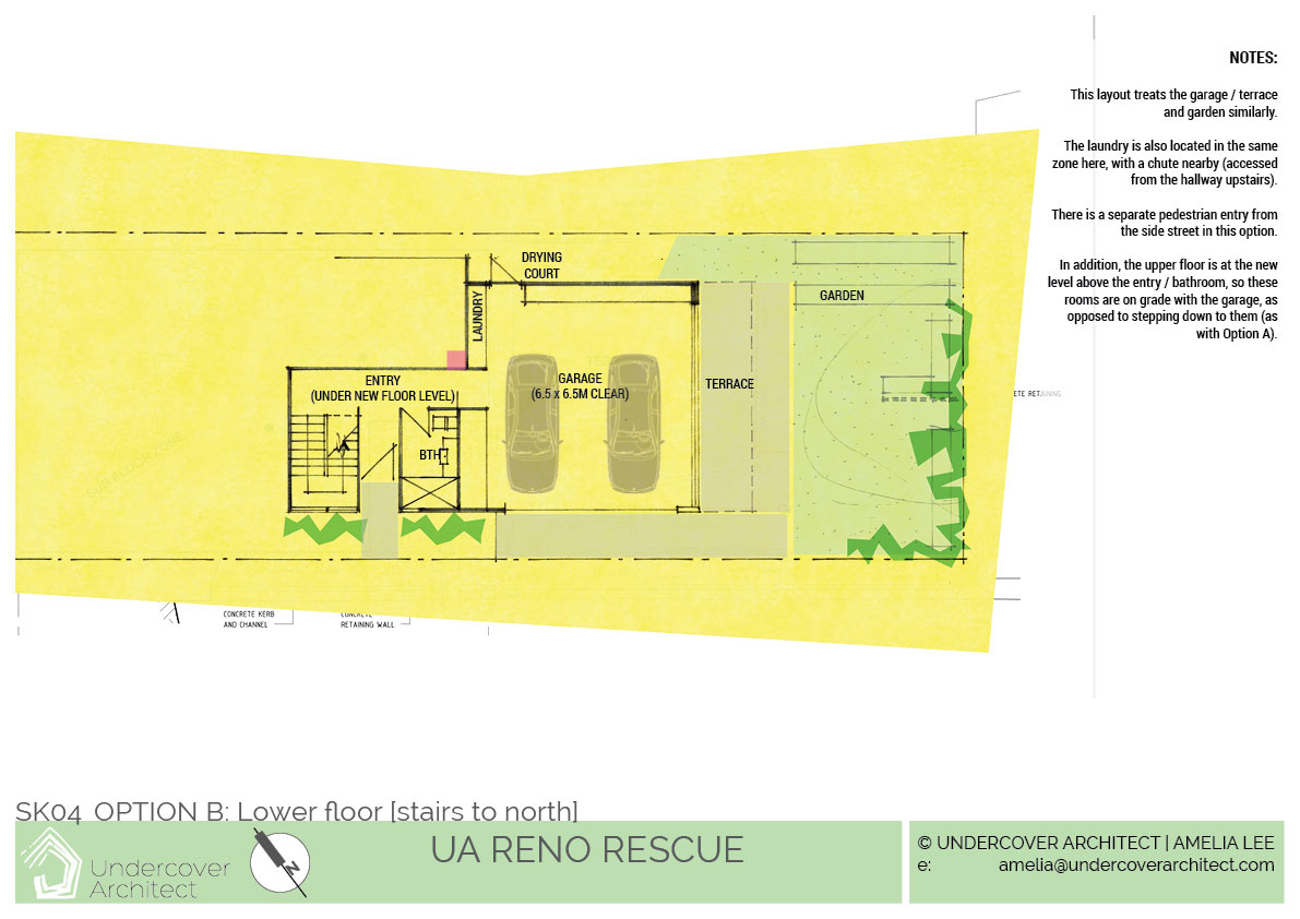
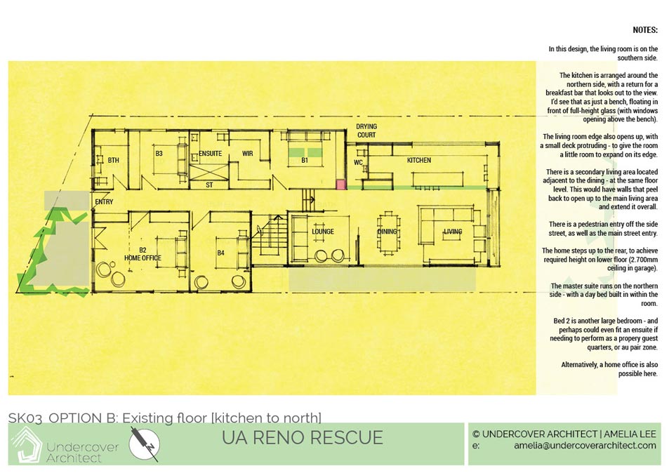
Option B shows the kitchen on the north, and opens the dining and living room up to the side street.
This locates the stair on the southern side, with the possibility of pedestrian access off the side street also.
In this option, the master suite is drawn on the northern side, and a secondary living area is located next to the dining area … and can open up to it to expand that part of the home.
Ideas to inspire
At this stage, it’s great to be able to use images from other projects to inspire ideas about how various parts of the design could be – without having to commit to them in your own design.
And often this is a great way for me to include ideas that can’t be drawn simply in a floor plan, but conveyed really powerfully in images from another project.
Some of the ideas for this included:
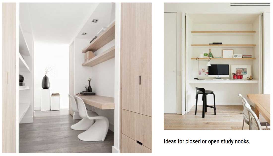
Study nook (a home hub for easy computer use within view of family activity)
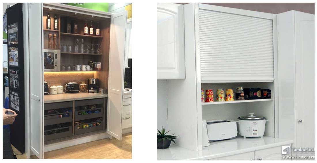
Appliance cupboard (in lieu of a butler’s pantry)
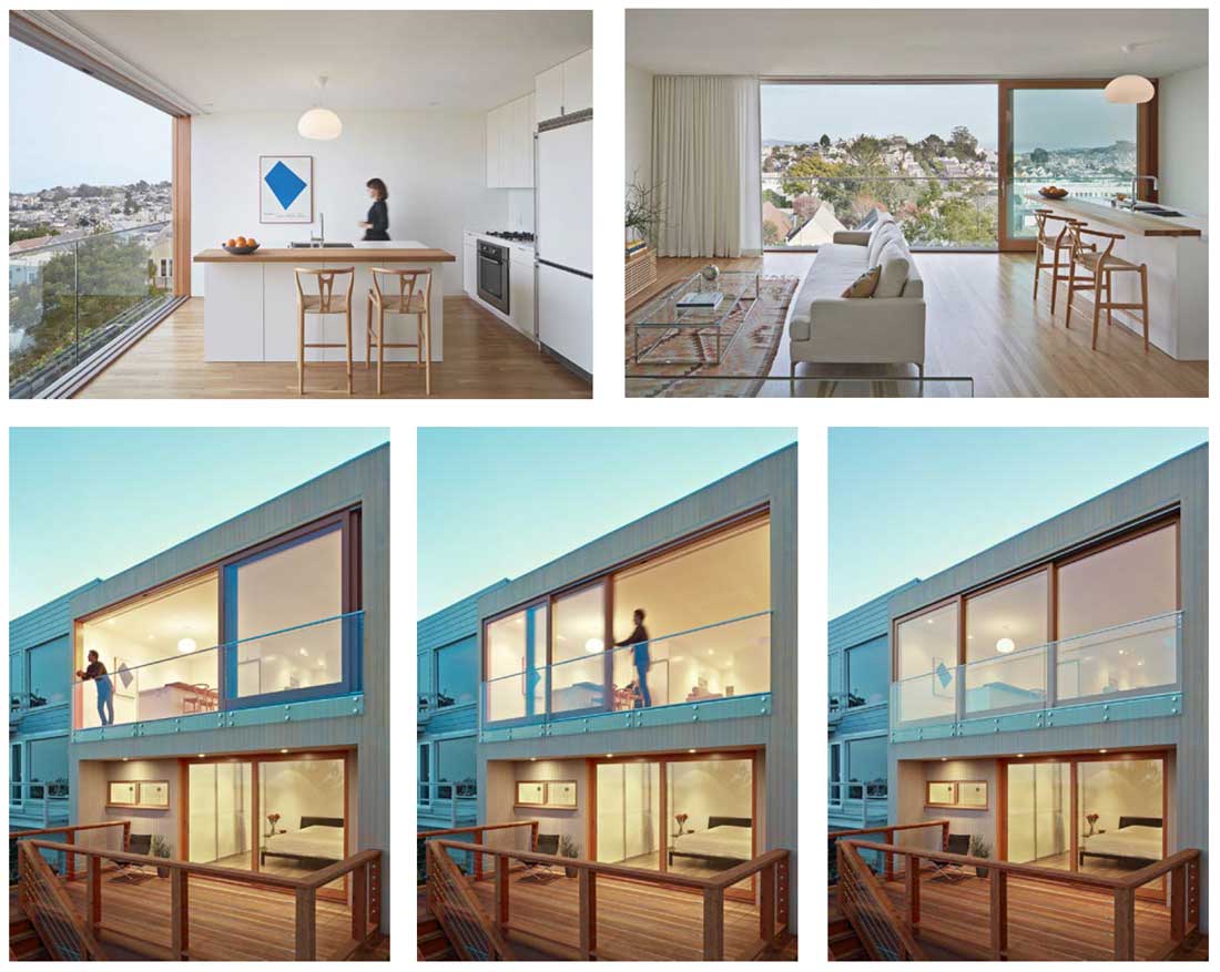
An indoor space that has external access, and feels like a verandah inside
Next steps
The Reno Rescue report laid out action steps for Michelle and Sarah to take next.
The most significant action step required is to decide on a preferred plan, and determine what changes need to be made to it.
When your project is about selling at a profit – either now, or in a while – my recommendation is to get advice from real estate agents in your area. They’re the closest to what happens in your suburb … what sells and what doesn’t … what the deal breakers are, and the must-haves.
Other action steps include
- getting greater detail around how the exterior of the home will look
- sourcing some detailed planning advice (from a Town Planning consultant) to help with developing strategies for simple approvals
- once some more design resolution has happened, we can start getting input on the cost to build
So which option?
Which would you choose – Option A or Option B? Both have their merits for different reasons … and sometimes a choice can purely be about personal taste.
Which option did Michelle and Sarah choose?
Well, that will have to wait for the next Project Diary update! CLICK HERE to read the next instalment.
Other blogs which may interest you …
Read about the 6 things I learnt from my own favourite reno.
Learn from the blunders, doozies and big mistakes we’ve made in our own renos here.
Should you bite the bullet and just knock down and rebuild? This is how to decide.
 With over 30 years industry experience, Amelia Lee founded Undercover Architect in 2014 as an award-winning online resource to help and teach you how to get it right when designing, building or renovating your home. You are the key to unlocking what’s possible for your home. Undercover Architect is your secret ally
Thanks for sharing, I love seeing how creatives come up with solutions. I’d choose Option A, because I really like the master suite connected with the home office/retreat – it seems like the office might be better utilised as a multi-purpose space, and I also like the layout of the kitchen/dining/family room with the more separate lounge downstairs. I love the concept of the ‘balcony’ room too!
Hi Jane
Thanks for your kind feedback – I’m glad you enjoyed seeing how this process happened. Stay posted to see the next instalment and I’ll share with you which option they chose!
– Amelia, UA x